Smiley Face Visualizations from Mood Data of a City

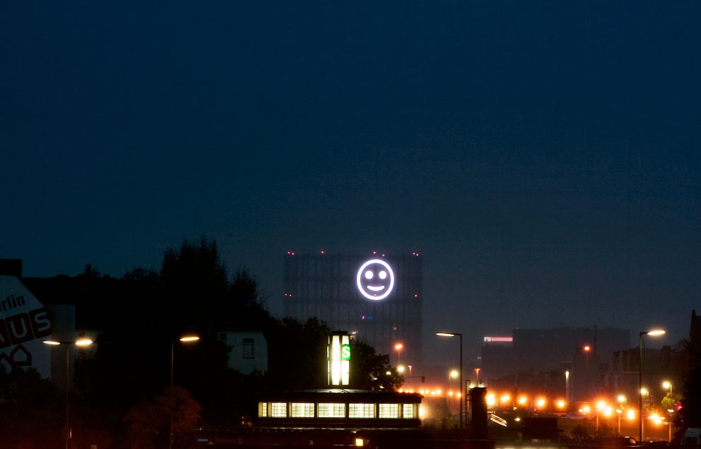
Project Stimmungsgasometer, by Richard Wilhelmer, Julius von Bismarck and Benjamin Maus, is a giant smiley face that changes based on the mood of Berlin citizens. When they are collectively “happy” the light is a smile, and when they are not, it is a sad face. Input comes from facial recognition software (contributed by the Fraunhofer Institut) that takes in video from a strategically placed camera. The obtained mood data are then stored on a server and processed by the smiley on the screen to visualize the emotions in real-time.

Kind of hilarious, a bit weird, and somehow already feeling like its showing its age (though as I understand it, it was a temporary installation back in 2008). Data-driven artwork is already boring — that is, taking dataset x and applying it to artwork parameter y. Somehow I feel like Cory Arcangel had something to do with wrecking this for everyone, in the best way possible.

Thinking about ways to animate the intangibility of the city still seems like a good idea though.

via an email from Kim seen on Flowing Data & [Stimmungsgasometer via infosthetics]

David Rokeby’s long wave

David Rokeby's Long Wave

David Rokeby is a Canadian artist who worked for years in new media, creating interactive installations, and exhibiting them around the world (including here in Windsor most recently at the 2008 Media City -curated AGW exhibition). I had the opportunity to work with him on that 2008 show, Plotting Against Time, and he is one of the nicest and most brilliant people I’ve ever met.

More recently, his work has turned to large-scale installations.  2007’s Cloud played with perception through small sculptural elements rotating under a computer’s control.

This year’s long wave is a site specific installation that was commissioned by Luminato, Toronto Festival of Arts + Creativity and was on view at the Allen Lambert Galleria, Brookfield Place, Toronto, June 5 – 20, 2009. It is a 380 foot long, 60 foot high sculpture tracing a helix through the entire length of the galleria.

“long wave” is a materialization of a radio wave, a normally invisible, but constantly present feature of environment. It represents the length of a radio wave in the short-wave radio band, in between the sizes of AM and FM radio waves. In our contemporary wireless environment, populated by tiny centimeter long wifi transmissions, these radio waves are really the dinosaurs of our communications era.

I’m getting more and more interested in larger-scale installations like this that at least in part respond to the architecture in which they are situated. With so many vacant building across this city, why worry about a sculpture garden when we could have an “installations in abandoned factories” tour?

AMPHIBIOUS ARCHITECTURE

amphibious2

A project by xClinic Environmental Health Clinic at NYU and the Living Architecture Lab at Columbia Graduate School of Architecture, Planning and Preservation, AMPHIBIOUS ARCHITECTURE attempts to generate a new dialogue between the environment and us.

The description, quoted from the site, since it’s more clear than my attempt at synthesizing the information would be:

“Installed at two sites along the East and the Bronx Rivers in New York, the project is a network of floating interactive buoys housing a range of sensors below water and an array of LEDs above water. The sensors monitor water quality, the presence of fish, and human interest in the river’s ecosystem, while the lights respond to the sensors, creating feedback loops between humans, fish in their shared environment.

Additionally an SMS interface allows homo-citizens to text-message the fish and receive real-time information about the river, contributing towards the collective display of human interest in the aquatic environment. The aim of which is to simultaneously spark a larger public interest and dialogue about our local waterways.”

amphibious1

These are the sensors lit up before being installed in the river. To see some video of the sensors actually installed and floating, you’ll have to check out the site’s landing page.

eastriver

This is an image of some of the sensors lit up, being activated by passing fish, water conditions, and text messages. It’s an amazing cool project, especially given our proximity and recent interest in imagining some kind of Detroit River based project.

Eclipse – Park Pollution Visualization

Eclipse

It seems I keep running into projects that attempt to visualize pollution levels. I’m not sure what intrigues me about this particular project, but I do connect with it on some level. I might just be drawn to projects which use real-time or near-real-time data. Here is a summary this project’s purpose.

Eclipse is an interactive artwork that alters and corrupts appropriated photographs of United States national and state parks based on real-time Air Quality Index readings from the web (AQI or particle pollution data is available from airnow.gov). Eclipse was commissioned by Turbulence.org and was created by Cary Peppermint and Christine Nadir, who produce ecoarttech.net.”

In The Air

In the Air - a data visualization project initiated at MediaLab in Madrid

In The Air is a data visualization project initiated at MediaLab-Prado in Madrid. The project has taken a large dataset consisting of a year’s worth of air quality readings from Madrid and is beginning to realize a number of ways to make visible the invisible agents of the city’s air (gases, particles, pollen, etc). In The Air is using both web interfaces and physical prototypes for representing the data, and while the web component looks very slick, I’m considerably more interested in the physical parts.

I’m not sure how well the images read above, but those are some examples of their process as they work their way through Arduino-controlled contraptions that will spray out different colours of mist depending on the air quality data. There’s a video of one of their failed attempts on Serial Cosign, which is where I originally saw the project.

Seeing people do stuff is inspiring.

Design by Sound

Sound Chair by Matthew Plummer Fernandez

Sound/Chair by Matthew Plummer Fernandez was the result of testing 719 sounds to see which one produced the best physical object. Using 3D visualization software he wrote, Plummer Fernandez graphs the sound on a volume/time/frequency plot, thereby realizing “the beautiful and unexplored aesthetic of sound […] a landscape of spikes and shapes that vary accordingly to the type of sound.”

Plummer Fernandez is a Royal College of Art (soon to be graduate?) and designer based in London, though I find many of his “self-initiated” projects most interesting—The Sound of Light (“A casing is made for a flourescent tube light by recording and graphing 1 second of the ‘hum’ sound produced by the light”) and Sound Tagging (“Most large buildings have distinct auditory signatures as a result of vibrations generated by traffic, underground, and wind that resonate through the solid structures”)—remind me of what I love about sound.

Gapminder: Free Data + Building Understanding

Gapminder - visualizing Canada's forested area vs surface area

I watched a TED talk sometime over the summer by Hans Roslings, in which he talked about data visualization, specifically using Gapminder. The website, Gapminder World is powered by Trendalyzer, and “enables you to explore the changing world from your own computer.” Perhaps most interesting is that the software allows you to see changes over time, seeing the way things change and the ways in which those changes are interrelated. If you visit the site, make sure to press the play button below the graph before you do anything else—it really helps to understand the possibilities of the software.

I’m very interested in trying to imagine what it would do, in terms of change, if we did have a better understanding of the way in which we and our actions are interconnected to other people and situations across the world and 20 years from now. Are graphs with moving the circles the best way to do this? I’m not sure, but I think the idea behind the tool is incredibly important.

[via]

Statlab by Tjerk Stoop

Statlab by Tjerk Stoop

Statlab by Tjerk Stoop is an environmental art project, creating an analog visualization of air quality. From Stoop’s website, “It displays the daily average of CO2 concentration trough a chemical reaction where chalk particles are formed. The result is an analogue graph where the difference in the amount of chalk particles per tank is a global measure for the fluctuating CO2 concentration within one week.” Great to see physical/analog visualization presenting important data in a clear manner (well, assuming you read the accompanying text).

[via]

GOOD Magazine – Vampire Energy

GOOD Magazine has been creating a number of these short videos with great animations discussing and illustrating a variety of issues. This one, in particular, talks about “Vampire Energy,” the energy that appliances and electronics use, even if they’re in standby mode. Best practice is always to have your TV, computer, etc. connected to a power bar that can be shut off when not in use, thereby cutting the power completely.

I think the video is a good example of distributing knowledge effectively. They took existing information/data (about power consumption) and created an animation that does a better job at communicating it than a bar graph and table of numbers probably ever could.

Usman Haque's Primal Source

[NOTCOT at GLOW: Usman Haque’s Primal Source from Jean Aw on Vimeo.]

As part of GLOW in Santa Monica, Usman Haque’s Primal Source was a huge interactive light/projection installation on the beach. Rear-projecting onto a water-screen, the installation responded to sound from the crowd with microphones being placed along the crowd’s edge on the beach. The event went on for 12 hours throughout the night. The software was built withProcessing and PD (an open-source cousin of Max/MSP/Jitter). 

[via] & [via]