
It seems I keep running into projects that attempt to visualize pollution levels. I’m not sure what intrigues me about this particular project, but I do connect with it on some level. I might just be drawn to projects which use real-time or near-real-time data. Here is a summary this project’s purpose.
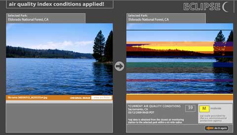
“Eclipse is an interactive artwork that alters and corrupts appropriated photographs of United States national and state parks based on real-time Air Quality Index readings from the web (AQI or particle pollution data is available from airnow.gov). Eclipse was commissioned by Turbulence.org and was created by Cary Peppermint and Christine Nadir, who produce ecoarttech.net.”
Data visualization is tough. I’ll be forever fascinated by the idea of using real-time (or near real-time) data as a part of a system to generate something new, but I often begin to have difficulty with data visualization projects once I start asking why?
Why does increased pollution levels change the colours, or repeat bands of pixels in the photo? I understand that there’s a relationship (the worse the particulate matter, the more corrupted the photo looks), but I just wonder to what end this type of visualization occurs. Understanding that visualization is a mode of education and communication that has the potential to rethink our relationship to data is as far as I can get, my actual understanding of what more particulate matter or a higher air-quality index means remains weak.
I actually quite enjoy this project, in no small part because of their use of real-time data, pulled images from a public bank of other essentially real-time data, and a focus on the environment, but I’m just still waiting for a project that somehow addresses a strategy or tactic of data visualization that I haven’t seen yet.
Anyways, good find Josh, Turbulence.org is a fantastic resource!!!