
Getting it done, first thing in the AM.
Getting it done, first thing in the AM.

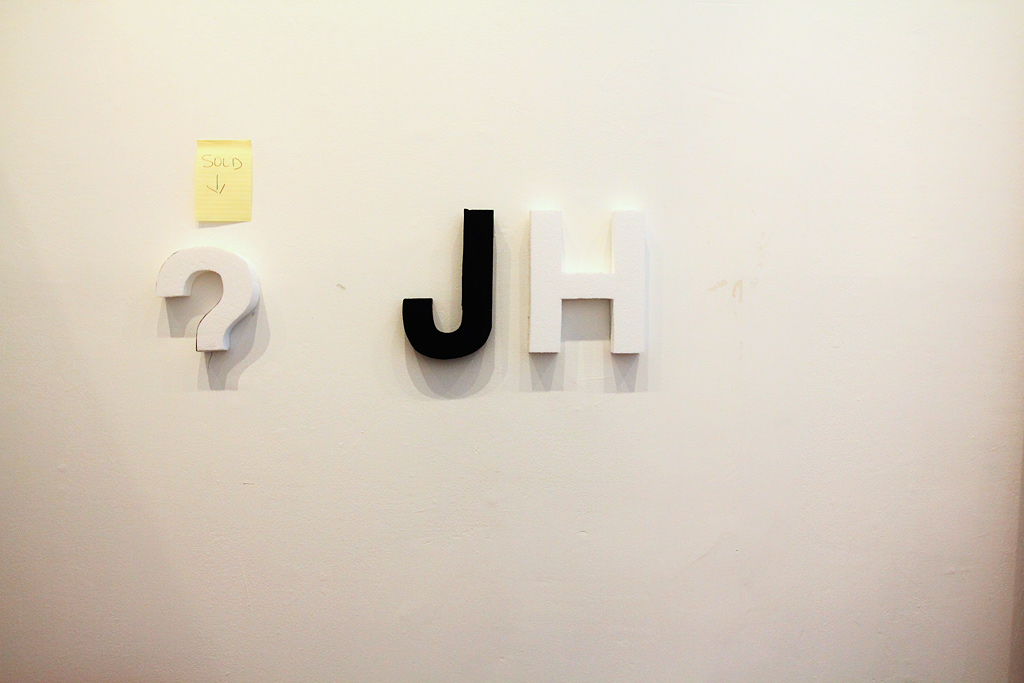
From yesterday afternoon — testing the stamp that Rosina set up and the cards we just got back from the printers.

We also got a fun package from Hamilton Artist Inc. that included some of the “questionnaires” we did from the last art crawl.

These will eventually make their way into our forthcoming publication.

Detail, stamp test.

Yesterday afternoon, Kevin and I tackled painting the letters, while Hiba cut some more. Into the evening, news came that Kevin had finished cutting all the letters!

Make sure you pick some of these up on Thursday, ok?
Another instalment of In Store, featuring Lee Rodney discussing her Border Bookmobile project, in the multi-part documentary that our exceptionally talented friend, Daragh Sankey, has been putting together. Here’s his notes on the latest:
Ed. note: Hey, it’s been a while! I did a lot of overtime and also a freelance job and had to prioritize all that cash money work over this project, but I’ve managed to get one more done. This one is about Lee Rodney and her project the Border Bookmobile. There will be two more films after this: one is a mild recut of an earlier short I did, about Andrea Carvalho. The other concerns Leesa Bringas’ Postcards To Indian Road. I have another film coming, about Broken City Lab itself, but it has ballooned in scope and length to encompass events outside of the SRSI residency, so I don’t know if it belongs as part of this series of films. Besides, who knows how long it will take me to finish!
Lee Rodney’s reputation preceded her. She’s a professor at the University of Windsor, and some of the residents of SRSI and Broken City Lab members had been her students, and spoke very highly of her. Sure enough, there were many fascinating things to document during her stay: the bookmobile itself, the tour of Windsor’s forgotten neighbourhoods, and many fascinating conversations, including the one with Justin that forms the backbone of this film.
There are a number of borders crossing through this film. One is the border between Detroit and Windsor, that divides what in many ways should be considered one city. Another is the border between city and suburb. Also there is the border you see in the final shot. Nature borders the city, but not only at the outside edge. It has a way of creeping back in.
")
Lucy stopped by this morning to keep cutting. Hiba and I painted the letters.
White it is.
")
We had a lot of leftover wall paint, which means we not only have more than enough paint, but the letter faces will gain a bit of rigidity and protection since it’s epoxy paint.
")
Hiba paints.
")
After trying to paint the letters on the wall, we shifted to a make-shift table. Easier to avoid paint running.
")
We made a drying rack.
")
Protection. Recommended originally by Jennifer Willet. We should actually have more of these on hand.
")
The drying rack doing it’s job.
")
But, of course, it didn’t fit many letters, so we just started lying them out on the table.
")
Two brushes — these might be leftovers from Make This Better.
")
Also, picked up the postcards from Dan Bombardier, while he installed for an upcoming show at Artcite.
")
Also, Daragh Sankey posted another section of In-Store, his documentary on SRSI … we’ll post it on here.
")
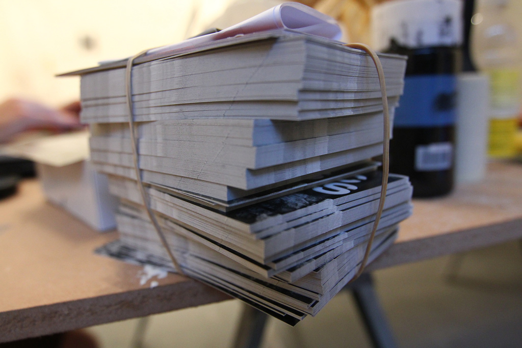
Stack of postcards!
")
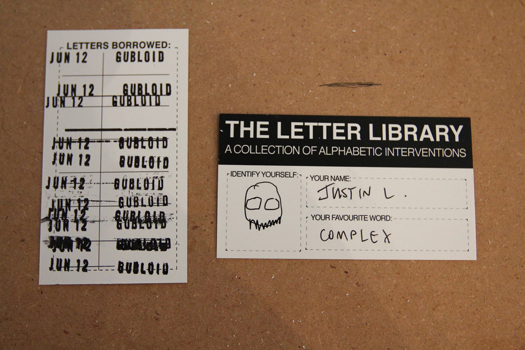
Oh, and our library cards for the Letter Library.
")
The back of the postcards, as you can see — lots to come!
")
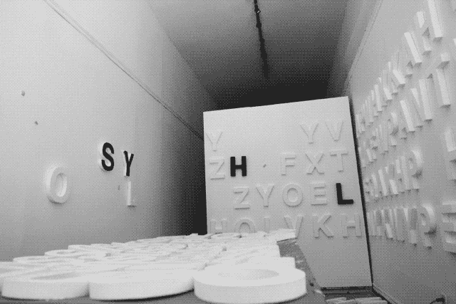
Kevin and Josh ventured out with a single-use camera to test what the temporary installations would look like, as we continue to prep for Thursday’s launch of the Letter Library here at CIVIC SPACE.
Also, film is fun.
")
The letters look great and the photos aren’t too bad either. They definitely have a colder tone to them, but it works!
")
This shot was excellent — love how visible this is from a distance.
")
Recycling containers = excite.
")
Strange undulations in the wall = excite.
")
Blank walls = excite.
")
The conversation these texts have with other tags, signs, etc. are really interesting.
")
The prints. 4×6. We’ll need others.
")
Hiba starts to arrange these test photos as we figure out how we’ll design the exhibition space.
")
Also, on the to-do list — pick up our postcards today!

Last night Hiba, Danielle and I met to do some more prep work on the letters for the Letter Library launch on June 21st. We painted another test letter E a different shade of grey and started to populate a wall with some more of the tests. It was excellent to see more than a few letters up at once to start to get a sense of the scale of the cluster.
")
Danielle tried her hand at cutting the letters for a little while, but we quickly shifted over to more tests, while also playing catch up and talking through some other projects we want to kick off later this summer.
")
We head out with a grey letter E and a two-tone S.
")
This was around 9pm or later … so we didn’t get a read of this shade of grey in the harsher sunlight. There’s something interesting about the grey — certainly it doesn’t pop like the white (or the black really for that matter), but it feels a bit more anchored.
")
We also put up a white letter Y. It’s no surprise it stands out the most, outside.
")
Danielle moves the letters around to other locations.
")
YES, more often.
")
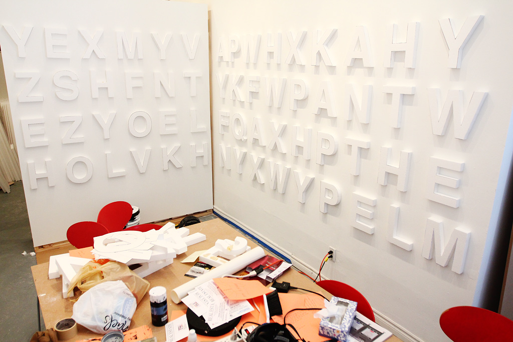
Hiba, Lucy, and I returned earlier this morning. Hiba installed some rows of white letters to get a better sense of how they’ll look on the walls.
")
We also figured it might make them easier to paint and not take up every square inch of walking space while we continue to prep.
")
Taping the letters.
")
Meanwhile, Lucy takes on the jig saw.
")
We’re going to play a lot with the lighting.
")
Letters temporarily installed on a couple of the walls. We’ll end up putting them a lot closer together on the final install.
")
We’re still planning to paint the faces white to remove the black lines left over from tracing.

The effects are interesting — about what I expected where they feel more a part of the wall than objects to take out and distribute. Of course, getting closer to the letters easily reveals that they’re styrofoam, but we’ll have to work out a really straight-forward set of instructions to carry out the project.
The plan going forward — finish cutting the letters today and Monday, start (and hopefully finish) painting Monday, start clean-up and install Tuesday, and do all the other prep by Thursday morning, giving us the better part of the day for contingency.

This afternoon at CIVIC SPACE started out with a video chat with Jason Sturgill from Portland about a really awesome project we’ll be collaborating with him on in the spring of next year.

There is also talk of Homework II happening this fall…stayed tuned for more info on this.

Also, our Akimbo ad was released today! Cool.

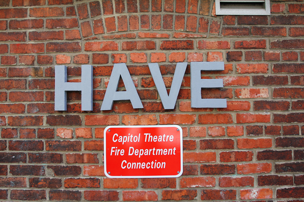
On the production side of things, we decided to do the final letter paint test for the Letter Library. While both white and black paint tests have had their pros and cons, we agreed on a final test of the colour grey to see if we can find a happy middle.

Word of the day today is: HAVE

Pre-paint.

Before coming to the space, Hiba went to Michaels to grab some grey paint. All the grey paint was sold out (weird), so we resorted to making our own by mixing our black and white paint remnants.

Painting…

Waiting…

After the letters dried, we hung them up in the space to see how they fit.

The grey definitely pops more than the white did in the space … and we do need to decide soon …

We took to the streets shortly after to take some install shots on different wall surfaces to compare with the white and black tests we did previously.

The grey has a nice pop, even on muted walls like this one.

While white had a really great pop on brick walls, the grey letters have a very interesting presence.

Almost looks like concrete on concrete!

The shadows cast on the grey letters give them more depth, while the black letters got lost in their own shadows.

The grey as the middle ground (in every sense) might win the day. It stands well on our white walls and looks interesting among the different textures of the buildings outside. Maybe we should sleep on it.
Remember, June 21st at 7pm, you’re invited to our Letter Library launch!

Great news! Drift v1.5 is available now on the App Store.
There are some really useful changes, including a better way to navigate from step to step in your Drift, some light tidying up upon registration, longer sessions to keep you logged in, and some fixes and adjustments to the photo upload process. All of that means that it’s easier to use and the documentation from your Drifts should look great!
The other major change is that Drift now requires iOS 5.1 or later.
And, if you haven’t already checked it out … if you mark your photos public, they’ll now appear in our sidebar with the instruction and a link to Google Maps with the location of where you took the photo, and of course credited to your name.
Drift helps you get lost in familiar places by guiding you on a walk using randomly assembled instructions. Each instruction will ask you to move in a specific direction and, using the compass, look for something normally hidden or unnoticed in our everyday experiences.
This project was generously supported by the Ontario Arts Council Media Arts Grant for Emerging Artists.


Wednesday afternoon shifts into further work on testing the efficacy of the styrofoam letters being black. We’re trying to decide in anticipation of our Letter Library (A Collection of Alphabetic Interventions).

Sara and Hiba painted.

HELLO.

Also, Kiki came by to help us paint the movable wall!

And, Josh made these for a workshop he’s giving through our friends at the Arts Council Windsor & Region.

The pile of cut-offs.

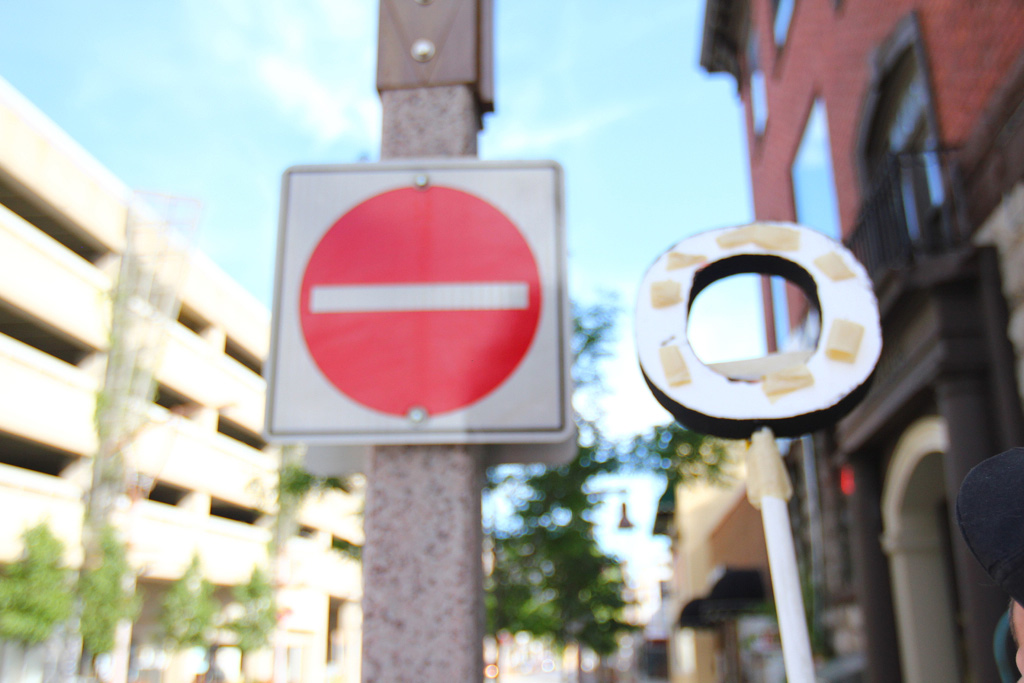
After the letters dried, I went outside and started to do some test installation. The black works well in the space, but outside, the shadows can destroy some of the legibility.

On lighter surfaces though, it works well.

Those shadows are difficult though.

From across the street.

On glass.

Inside, we discuss the possibility of keeping the letters white, but using a black background to help them stand out.

This could work, but would be a huge pain installing. This remains unresolved.

On to other ideas … we start wondering about creating a tool to assist with installing the letters in high places.

An old dental tool and some tape for the test.

It works fairly well…

But, it needs refining.

Some evidence of where the letters were punctured.

Gash.

So, Josh starts a redesign.

And Sara left notes about what to finish up on the postcard.

A detail of Josh’s latest design for our letter installation tool.

For a quick demo, a dust pan will suffice.

It will cradle the letter, but also act as a brace to help stick the letter to the wall.

Josh testing.

The scrap and push.

Looks promising.

It works!

Josh demonstrates the techinque.

Then, another revision…

It’s though that we need the option to have a smaller surface to work with letters that will not stand up on their own in the dust pan scenario.

Out the door…

…more tape.

A reaching test.

Adjusting the placement of the letter on the screw.

Attempt #2.

And it’s up!

The letter O.

Josh reviews the rig.

Then, loftier attempts.


And, in closing … some animated gifs from Hiba, Kevin, and Josh’s scrape dust-pan attempts.


Yes, it was a good day.

First decisions of the day to be made — whether to commit or not to painting the letters black or white. Somehow this has been one of the longest ongoing discussions we’ve had for a while. The next step though is to paint and test in the wild.

The letters from the table view.

Notes from a meeting with the wonderful Kika Thorne. She’s coming back to Windsor in September for a project with the AGW.

Our first piece of mail showed up today from our friends at Hamilton Artist Inc.

Also, breakfast of champions with Kika — Ms. Vickie’s Sea Salt and Malt Vinegar with coffee from Milk.
And, in between, a meeting with the City of Windsor and the Arts Council Windsor & Region — good things ahead.