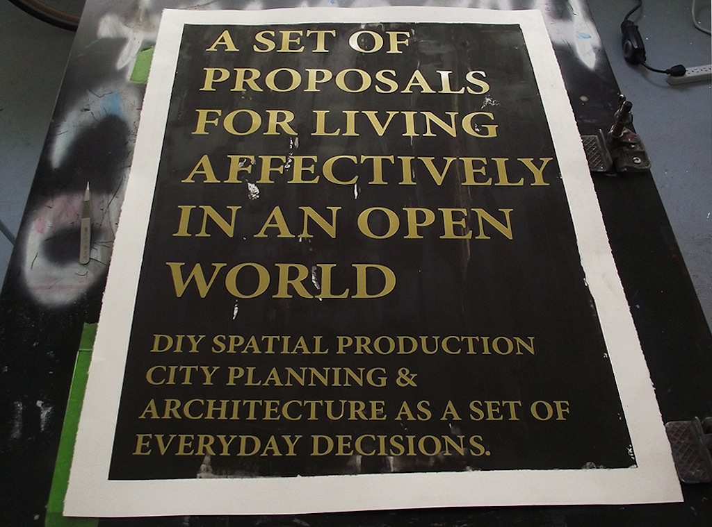
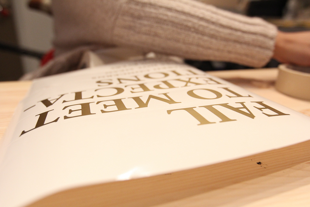
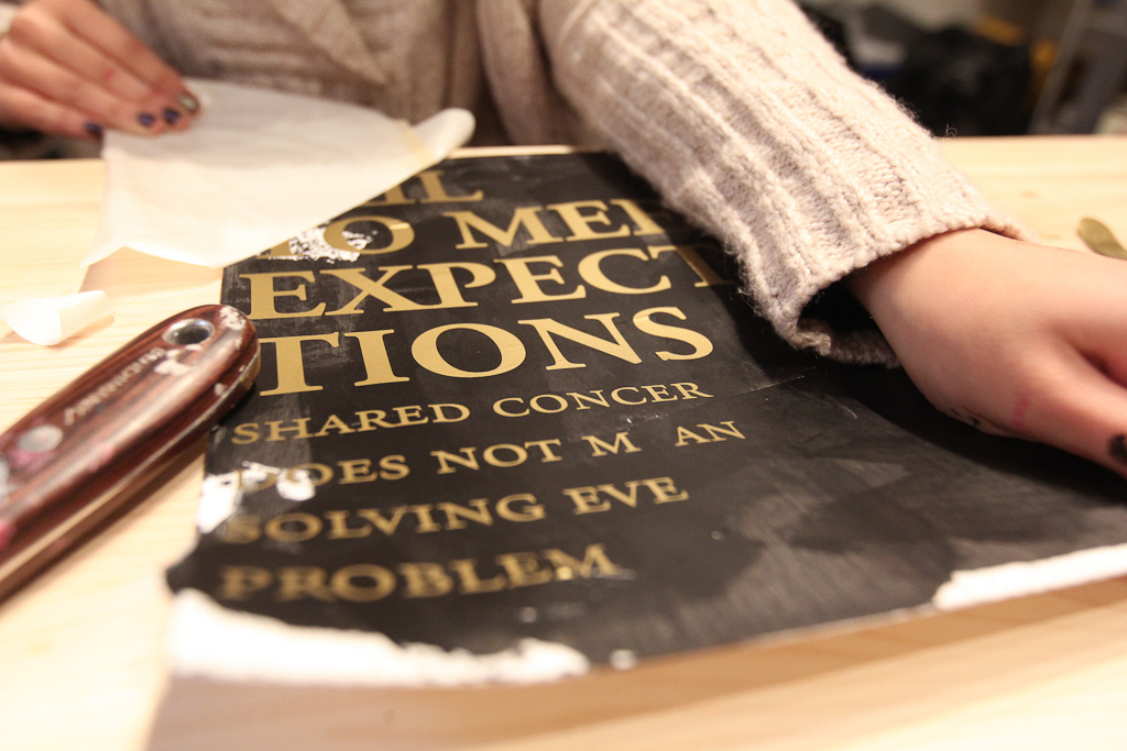
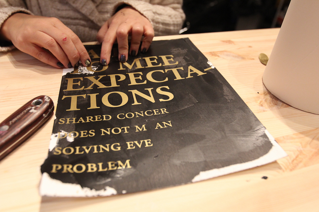
Today we’re working through a few poster designs for A Set of Proposals for Living Affectively in an Open World using gold vinyl on a previously hand-painted black background.

Today we’re working through a few poster designs for A Set of Proposals for Living Affectively in an Open World using gold vinyl on a previously hand-painted black background.
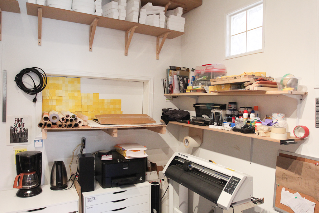
A look at our little corner of Civic Space. This is where we’ve been spending the majority of our time lately. For the record, the high shelves (those really nice ones with the Letter Library letters on them) were installed by Kiki. The lower shelves were hacked together by me. They’re very shoddy, but they hold many things.
As we’ve been hosting our 1W3KND Residencies, I love coming in on Monday and seeing the little re-arrangements made. Last weekend (I think) the coffee maker and tea kettle got a new home.
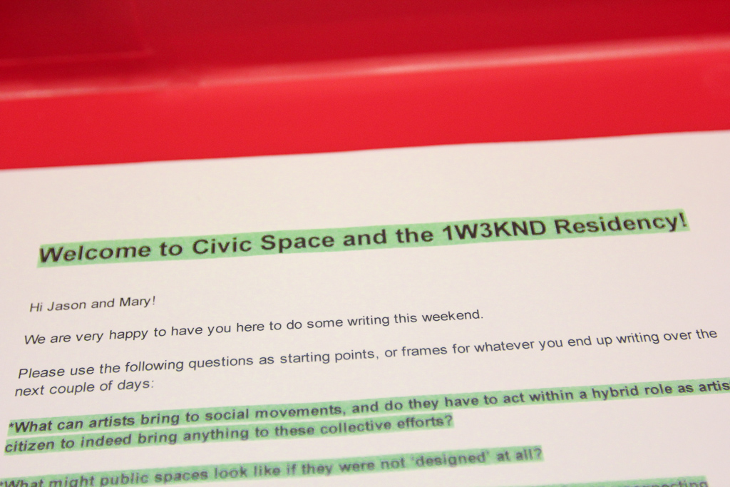
Hiba was away, so I got together the little instruction set for the writers in residence and put it back in the big red 1W3KND case.
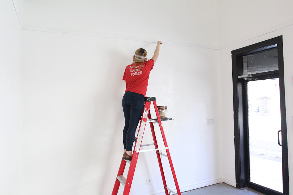
Meanwhile, Laura took on the task of repainting the walls. After two great exhibitions from Catie Newell’s class and the Green Corridor, the walls were in need of some repairs and touch ups.
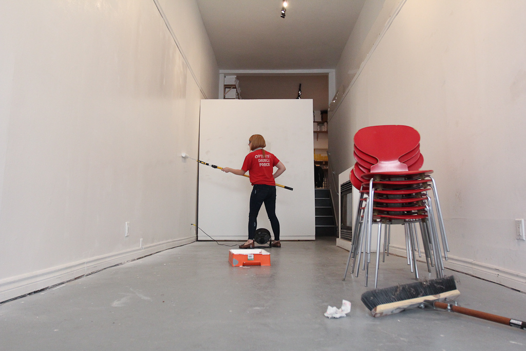
One can of paint got us about 80% through. One wall left, will have to pick this up on Monday.
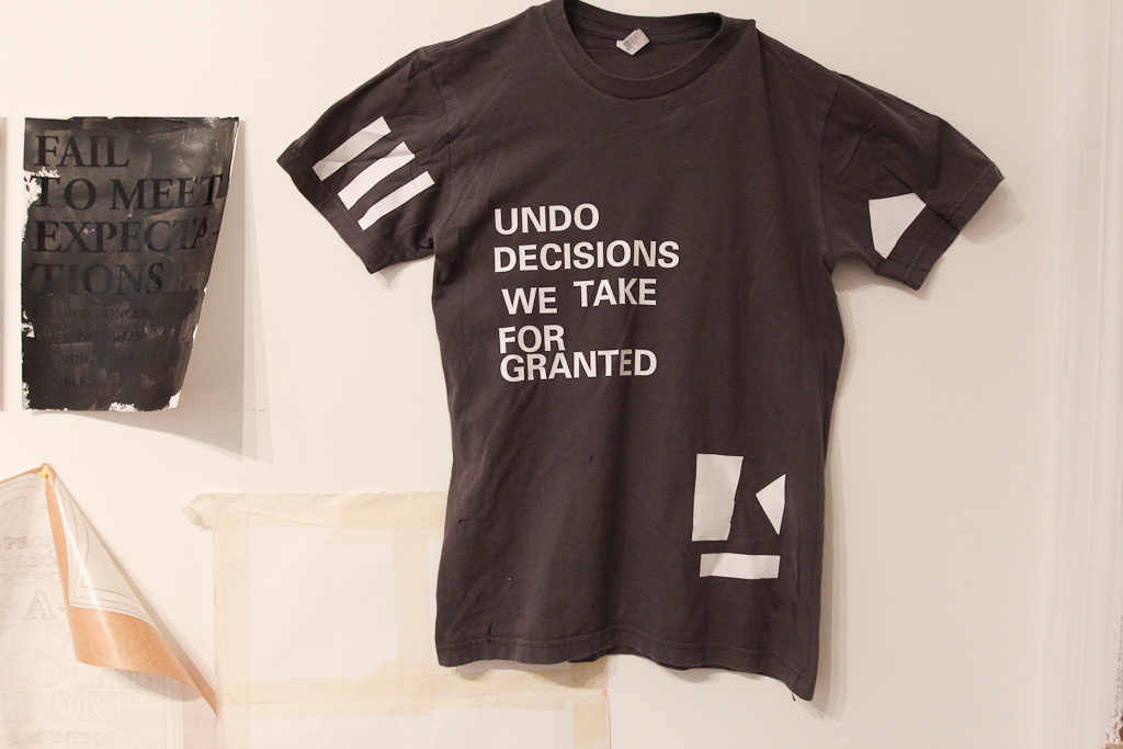
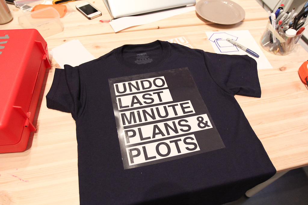
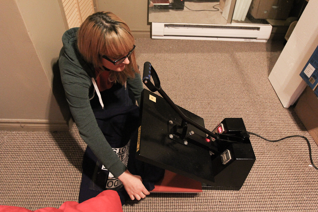
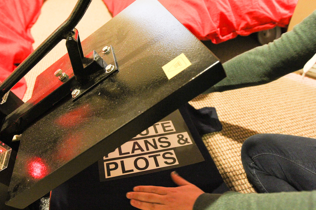
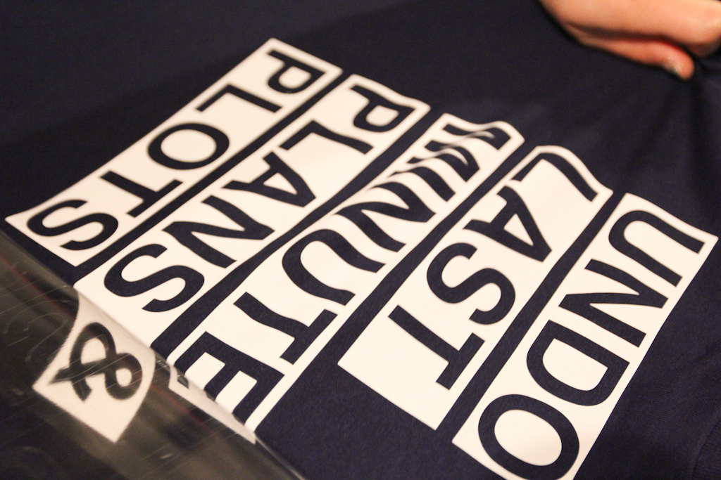
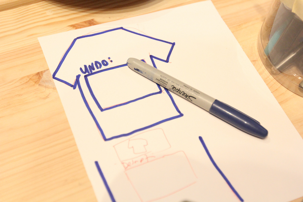
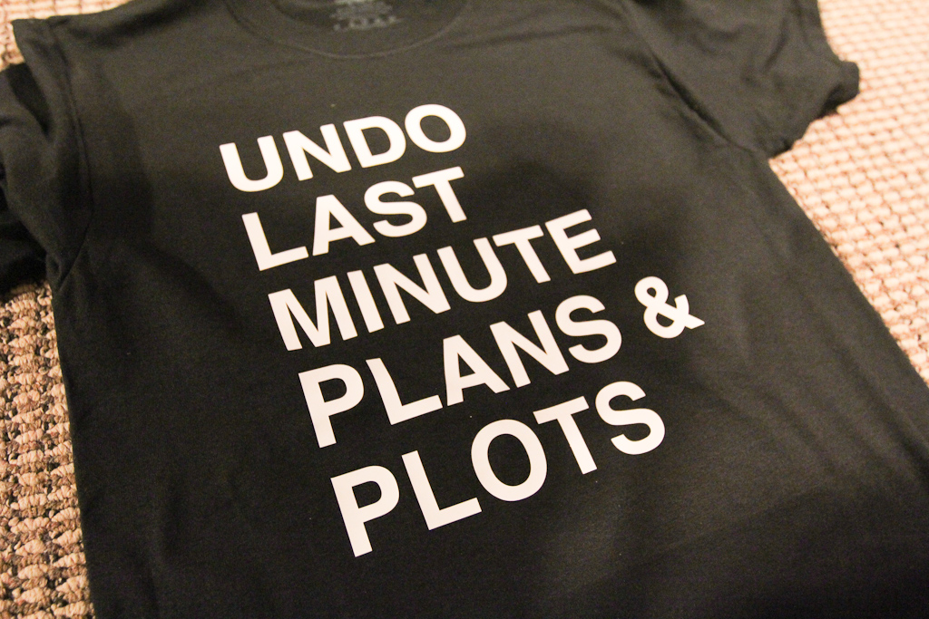
After painting, we spent the afternoon doing some more tests for this t-shirt project. The mangled shirt above features a number of test-sites of vinyl with various temperatures and times on the heat press.
But, before we could do more tests, we had to go back to the drawing board and get a better sense of the size of the potential texts.
We also played with a highlighter look instead of just straight text.
Our new weeding tools makes the vinyl cut process a lot faster.
Remember, cut in reverse for t-shirt vinyl!
Laura weeds.

Then, we place the design…
… and head to the press.
Laura is the master of this machine. I actually don’t even know how to make it do anything aside from plugging it in.
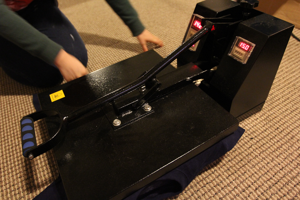
Laura picked up with the same time / temperature settings that we left off with before.
The vinyl seemed to go on no problem, but I think the temperature was still a bit hot, as it left a faint mark where the press hit the shirt.
We also played around with some ideas for the online forms that we’ll eventually make for this project.
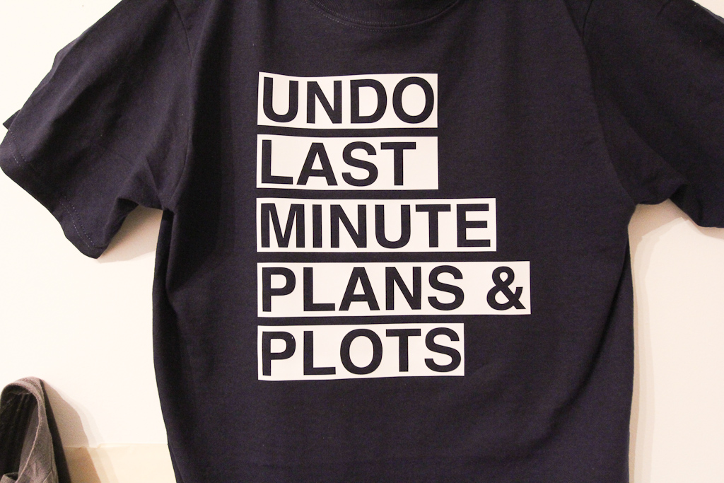
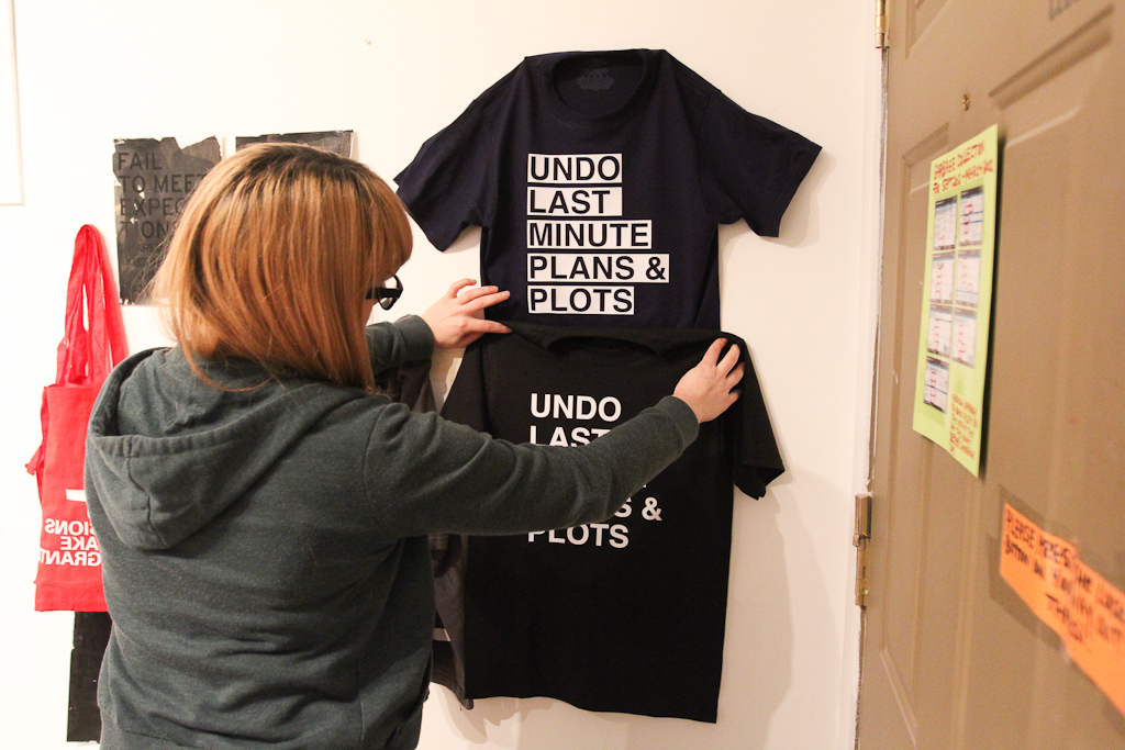
Above, the blue shirt on the wall.
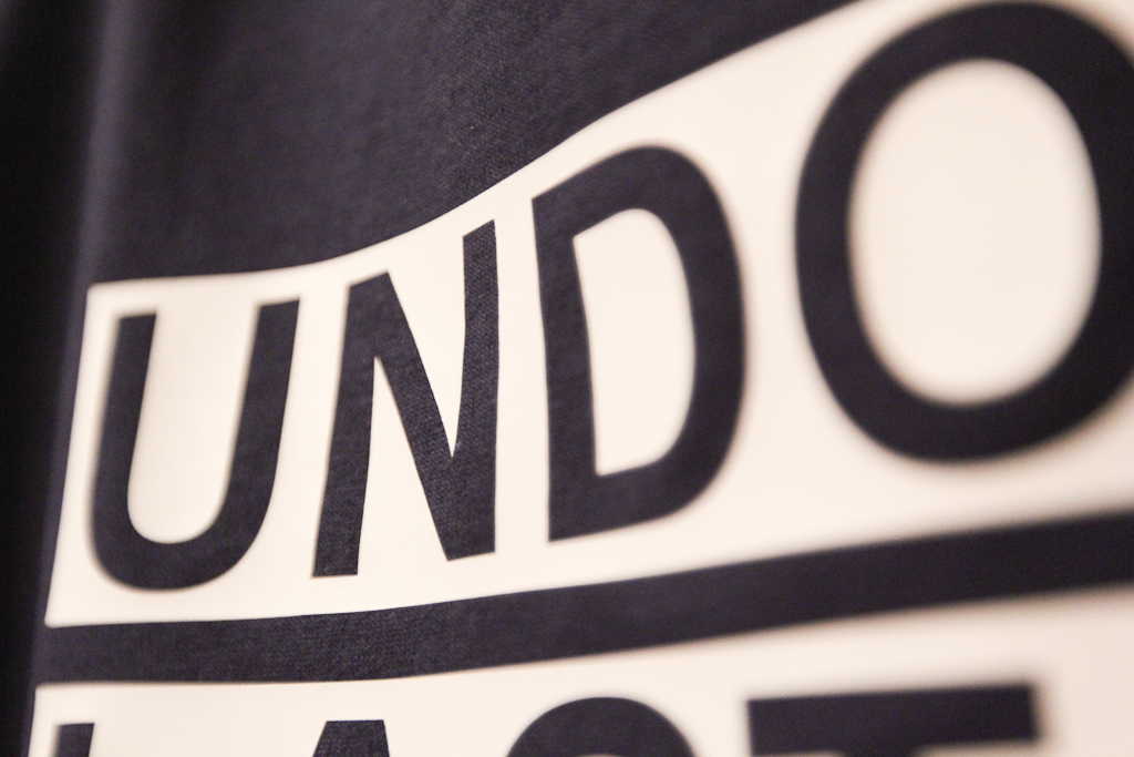
Detail of the vinyl.
For the sake of true comparison, we also cut the same text in standard Helvetica bold. We also set the temperature a bit lower in hopes of avoiding the marks from the press.
We’re pretty sure this looks better. I think we had discussed grey shirts before, we’ll see…
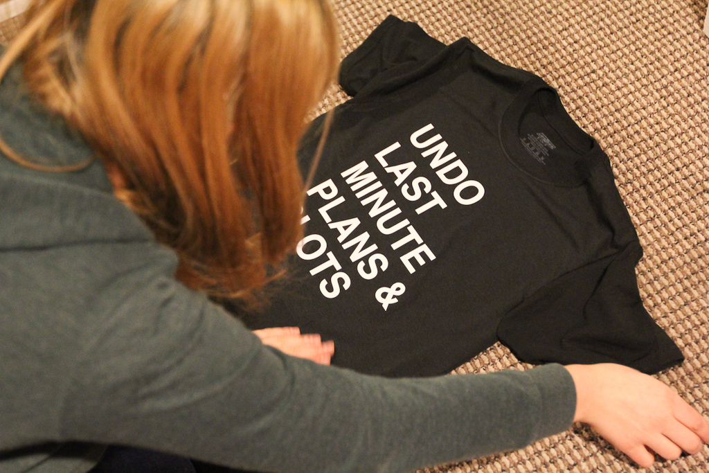
We ended the day doing some more comparisons. I’m going to wash the shirts and make sure that the temperature / time changes don’t effect the vinyl adhesion. More soon.
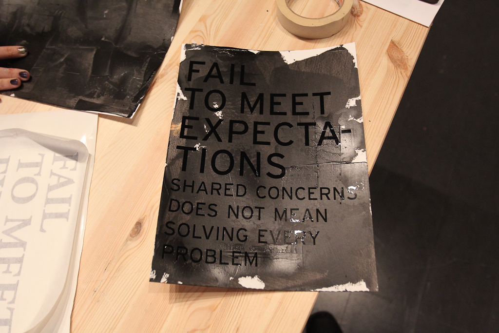
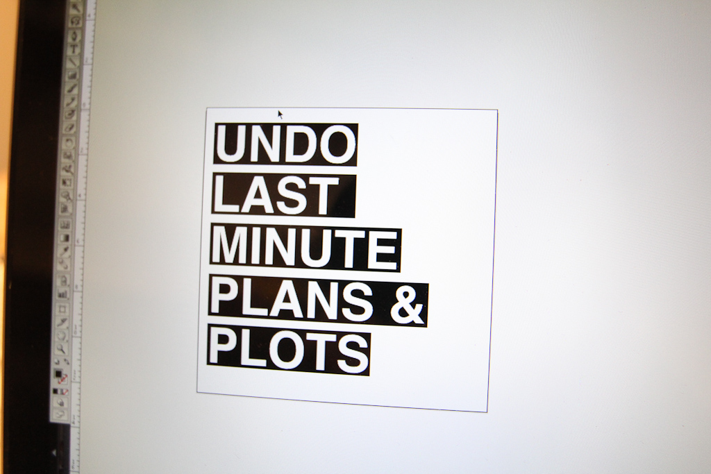
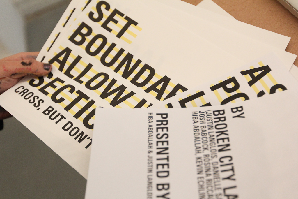
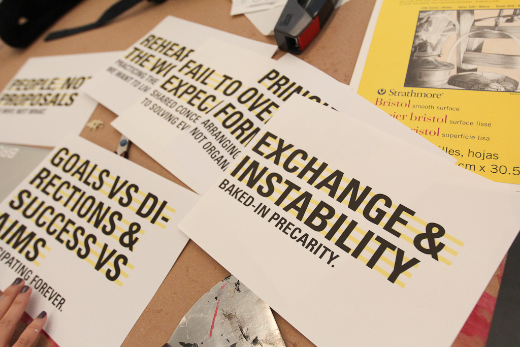
We’ve been talking about picking up on some of the ideas we put together for the OPEN panel discussion from earlier in the month, and it seemed like posters were a natural fit. Given the text statements that we made to address the an idea of economies and creative practice that served as the backdrop for our talk (rather than the normal set of images), we wanted to find a place for them beyond that PDF file.
So, Monday seemed like a great day to start playing. We’ve been doing so much paper work lately, this is long overdue.
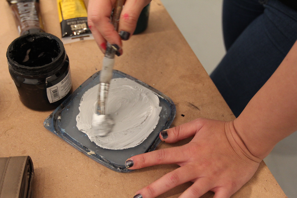
Hiba mixed some colours and started make some base colours.
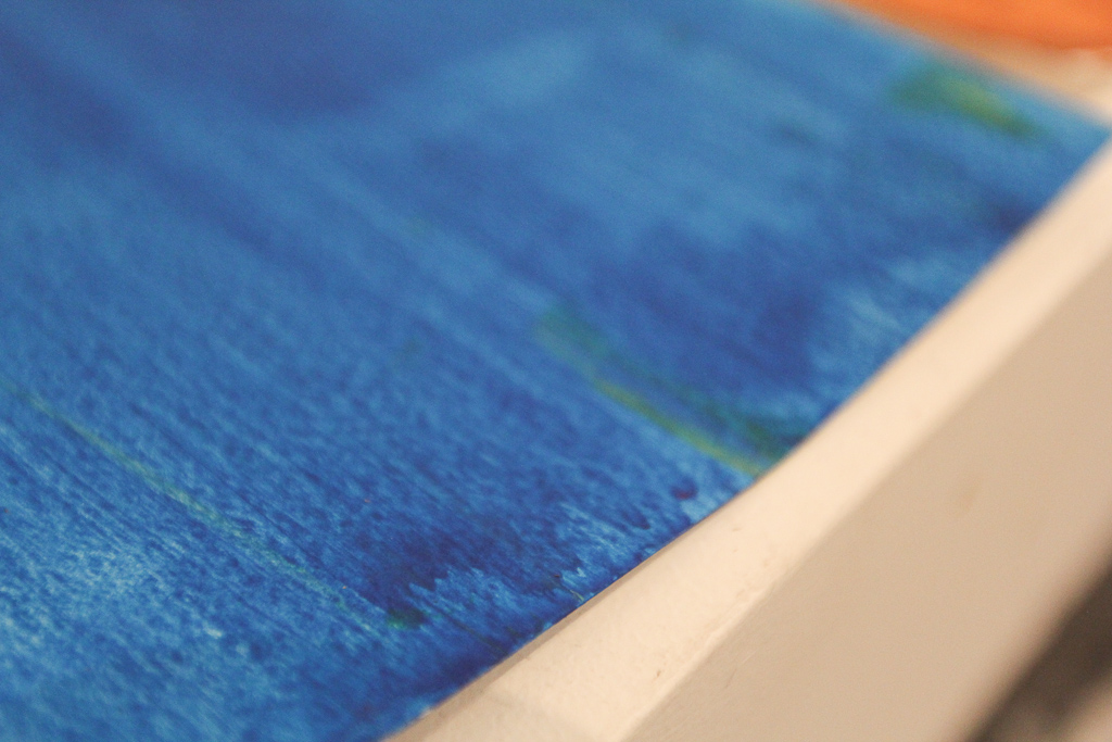
We decided from the start to cut some vinyl (rather than screen printing or stenciling at this point), so we experimented with some colour.
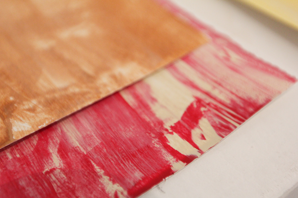
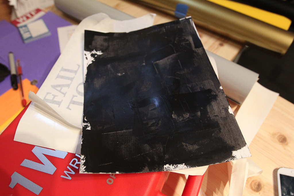
But, it wasn’t long before the black stood out. Hiba was using a metal scraper to spread the acrylic paint on these smaller 9×12 sheets. We want to make these larger posters soon.
Also, decided to play with some other vinyl … haven’t pulled out that gold for a while.
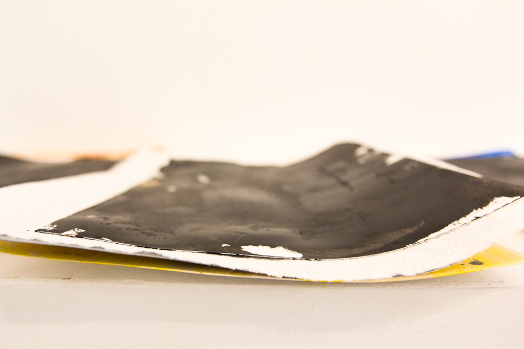
Detail of texture of the paint.
We printed out those slides and started sorting through.
We decided to go with just one, as we were planning to cut a couple different fonts and colours and wanted to be able to compare the results.
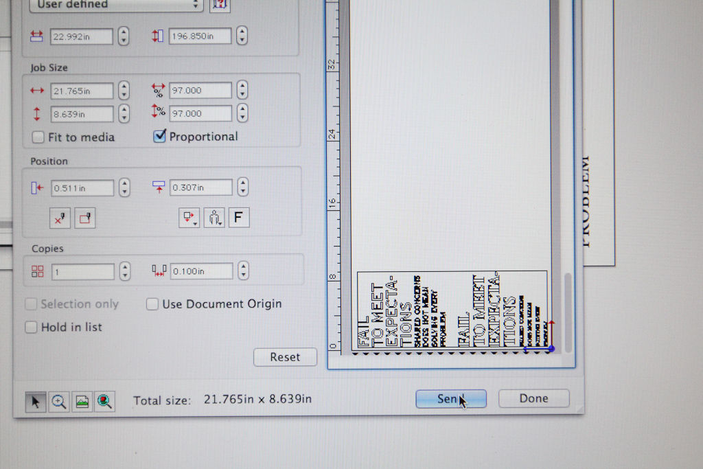
Good ol’ Cutting Master.
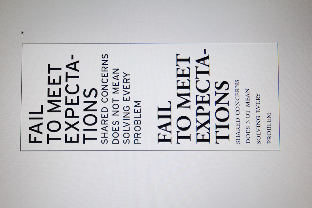
We went with Interstate and Garamond — all caps and small caps.
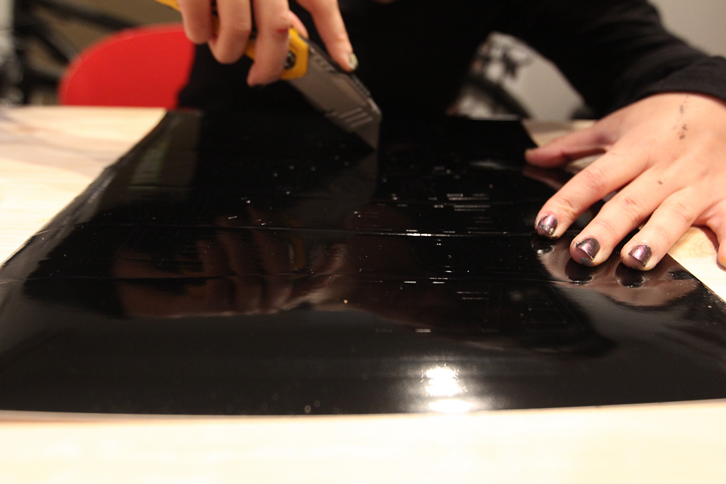
Hiba weeds the first cut of shiny black.
Interstate looked promising at first.
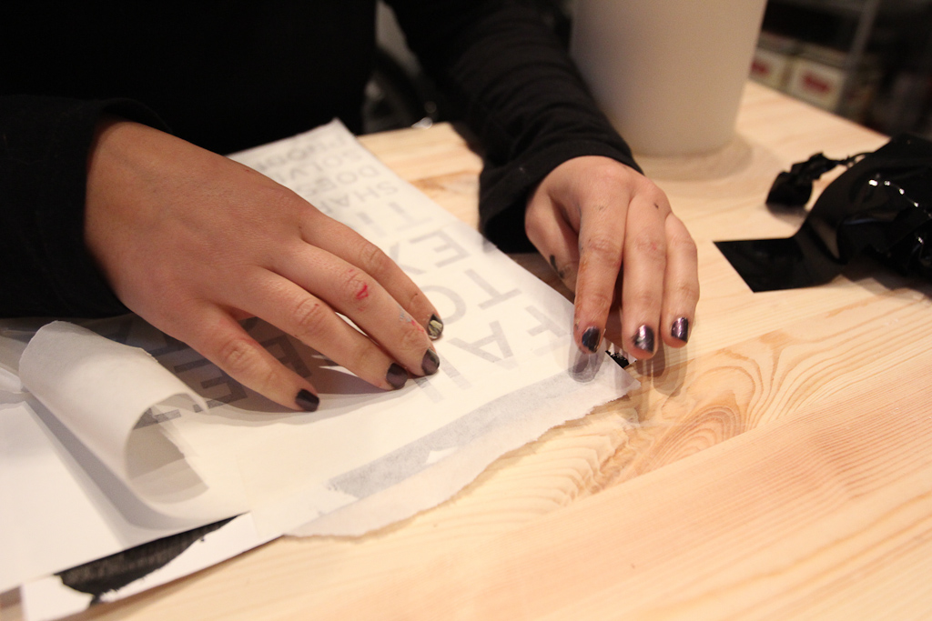
Hiba applying the vinyl to the paper.
The paint dried, but was just a bit tacky, which helped get the vinyl to stick.
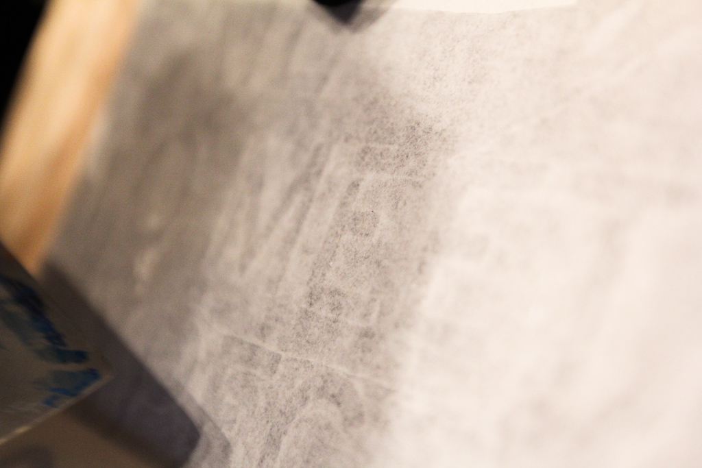
Detail, applying the vinyl, you can see the text through the masking.
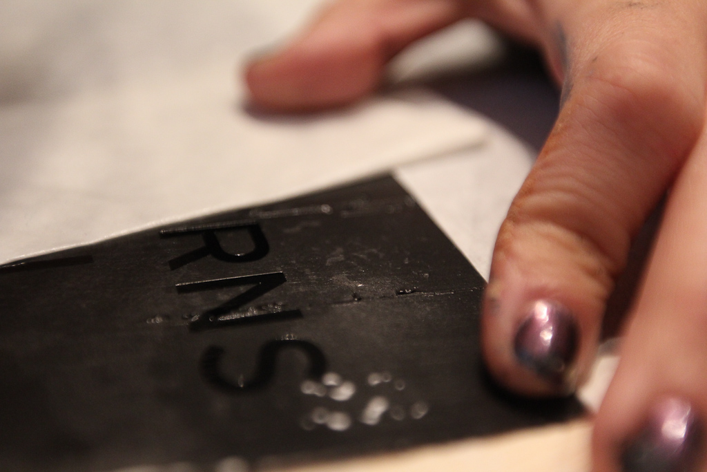
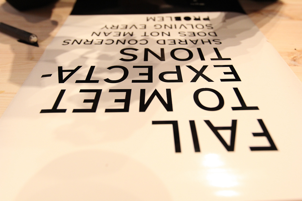
Pulling it up, the gloss black looks deep.

Nice and clear, but didn’t stand up to the serif font.
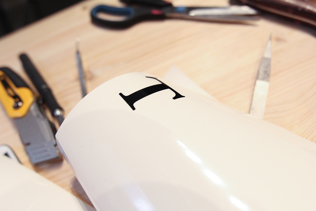
T.
Side by side, we’re pretty convinced with the Garamond on the right.
Less surface area of the font face makes it a little less visible though.
Garamond.
Interstate.
Then gold, just to get some contrast into the test.
The gold is a cheaper vinyl, but a lot easier to weed.
Fixing it up, as it didn’t stick to the paint as well.
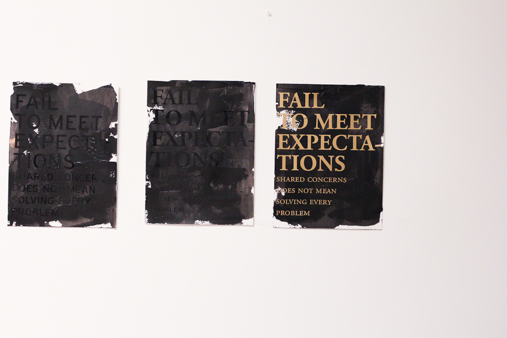
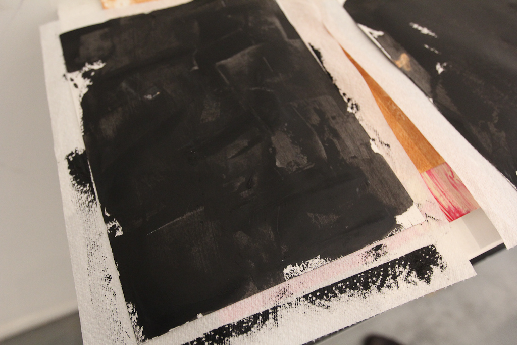
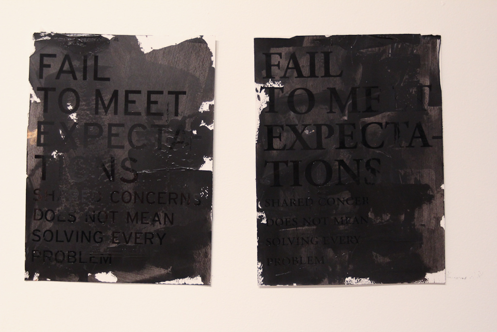
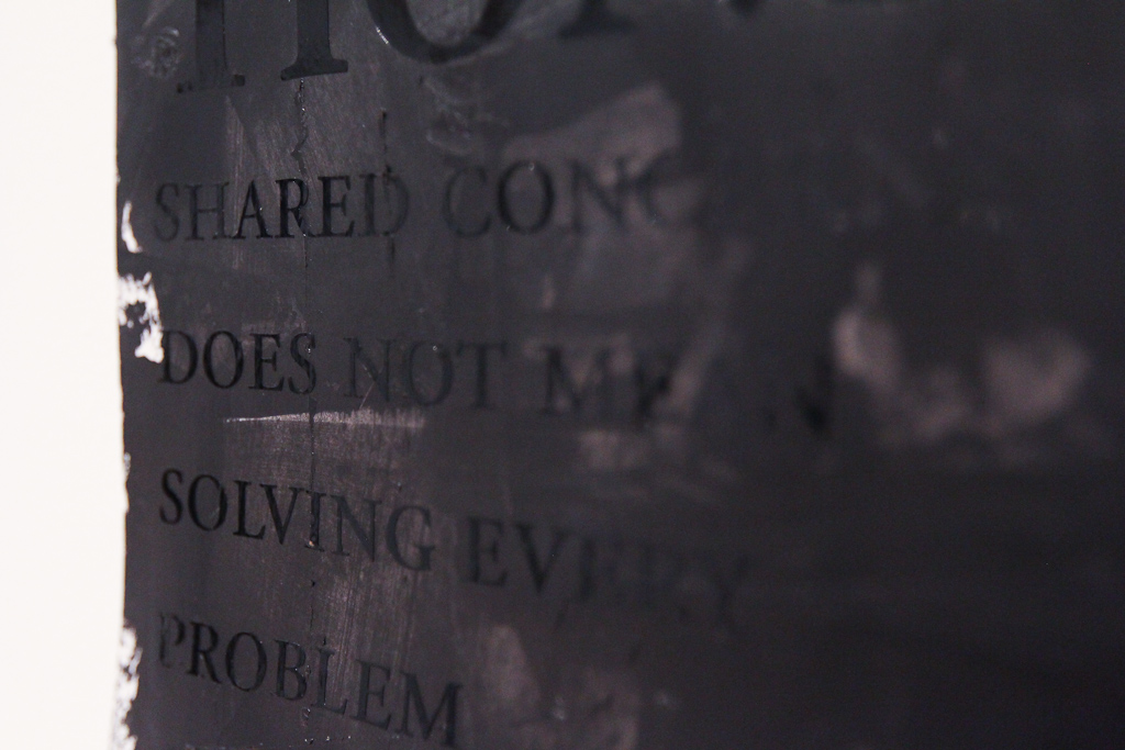
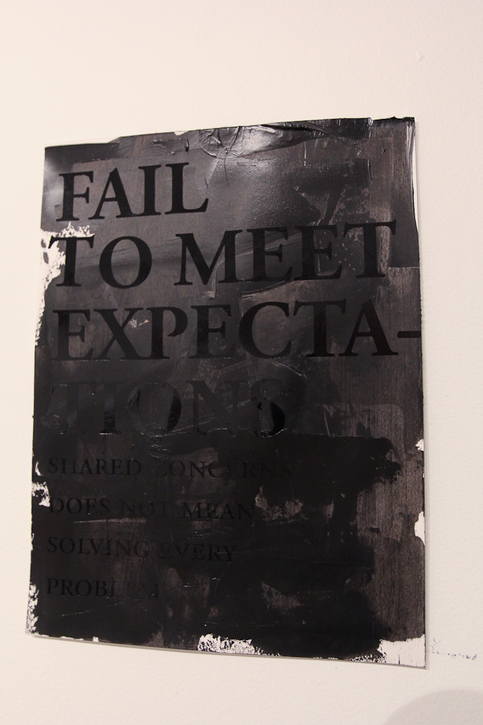
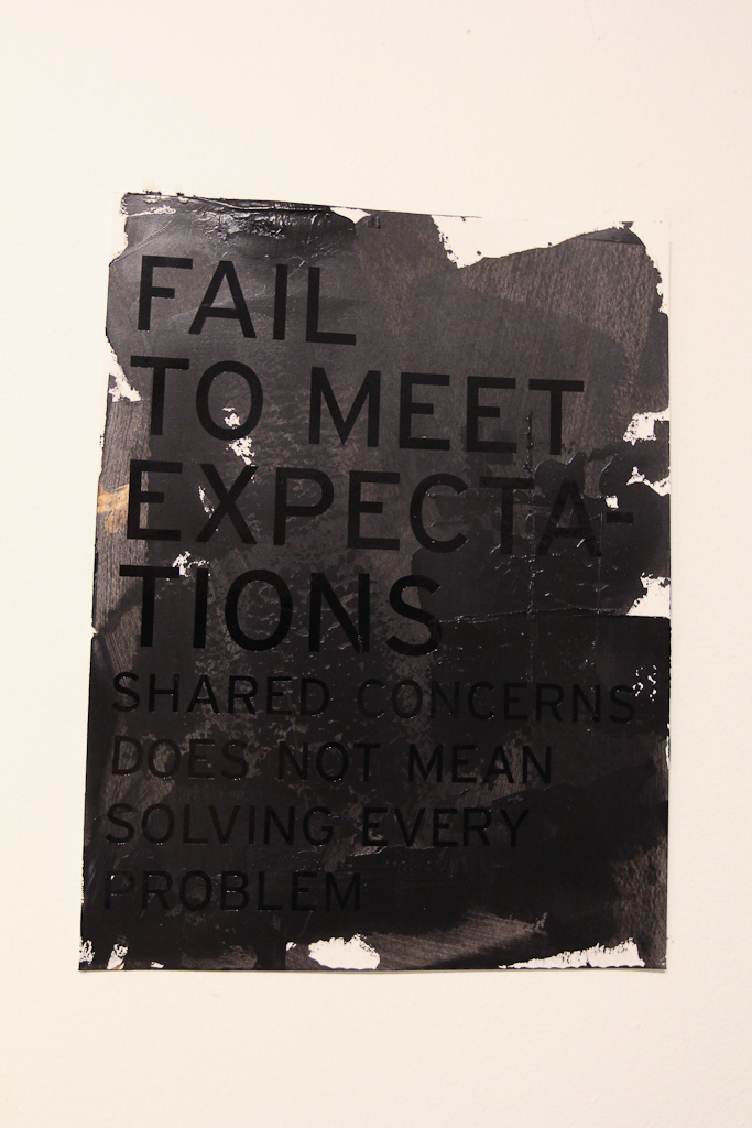
Side by side, the gold is most legible, but looks too much like a poster. Not sure what to do with the black on black yet. Thursday will be more time to play. Maybe we can get some larger paper by then … lots more to experiment with, but even looking at these photos now, I’m still pretty convinced of the black gloss serif. Maybe more play time with the texture of the paint.

I came back later on in the evening and saw the rest of the work Hiba did with matte black before she left for the day.

Definitely harder to read, but the thicker black paint and the matte vinyl really work up on the wall. Experiments on Thursday.
More soon.
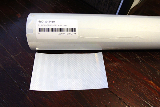

Earlier this week we received a couple of samples of various retroreflective materials for use on our letters for CAFKA.
One material, the one on the roll, is a vinyl (3M Scotchlite Reflective White Vinyl), perhaps most famously used in the Bright Bike project, while the other is an industrial substrate (3M Engineer Grade White Prismatic Sheeting) used on municipal road safety signs.
I’ve been doing a variety of tests with a flash, the one above where it appears that the Scotchlite vinyl is brighter was taken with my DSLR with the body flash, but the lens I have on there blocks the flash in the lower part of the frame. Tests with photos from my iPhone seem to favour the Prismatic Sheeting.

We’re still examining the costs of each and we still need to do some more rigourous tests, but it’s amazingly helpful to be able to see these side by side (thanks Sarah!) The vinyl has an estimated 7-year service life, the prismatic sheeting is about 10-years. Not sure on the cost difference yet.
Thursday is catch-up night, so there should be lots to talk about. I know Hiba and Karlyn were working on a budget and I think a whole bunch of the crew met up on Monday to do some work. We’ll have to plan some really well-thought-out tests for these materials, in the outdoors, etc., to see how they fare in the weather. I put up a spec-sheet for both materials to our Dropbox. Anxious to figure out the best plan forward!

Another Friday night open house gave the SRSI participants a great opportunity to show projections and engage in discussions about their experiences and feelings about working in Windsor.
Continue reading “SRSI, Day 15: Evening Projections & Conversations”

Official Day 1 of SRSI kicked off, lots of new folks starting their projects, vinyl is up, rooms are painted (and almost done), floors are clean, the storefronts are open!!! Come see us.
Continue reading “SRSI, Official Day 1: Welcome Julie, Eric, Daragh, Andrea, Julie and Jefferson”