AMPHIBIOUS ARCHITECTURE

amphibious2

A project by xClinic Environmental Health Clinic at NYU and the Living Architecture Lab at Columbia Graduate School of Architecture, Planning and Preservation, AMPHIBIOUS ARCHITECTURE attempts to generate a new dialogue between the environment and us.

The description, quoted from the site, since it’s more clear than my attempt at synthesizing the information would be:

“Installed at two sites along the East and the Bronx Rivers in New York, the project is a network of floating interactive buoys housing a range of sensors below water and an array of LEDs above water. The sensors monitor water quality, the presence of fish, and human interest in the river’s ecosystem, while the lights respond to the sensors, creating feedback loops between humans, fish in their shared environment.

Additionally an SMS interface allows homo-citizens to text-message the fish and receive real-time information about the river, contributing towards the collective display of human interest in the aquatic environment. The aim of which is to simultaneously spark a larger public interest and dialogue about our local waterways.”

amphibious1

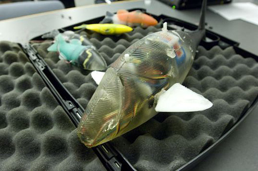
These are the sensors lit up before being installed in the river. To see some video of the sensors actually installed and floating, you’ll have to check out the site’s landing page.

eastriver

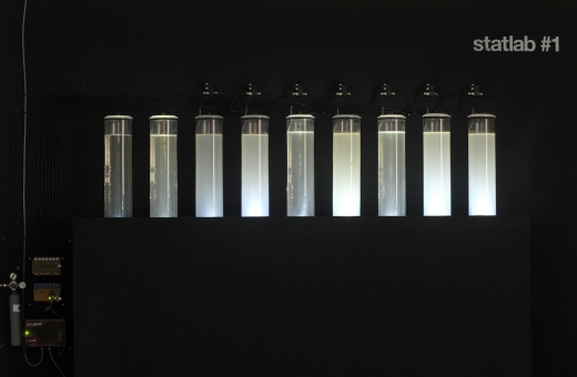
This is an image of some of the sensors lit up, being activated by passing fish, water conditions, and text messages. It’s an amazing cool project, especially given our proximity and recent interest in imagining some kind of Detroit River based project.

Billie McLaughlin’s Untitled

Huron Church

Installed alongside Huron Church Road, this large sculpture was made by Billie McLaughlin for Rod Strickland’s Advanced Sculpture class. The project requirements involved sourcing all the material for the work from existing sources (a zero-footprint sculpture). The 9 ft tall wooden gas mask was made from 100% reused wood, salvaged from the garbage of our community.

In The Air

In the Air - a data visualization project initiated at MediaLab in Madrid

In The Air is a data visualization project initiated at MediaLab-Prado in Madrid. The project has taken a large dataset consisting of a year’s worth of air quality readings from Madrid and is beginning to realize a number of ways to make visible the invisible agents of the city’s air (gases, particles, pollen, etc). In The Air is using both web interfaces and physical prototypes for representing the data, and while the web component looks very slick, I’m considerably more interested in the physical parts.

I’m not sure how well the images read above, but those are some examples of their process as they work their way through Arduino-controlled contraptions that will spray out different colours of mist depending on the air quality data. There’s a video of one of their failed attempts on Serial Cosign, which is where I originally saw the project.

Seeing people do stuff is inspiring.

Statlab by Tjerk Stoop

Statlab by Tjerk Stoop

Statlab by Tjerk Stoop is an environmental art project, creating an analog visualization of air quality. From Stoop’s website, “It displays the daily average of CO2 concentration trough a chemical reaction where chalk particles are formed. The result is an analogue graph where the difference in the amount of chalk particles per tank is a global measure for the fluctuating CO2 concentration within one week.” Great to see physical/analog visualization presenting important data in a clear manner (well, assuming you read the accompanying text).

[via]