We’re Featured in Artcite’s 30th Anniversary Exhibition, Opening Tomorrow Night at 7:30

1

“30X30 – Artcite 30th ANNIVERSARY SHOW pt. 2”

An Invitational Group Show featuring Works by Emerging Artists Nominated by Artcite Alumni and Members

Opening Reception – Friday, September 13, 7:30 PM at Artcite (109 University Ave. W, Windsor)

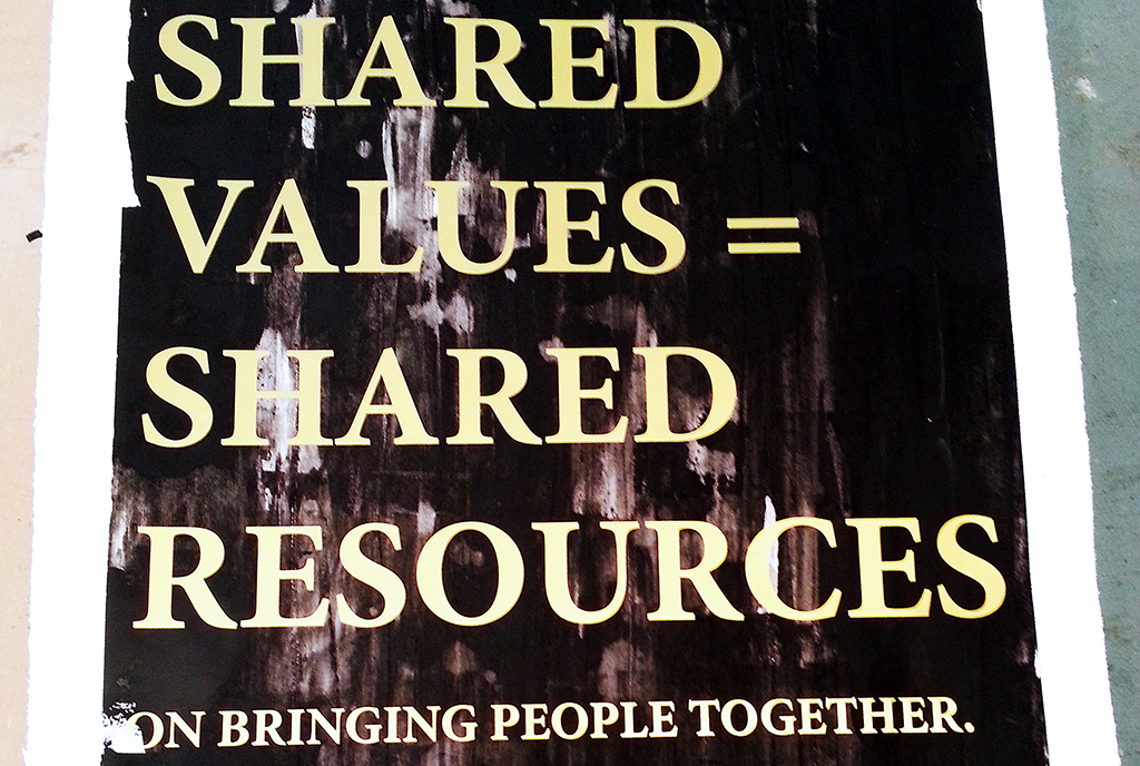
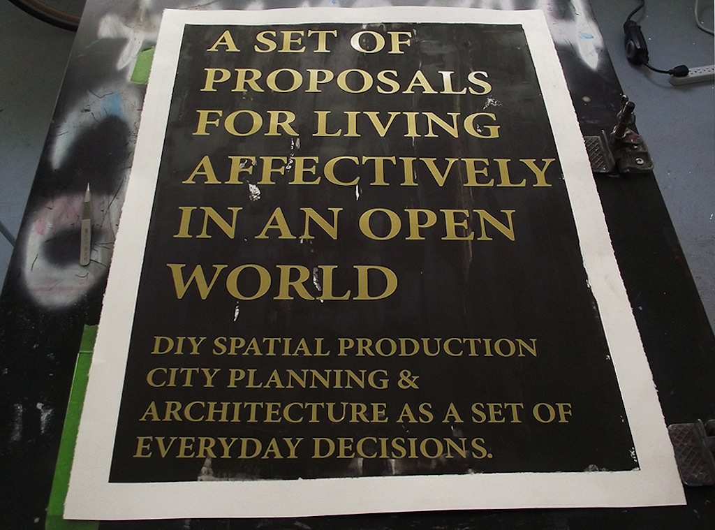
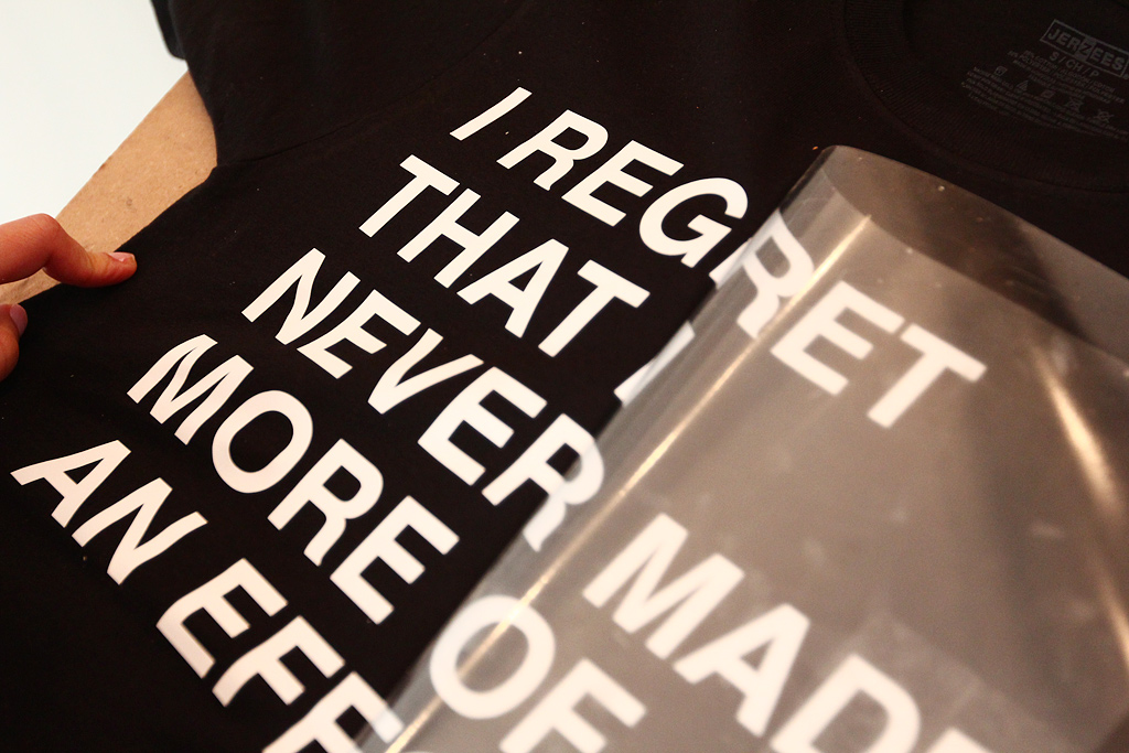
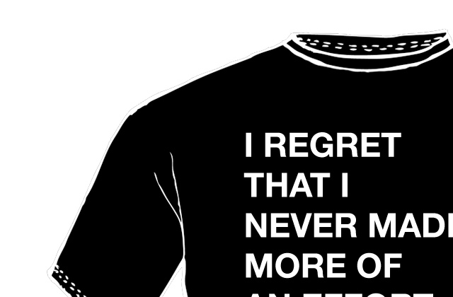
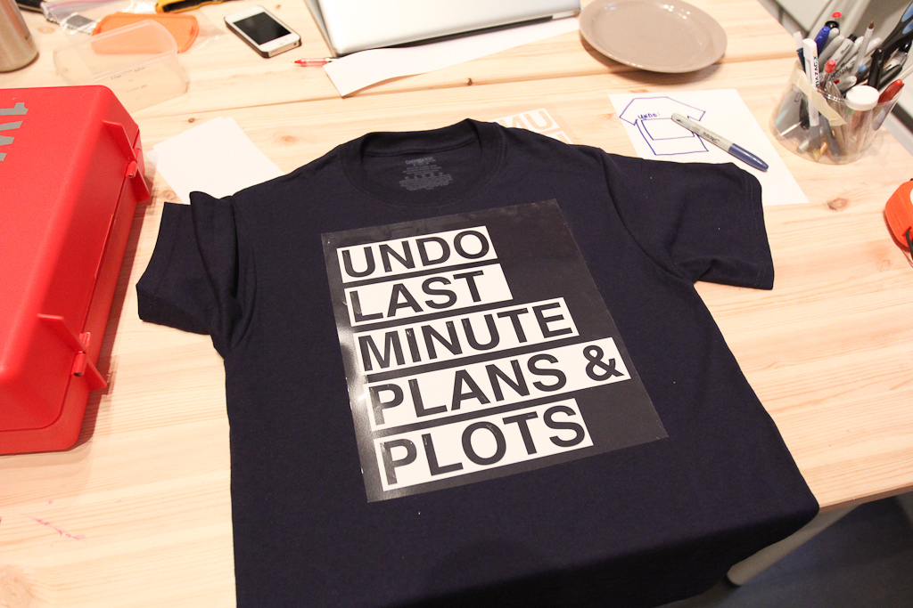
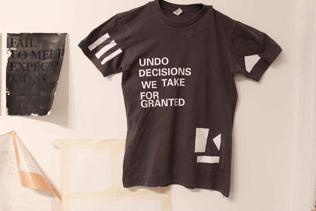
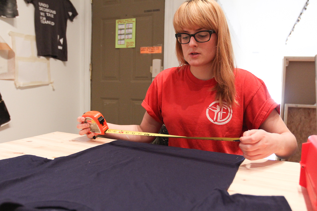
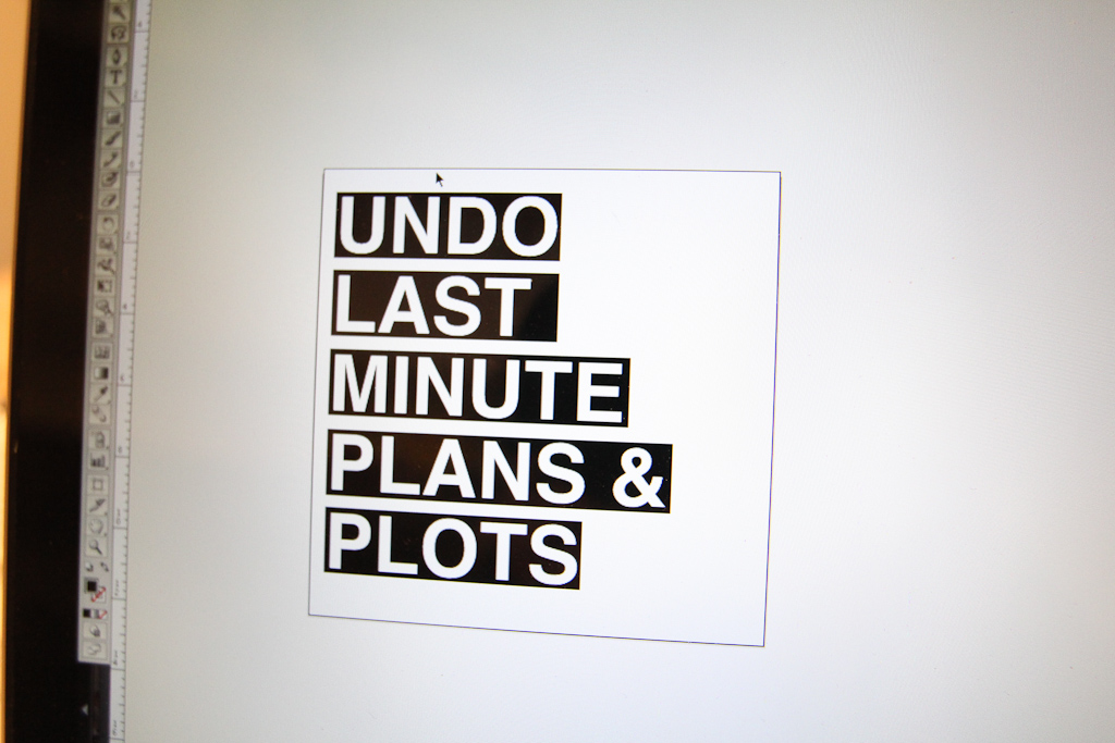
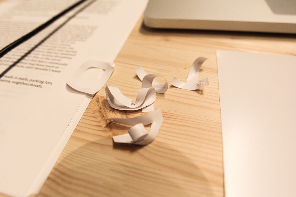
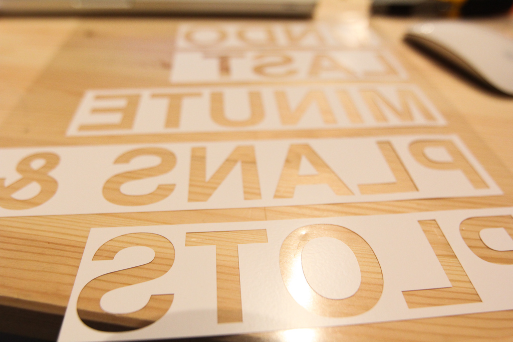
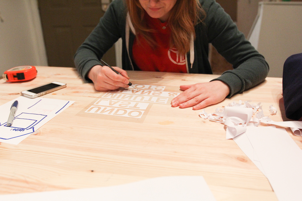
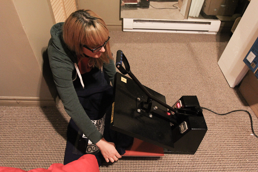
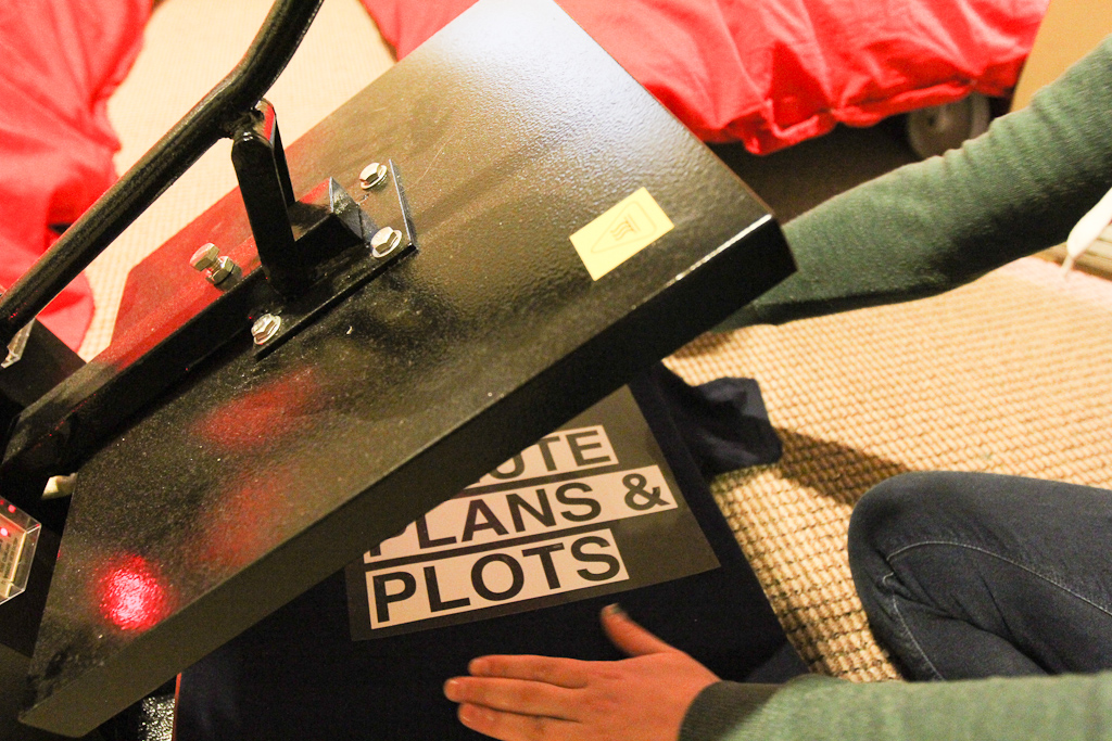
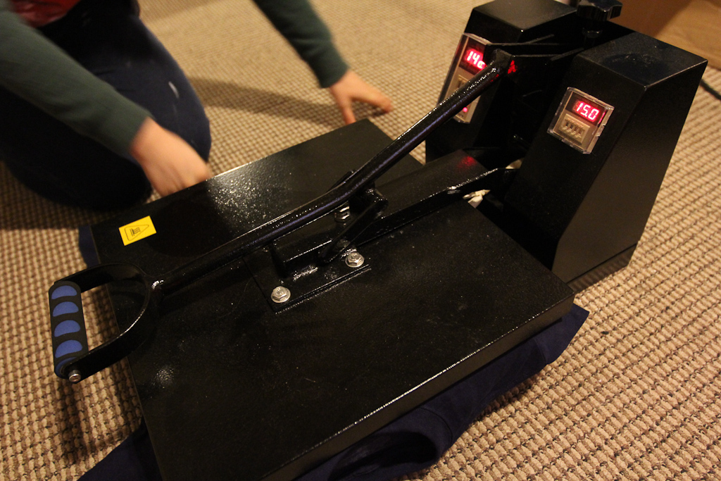
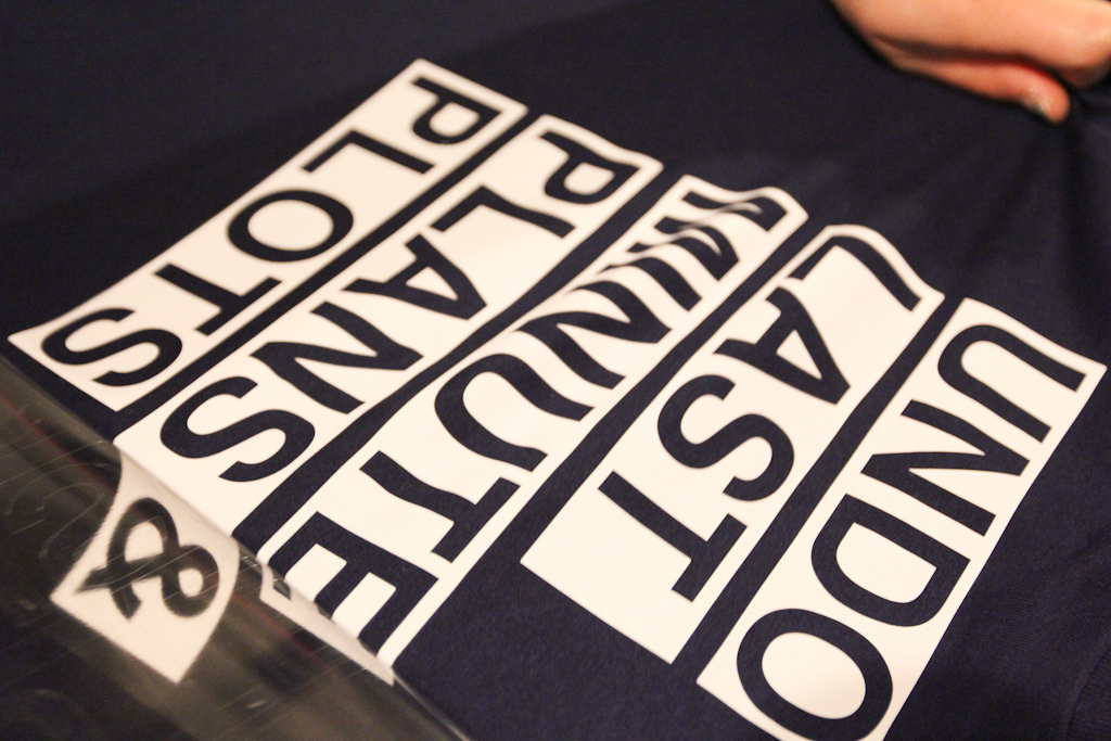
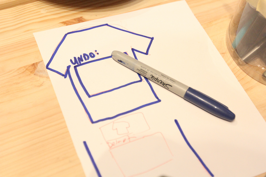
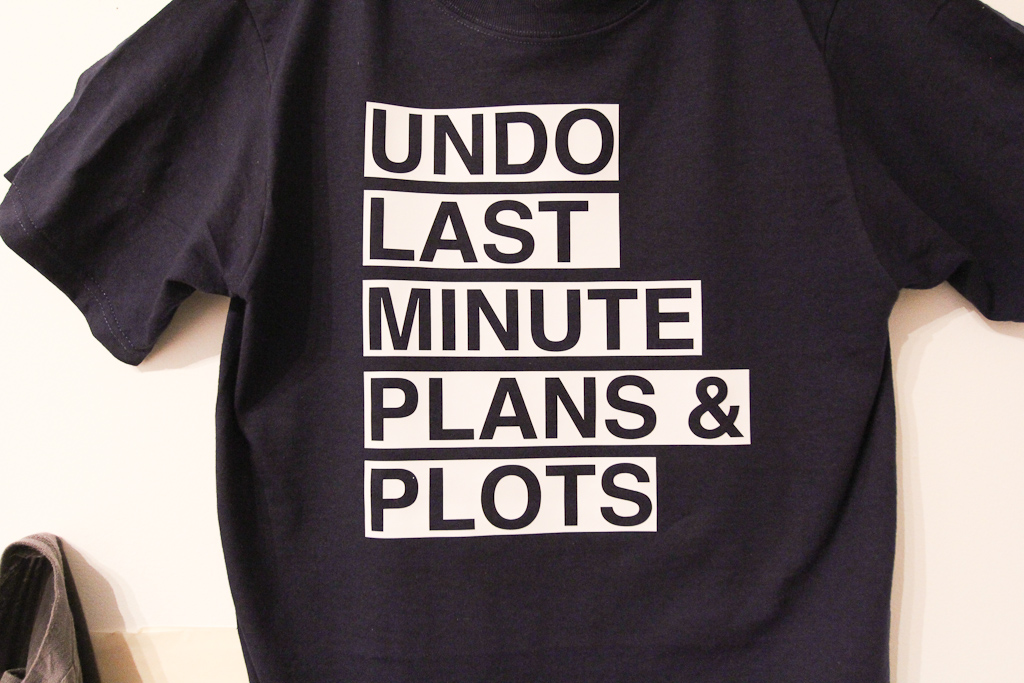
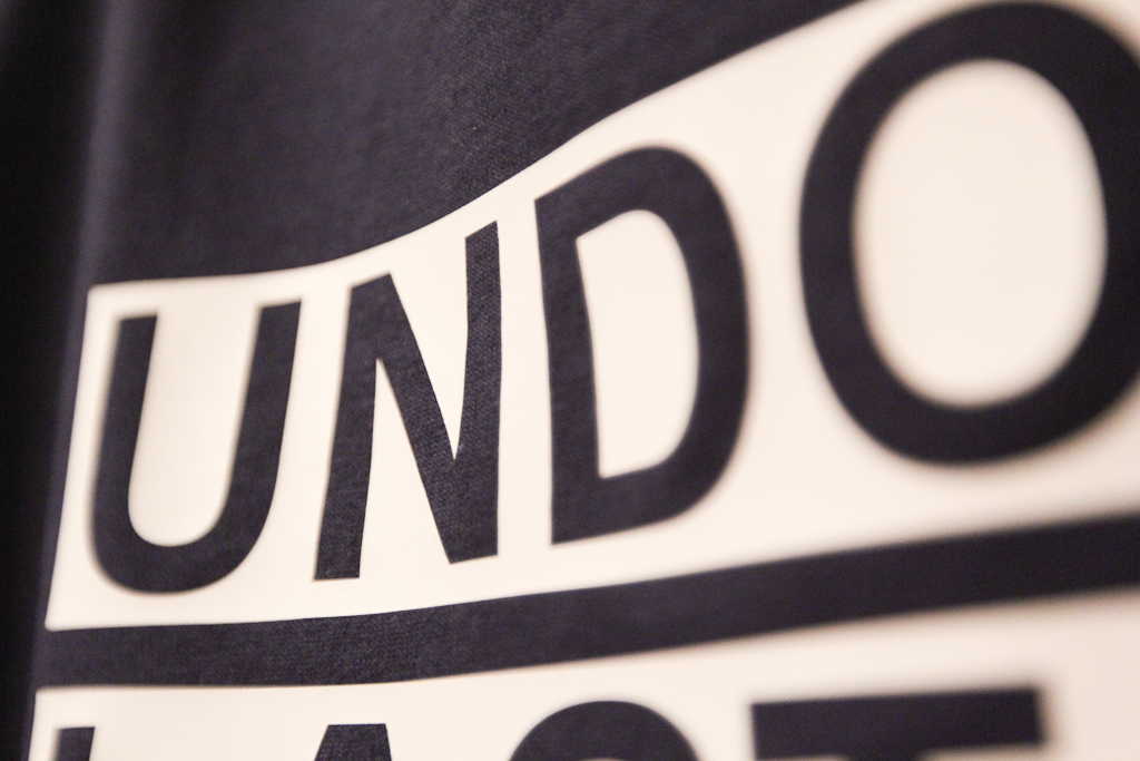
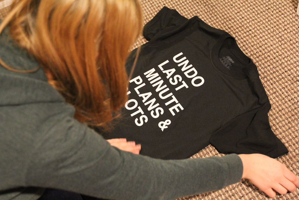
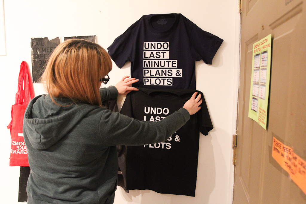
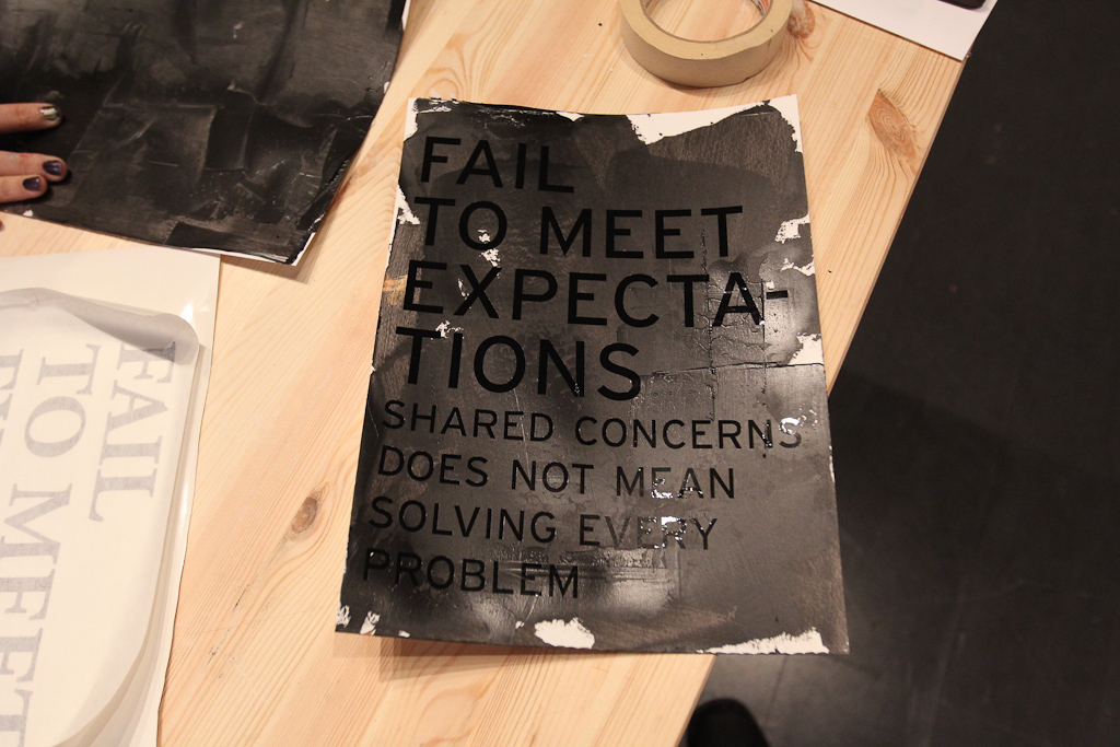
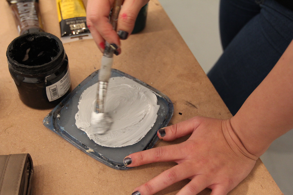
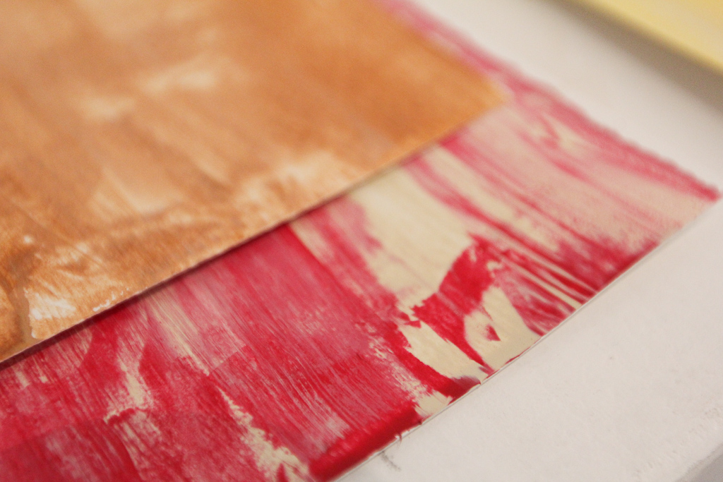
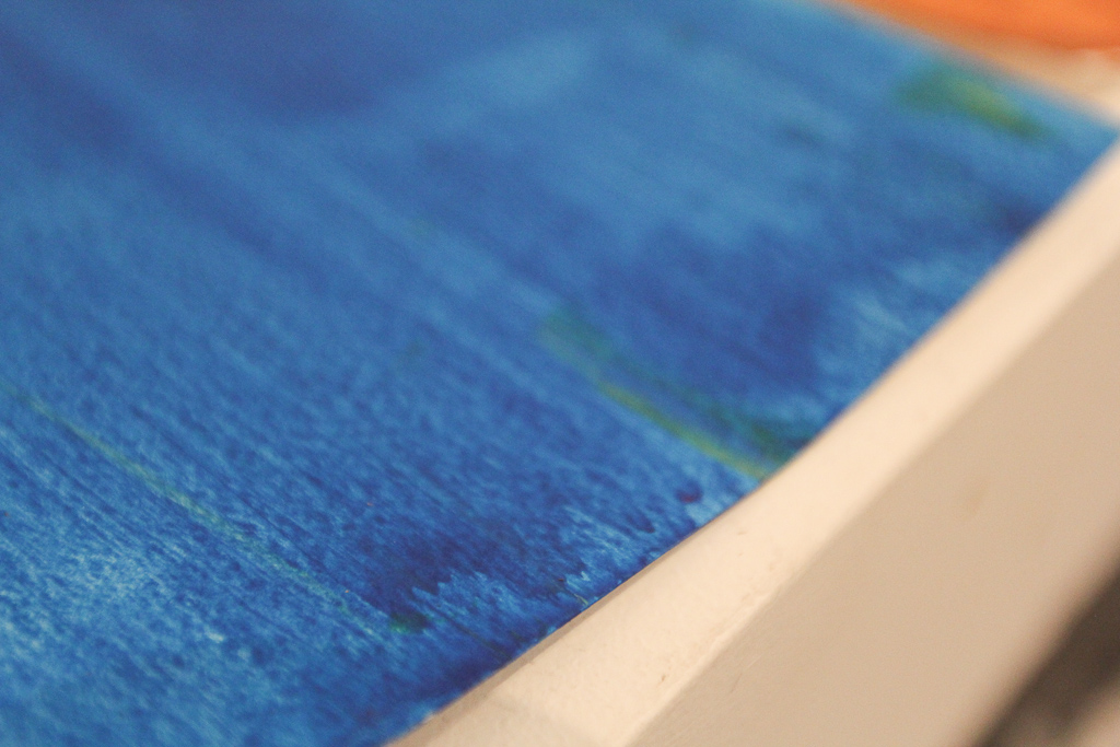
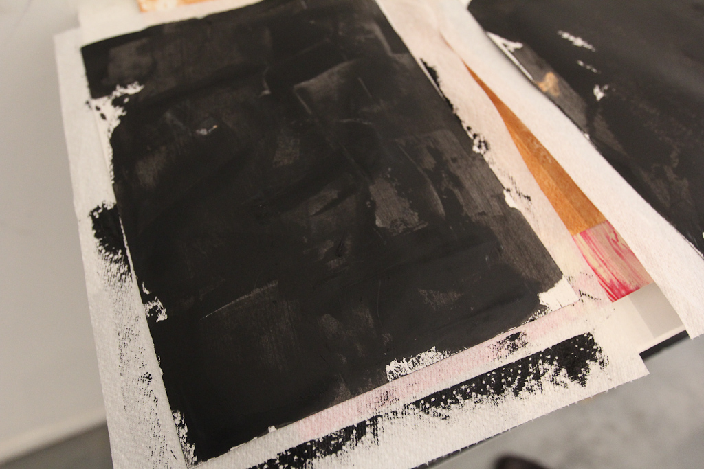
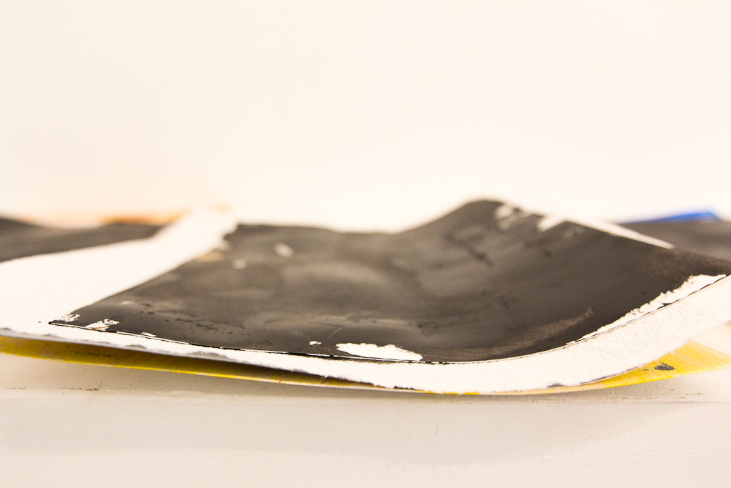
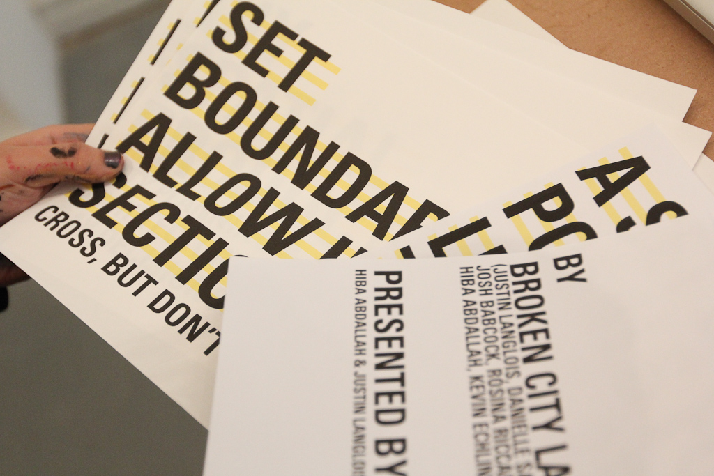
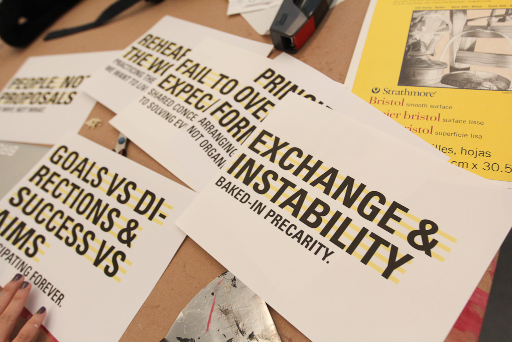
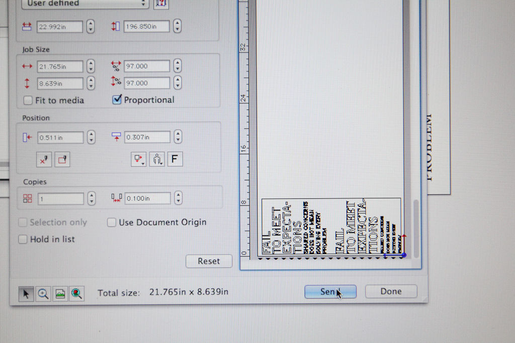
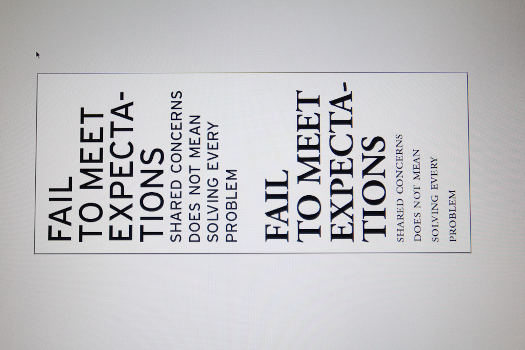
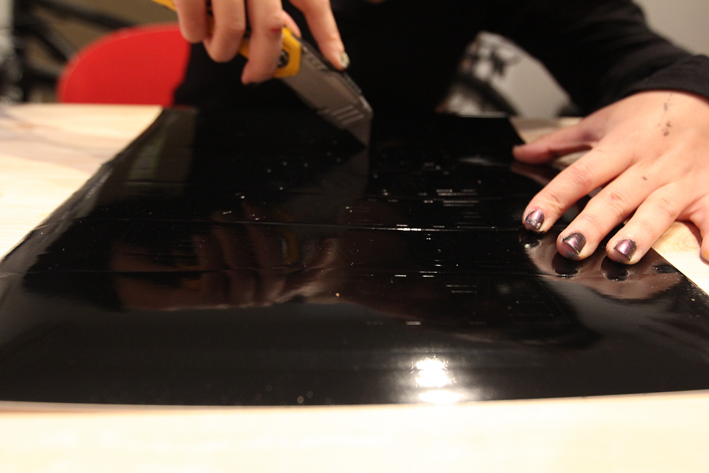
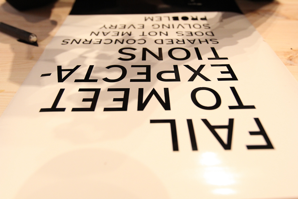
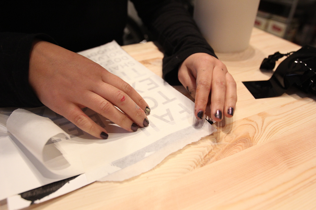
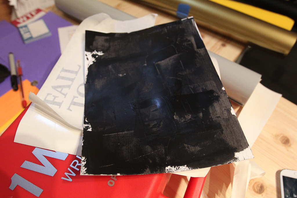
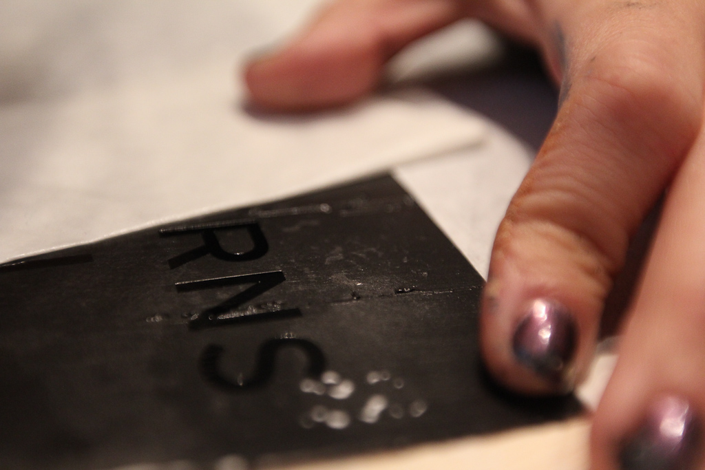
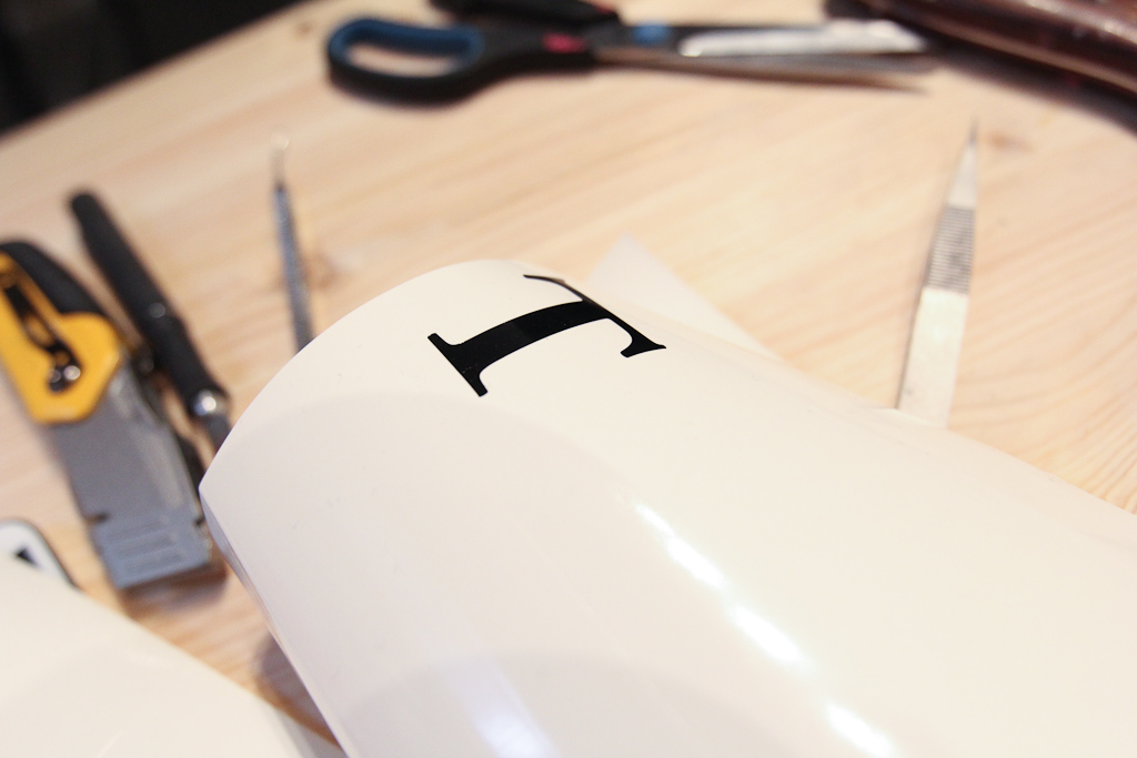
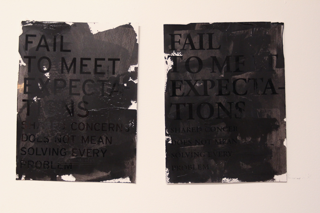
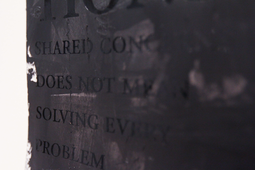
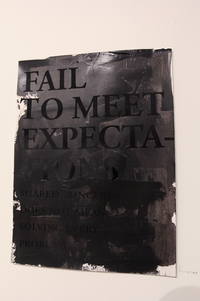
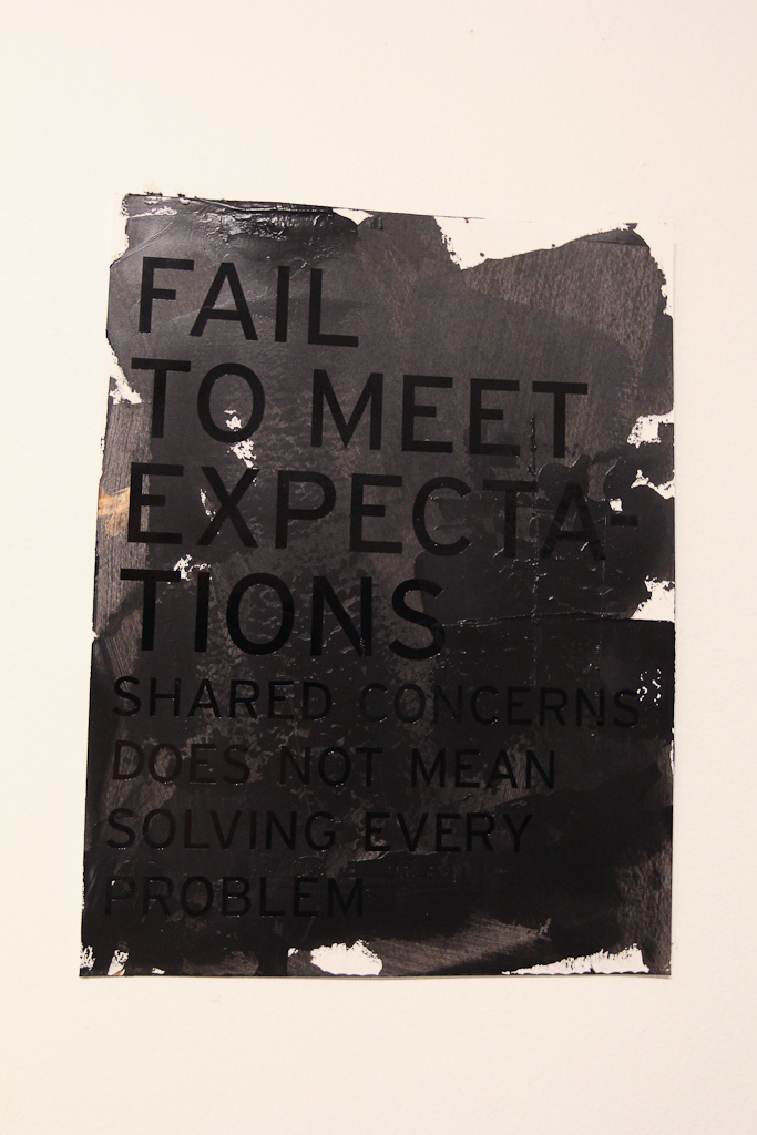
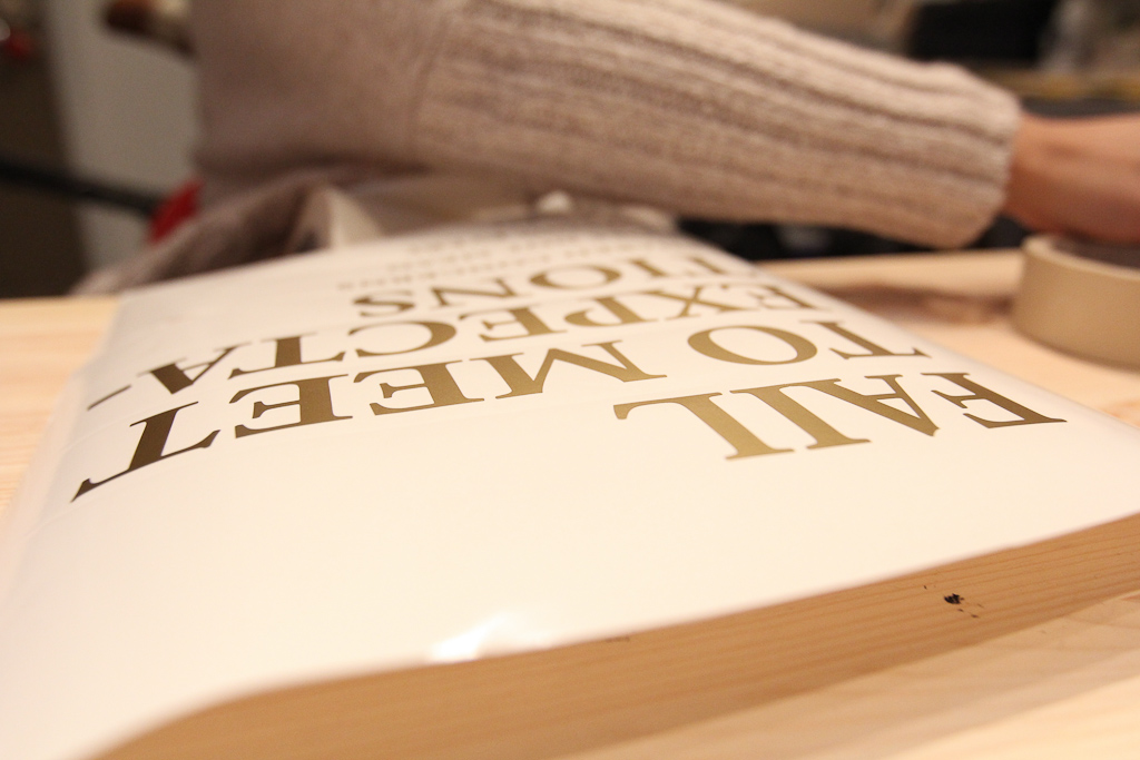
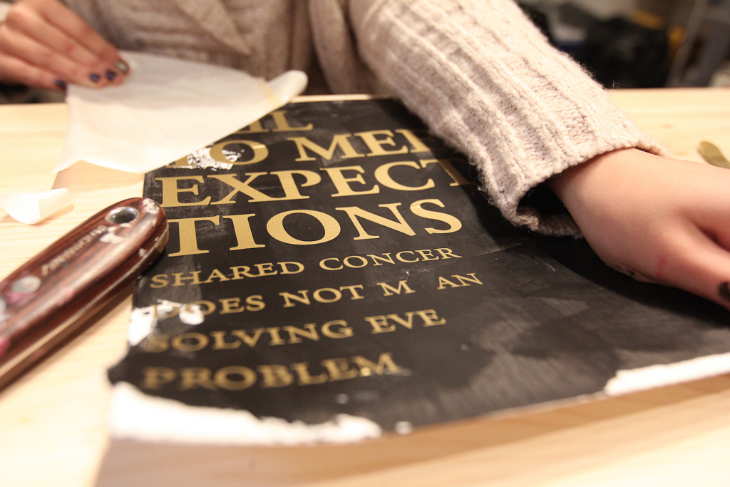
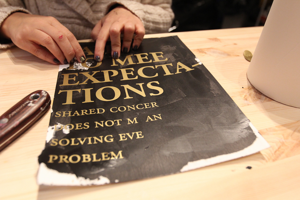
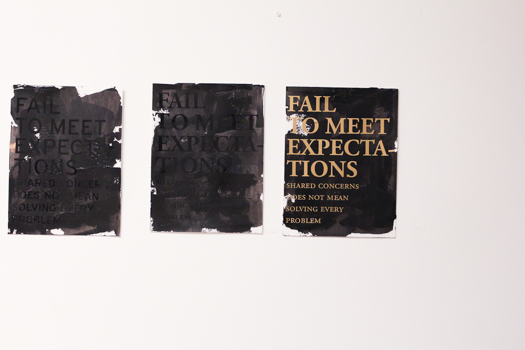
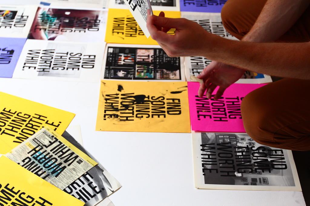
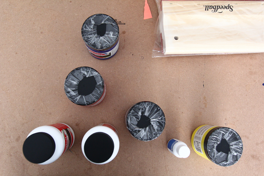
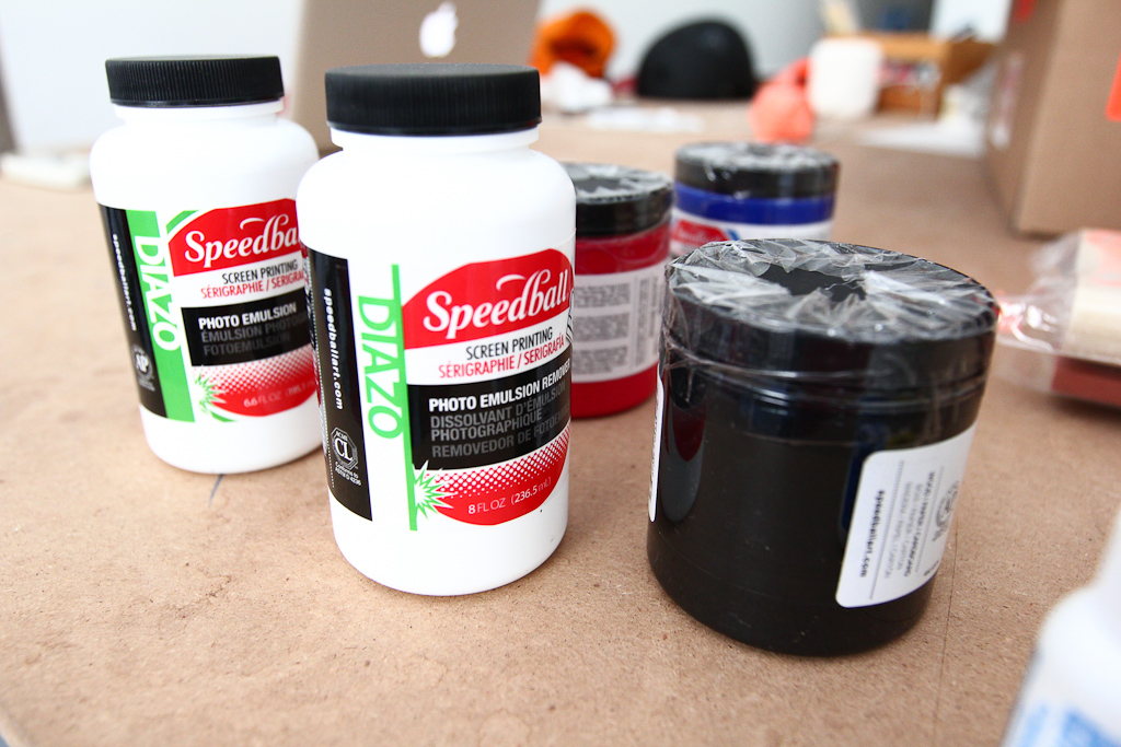
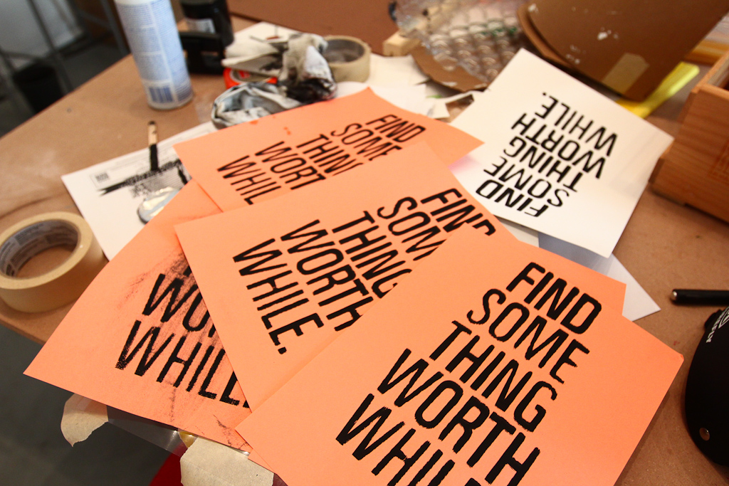
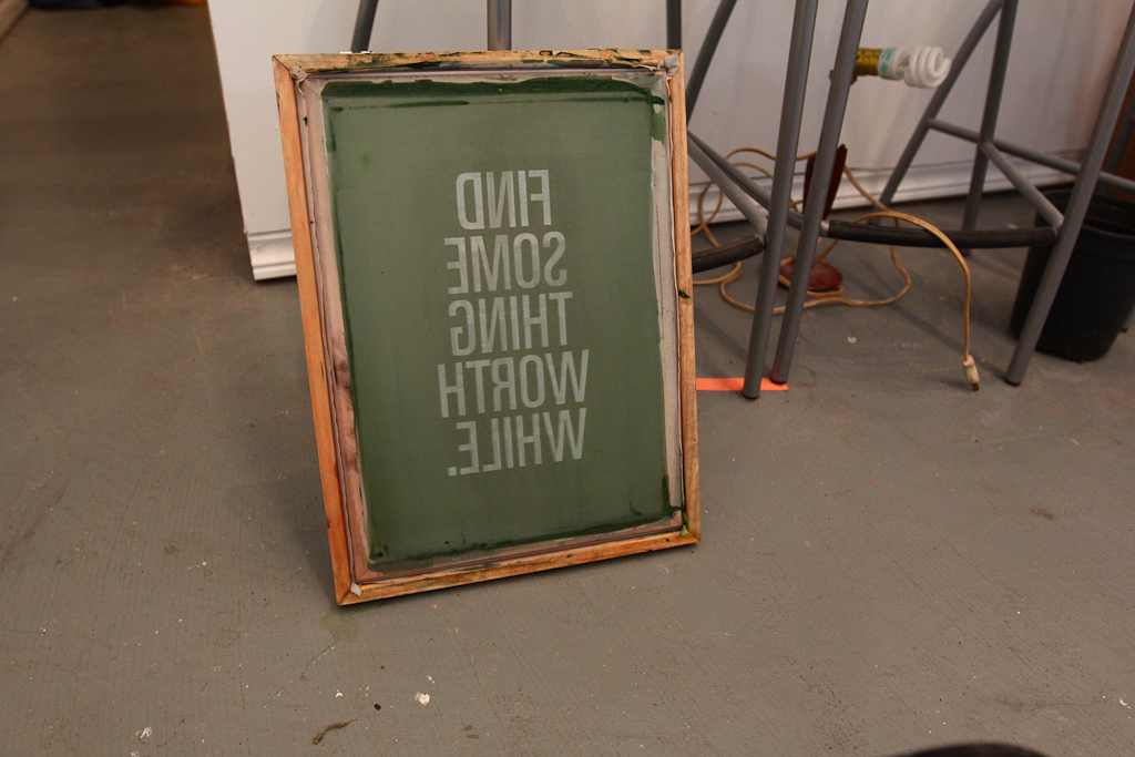
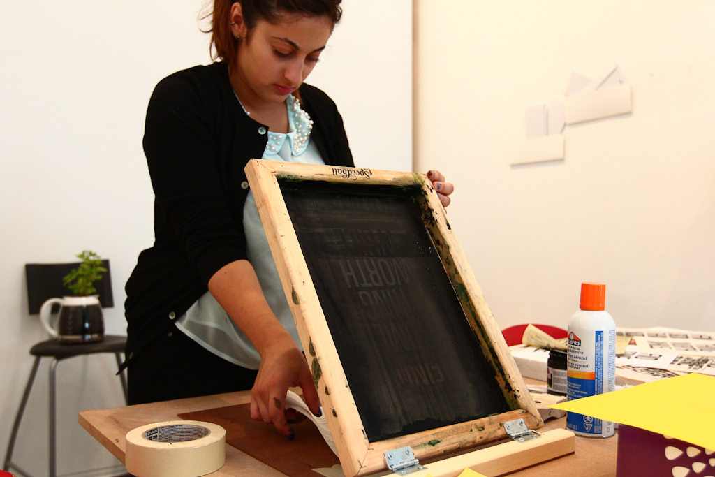
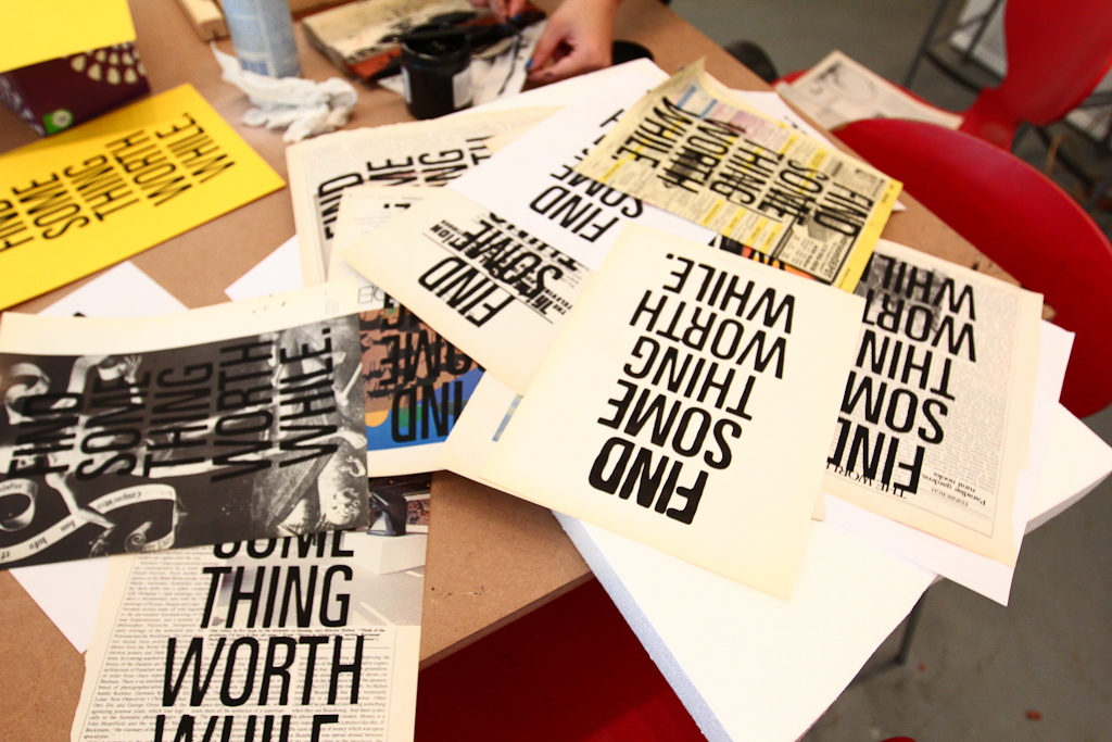
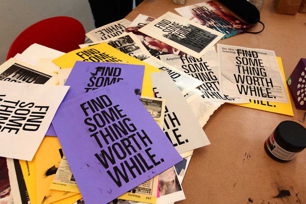
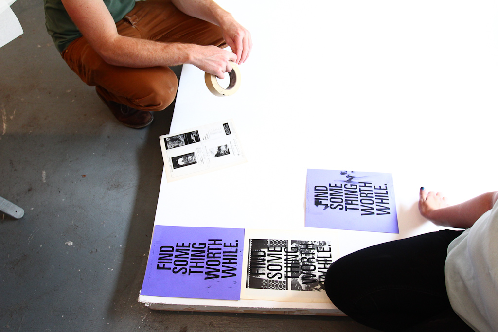
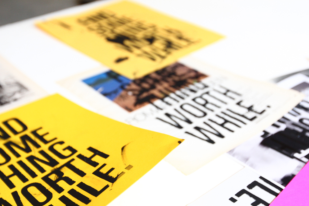
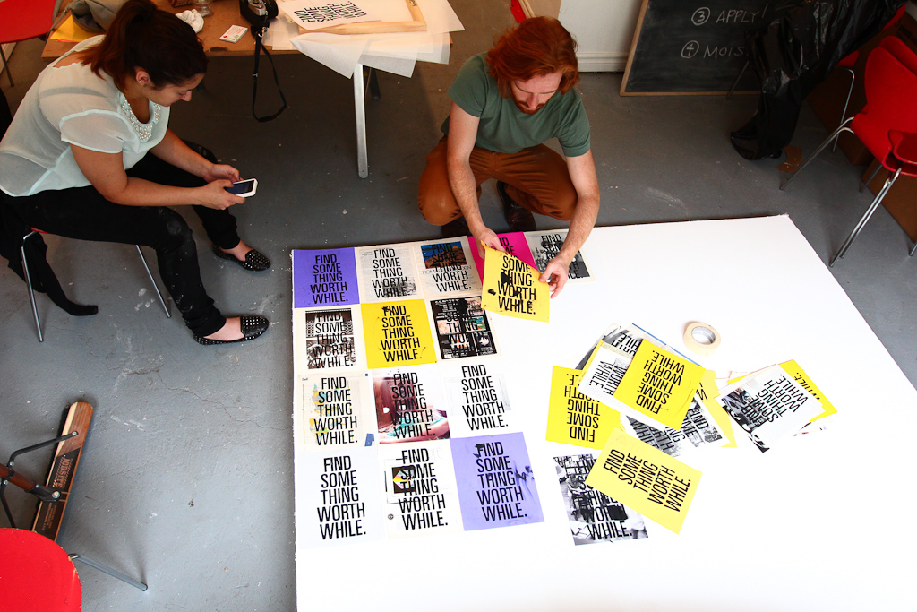
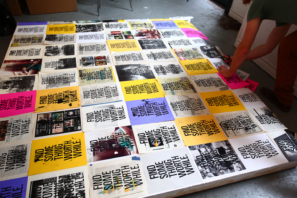
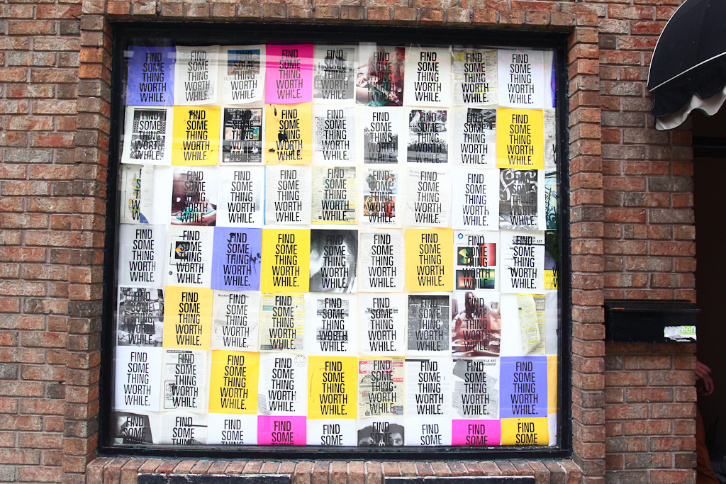
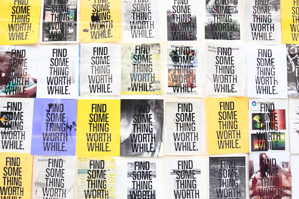
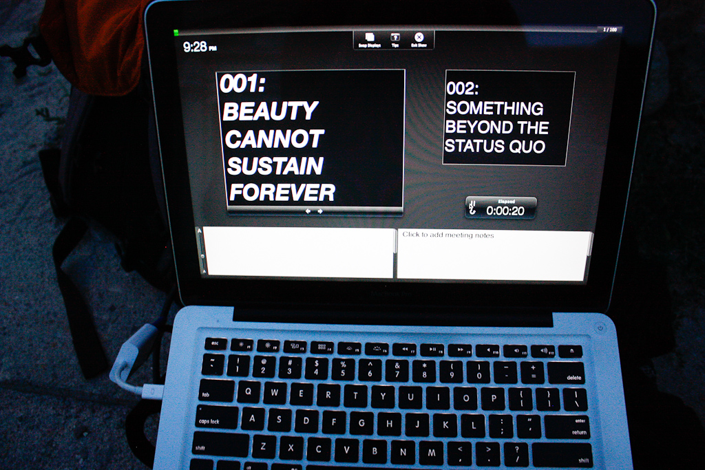
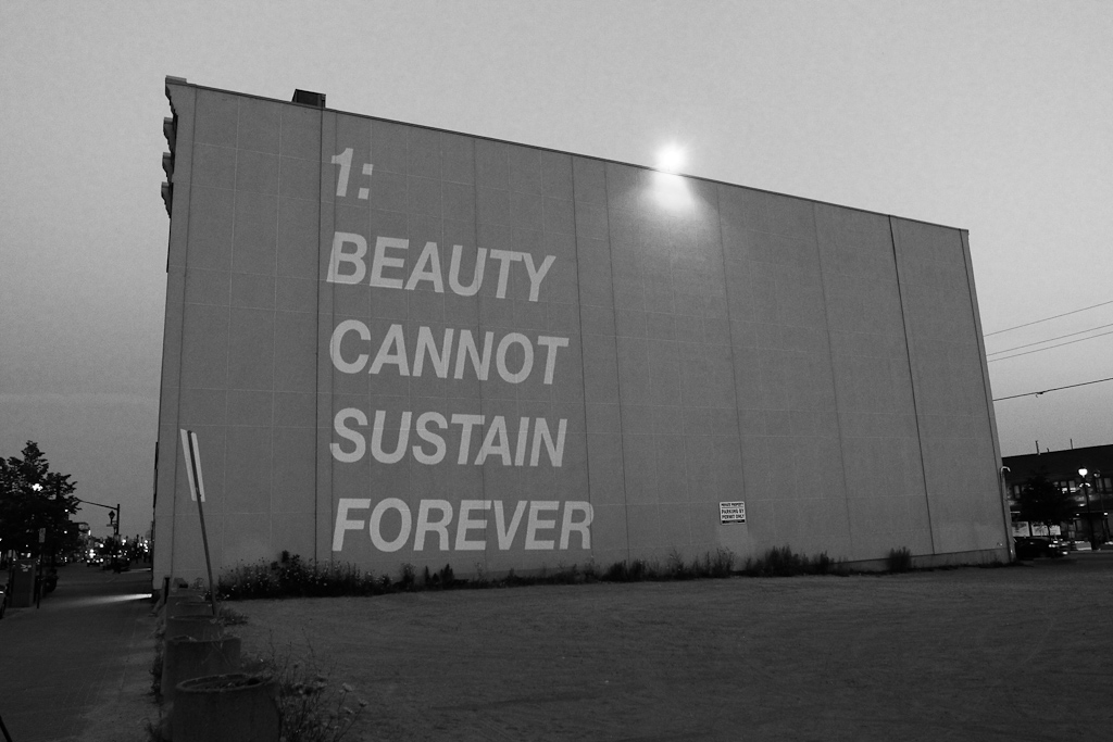
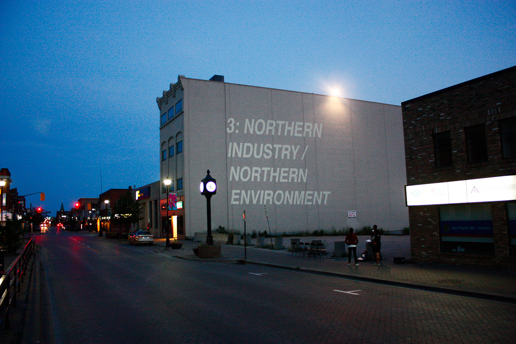
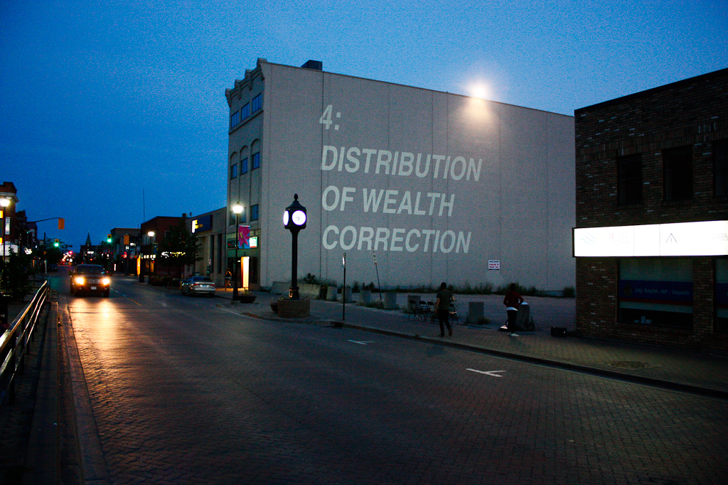
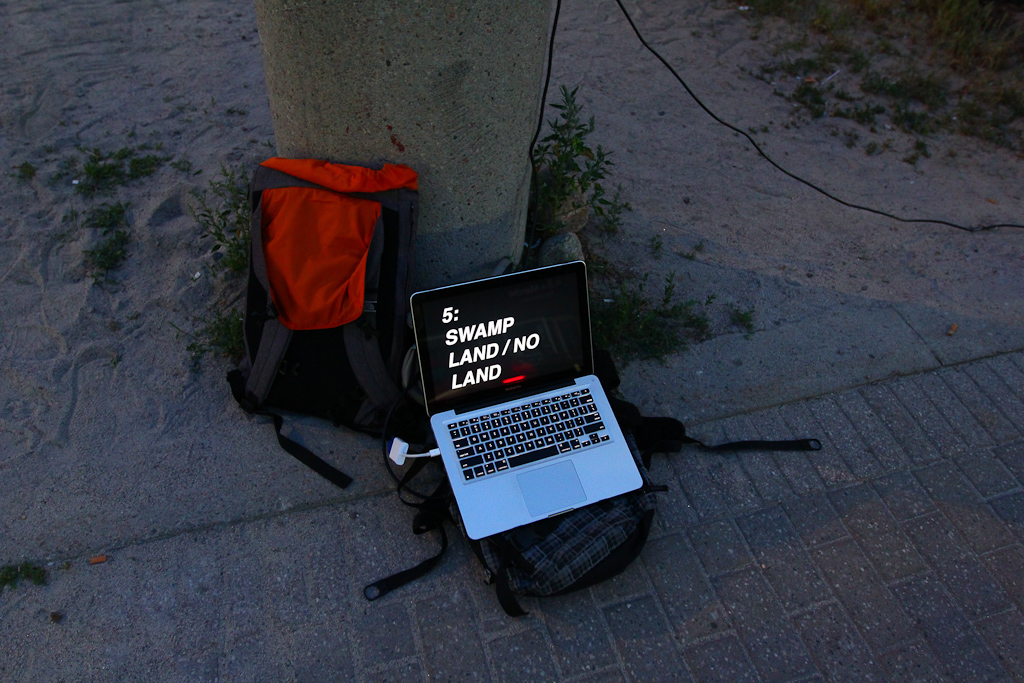
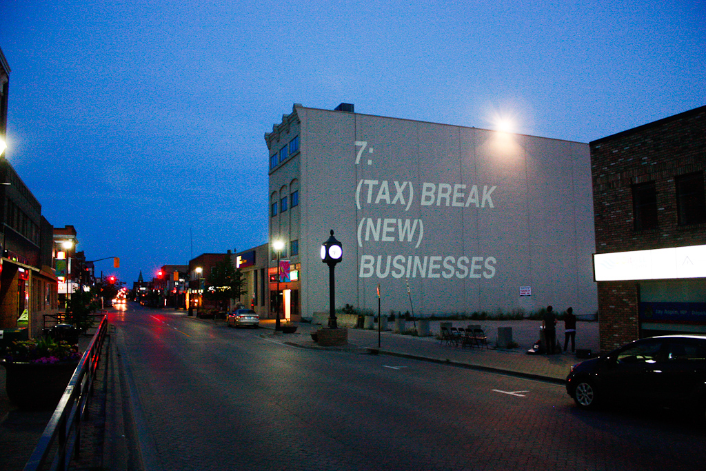
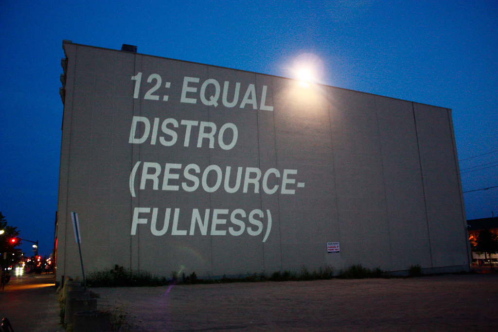
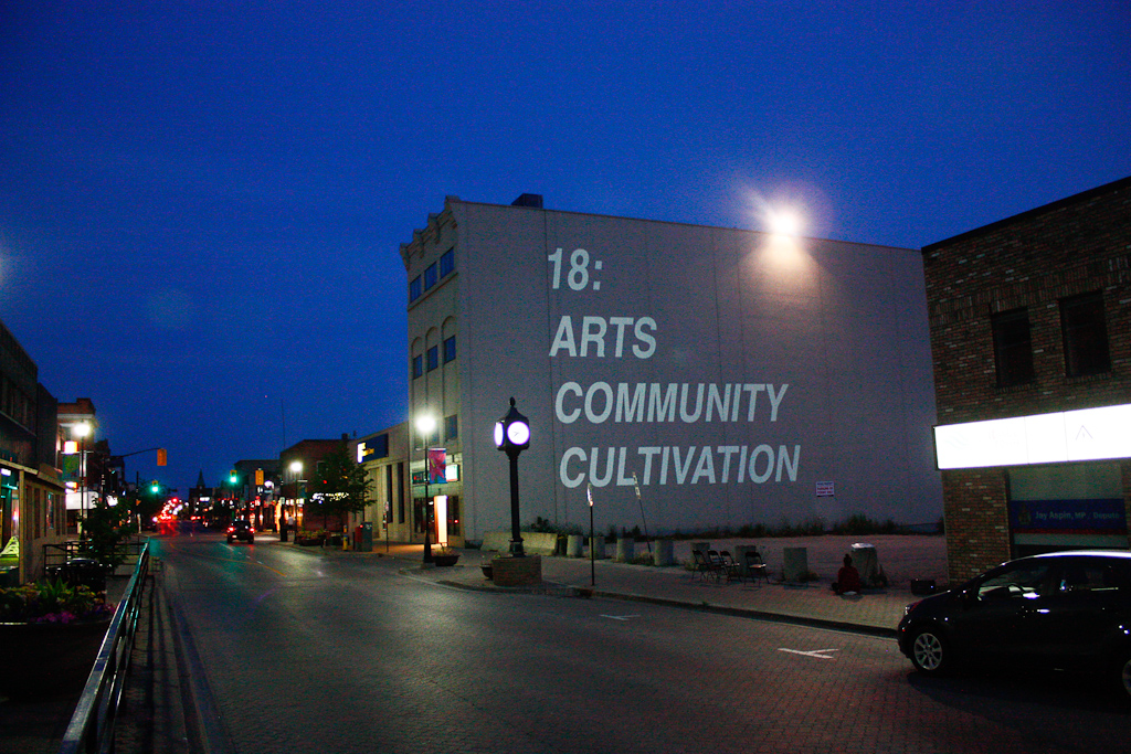
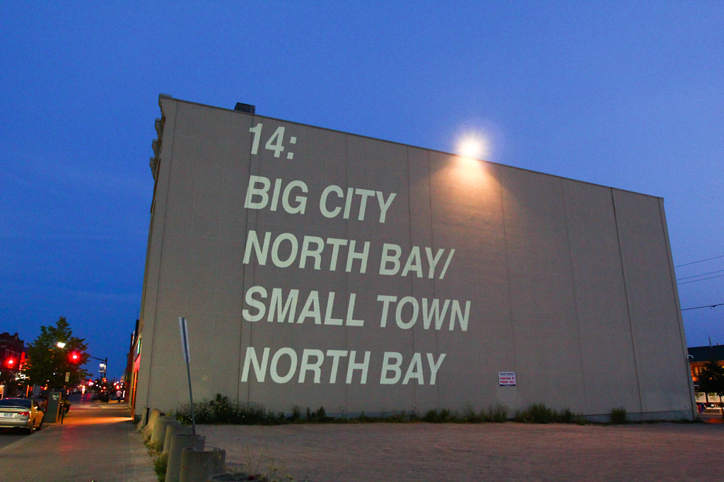
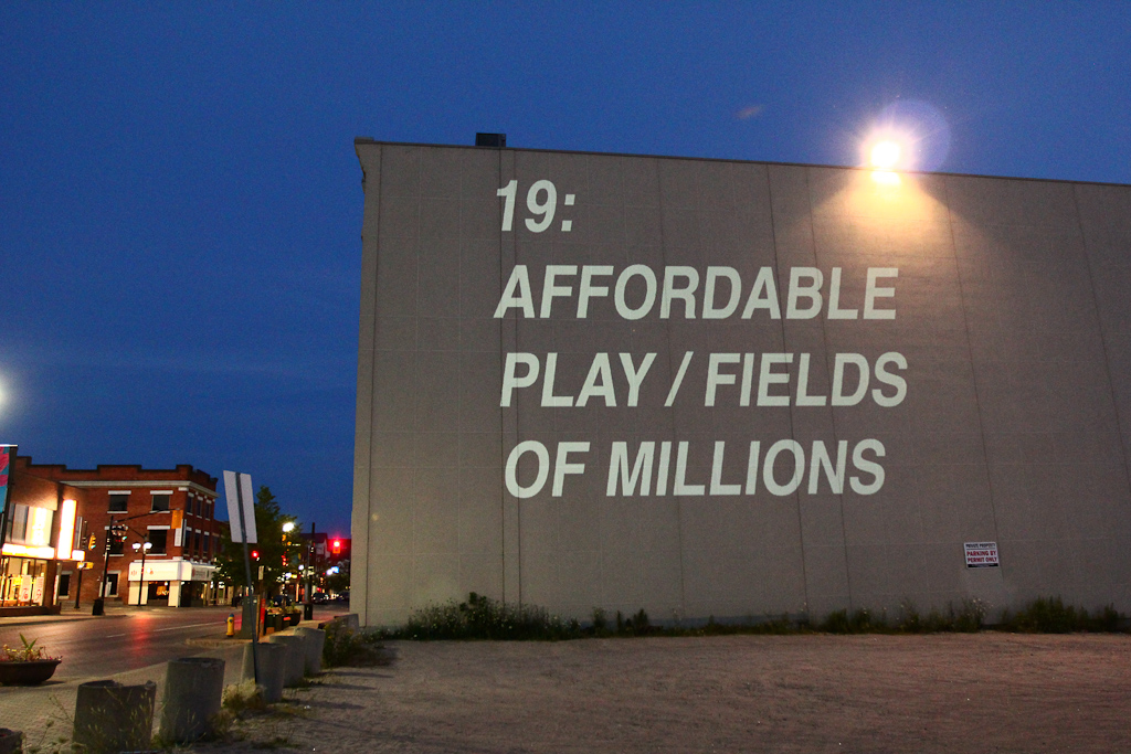
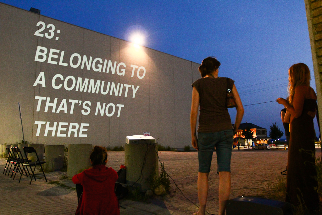
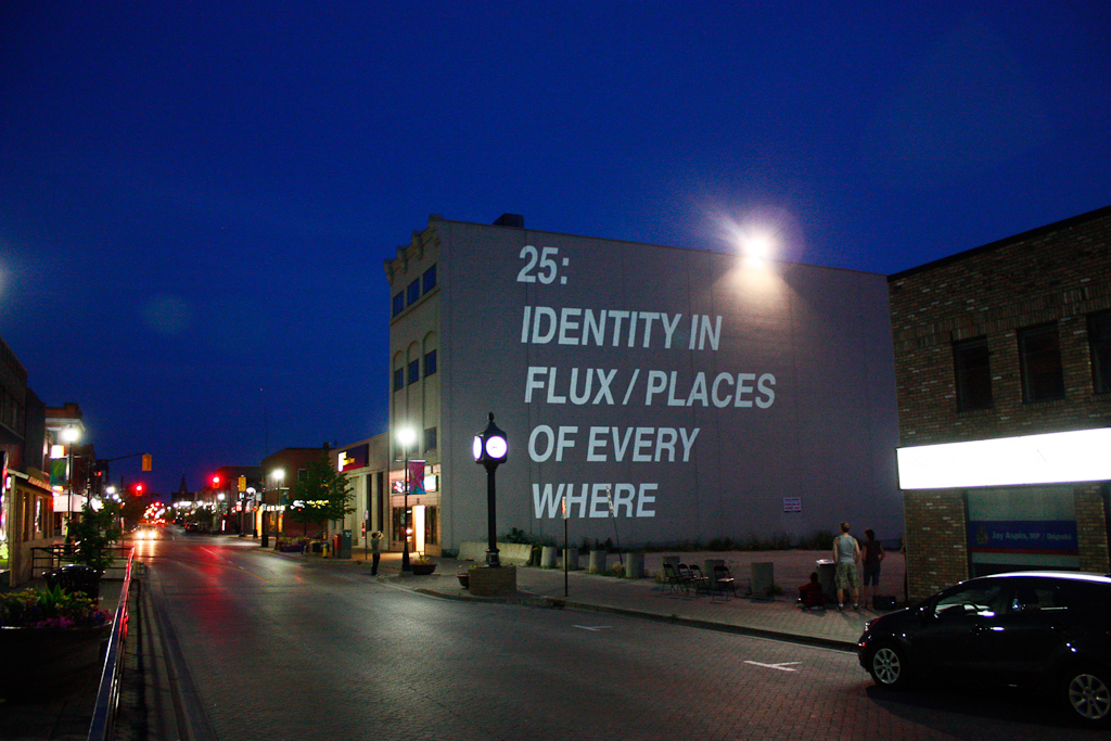
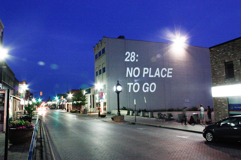
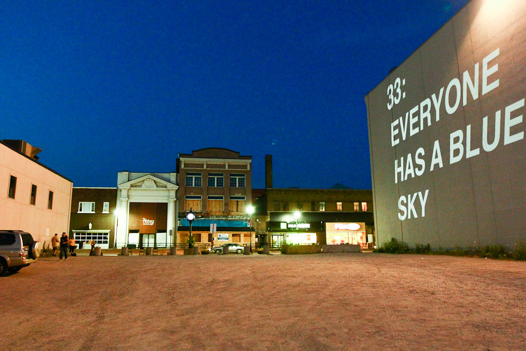
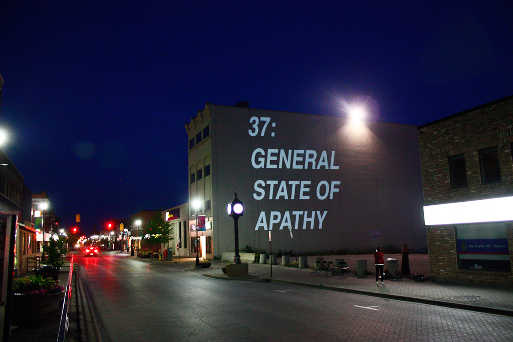
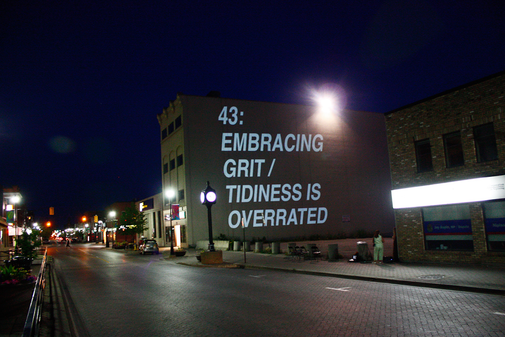
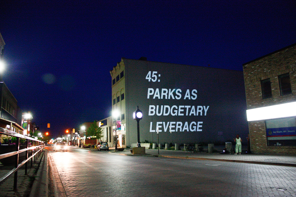
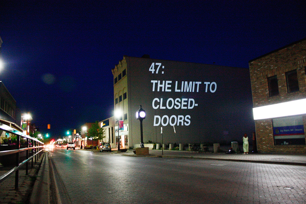
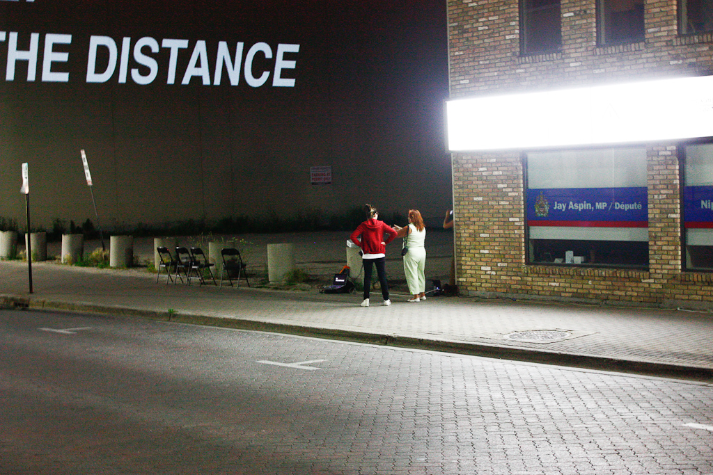
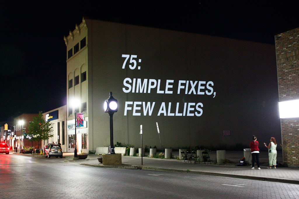
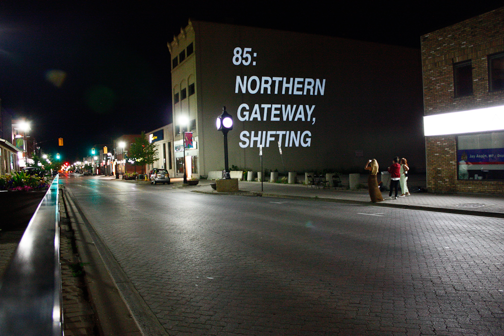
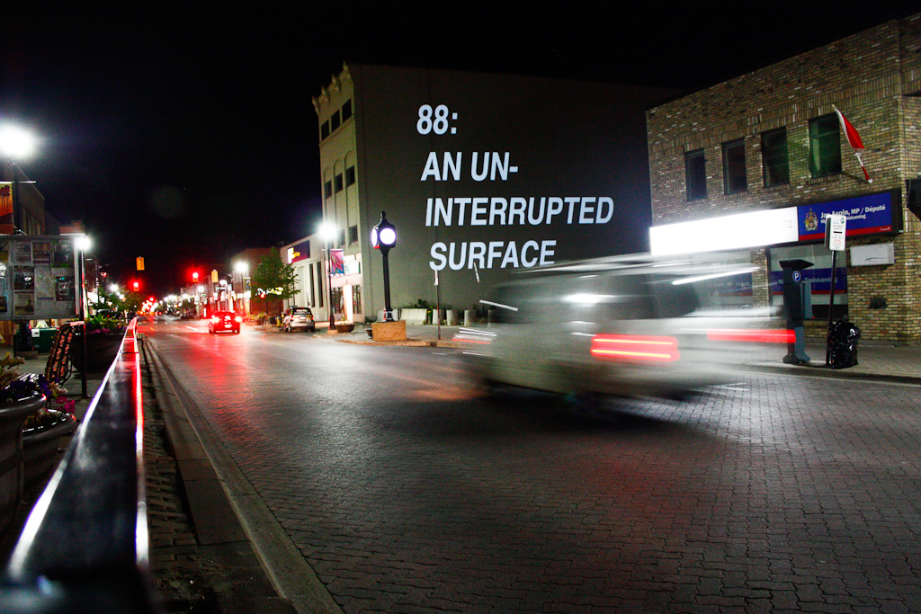
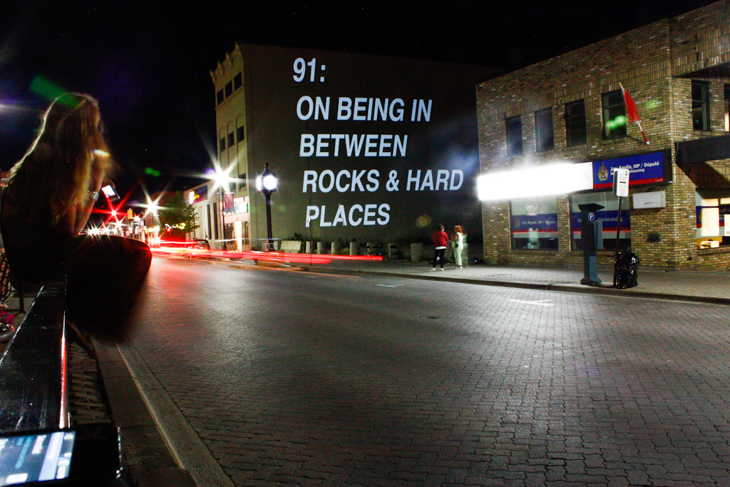
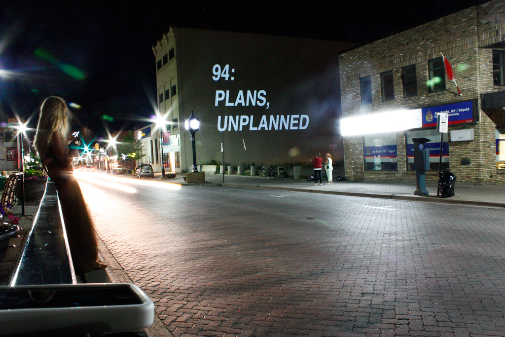
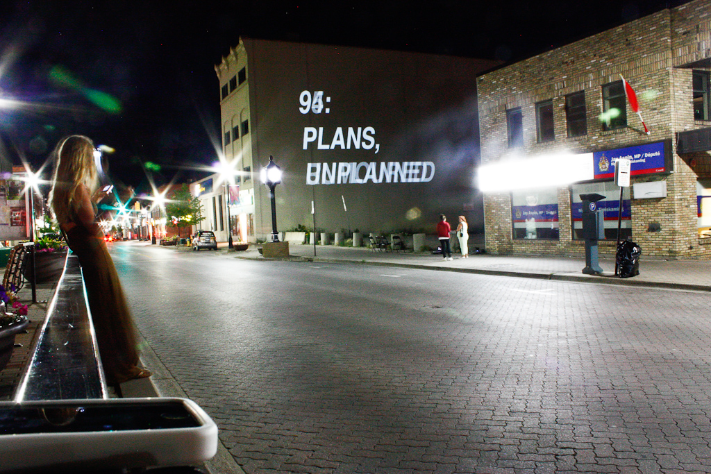
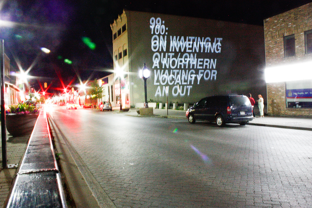
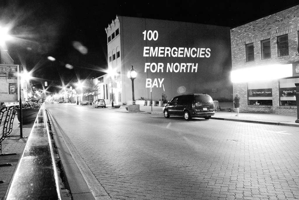
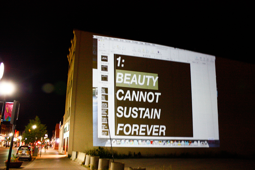
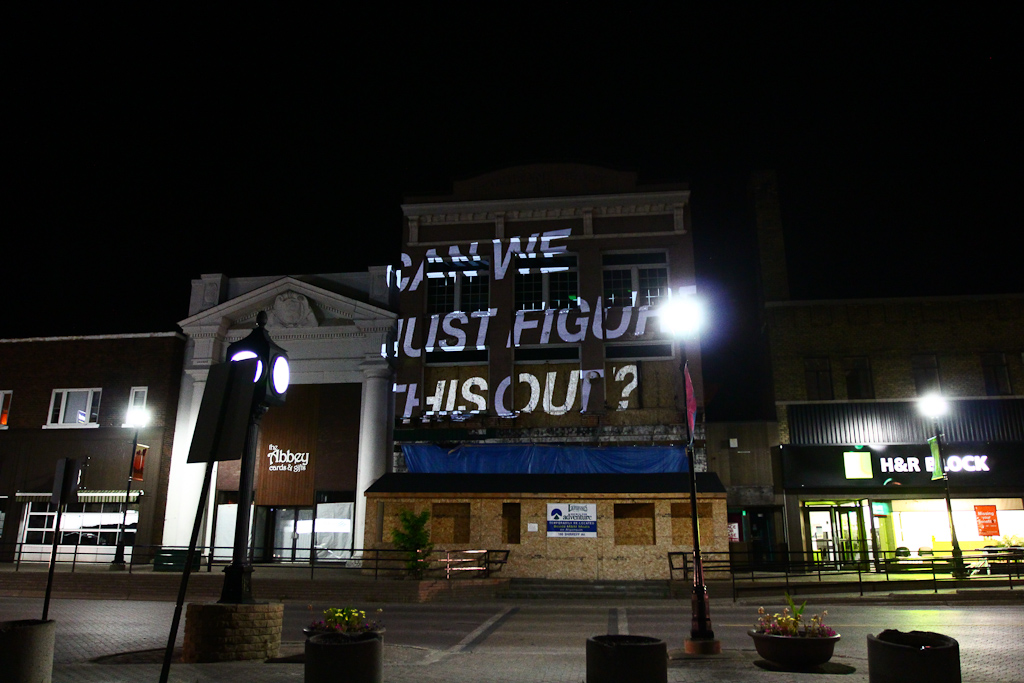
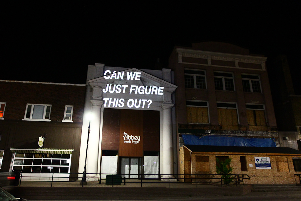
We’ve just recently been selected to take part in Artcite‘s 30th Anniversary / 30×30 exhibition, which opens tomorrow at 7:30pm. We contributed a series of posters which deal with issues we confront and negotiate with on a nearly daily basis (collaboration, creativity, time, resources, direction, etc.)

I know it’s short notice, but if you’re in the area, please stop by. There’s a ton of interesting work from 15 Canadian and American emerging artists. We hope to see you there!

The exhibition runs September 13 to November 16, 2013 – Wed-Sat 12-5 or by appointment

Featuring works by:

Daniel Bernyk (Windsor, ON)
Broken City Lab (Windsor, ON)
Michael Paul Britto (Bronx, NY, USA)
Katyuska Doleatto (Toronto, ON)
Hans Gindlesberger (Blacksburg, VA, USA)
Arturo Herrera (Windsor, ON)
Adriane Little (Kalamazoo, MI, USA)
Ella Dawn McGeough (Toronto, ON)
Susy Oliveira (Toronto, ON)
David Poolman (Toronto, ON)
Maayke Schurer (Ottawa, ON)
Andrea Slavik / Alicia Chester (Windsor ON, Rochester, NY, USA)
Owen Eric Wood (Windsor ON)
Nicole June Wurstner (Buffalo NY, USA)
Jade Yumang (Vancouver BC, Brooklyn, NY, USA)

Call for Participation: Regret & Resolve

tshirt-crop

With the start of the new year, we wanted to take stock of the regrets we have about the city or our roles within it, and the resolutions we might make to change this place for the better.

We want to ask two questions: What are the things that we know we should be doing, or wished we would do, or find ourselves scared to do, but never get around to actually doing? How can we take responsibility or ownership over our actions, or lack thereof, and find a way to be honest with where we should go next?

We’re wondering what citizenship looks like in a city like Windsor, and how we might be able to publicly and honestly articulate it.

Regret & Resolve  is a new project where we’ll be turning a series of resolutions and regrets into t-shirts. We’ll take online submissions from residents of Windsor and create a limited edition series of 50 shirts. Each selected submission will be made into two shirts — one for the author and one for our gallery exhibition. We’ll release all the shirts on the same night (January 31st) with an exhibition and exchange at Civic Space that will be open to the public.

We want these shirts to capture a moment of tension and hope in the city as we know it today and hope for it to be tomorrow. We feel like there may not be a venue to collectively articulate the responsibilities shared across this city, and that a t-shirt might be a good place to start. Printing these regrets and resolutions on t-shirts allows for a distributed conversation, a series of positions that we might take at the beginning of a new year, and a way to publicly talk about what we’ll do next. We’re really interested in an honest assessment of the things gone wrong, and the ways in which we might commit to righting them.

Interested? Fill out an online form between January 7-25, 2013 with your statement of regret or resolution. We’ll select 50 submissions and print them for the opening at Civic Space on January 31st from 7-9pm.


Submissions are now closed, see you on January 31 at 7pm!

Civic Space Studio Digest for December 13: on t-shirts and white walls

A look at our little corner of Civic Space. This is where we’ve been spending the majority of our time lately. For the record, the high shelves (those really nice ones with the Letter Library letters on them) were installed by Kiki. The lower shelves were hacked together by me. They’re very shoddy, but they hold many things.

As we’ve been hosting our 1W3KND Residencies, I love coming in on Monday and seeing the little re-arrangements made. Last weekend (I think) the coffee maker and tea kettle got a new home.

Hiba was away, so I got together the little instruction set for the writers in residence and put it back in the big red 1W3KND case.

Meanwhile, Laura took on the task of repainting the walls. After two great exhibitions from Catie Newell’s class and the Green Corridor, the walls were in need of some repairs and touch ups.

One can of paint got us about 80% through. One wall left, will have to pick this up on Monday.

After painting, we spent the afternoon doing some more tests for this t-shirt project. The mangled shirt above features a number of test-sites of vinyl with various temperatures and times on the heat press.

But, before we could do more tests, we had to go back to the drawing board and get a better sense of the size of the potential texts.

We also played with a highlighter look instead of just straight text.

Our new weeding tools makes the vinyl cut process a lot faster.

Remember, cut in reverse for t-shirt vinyl!

Laura weeds.

Then, we place the design…

… and head to the press.

Laura is the master of this machine. I actually don’t even know how to make it do anything aside from plugging it in.

Laura picked up with the same time / temperature settings that we left off with before.

The vinyl seemed to go on no problem, but I think the temperature was still a bit hot, as it left a faint mark where the press hit the shirt.

We also played around with some ideas for the online forms that we’ll eventually make for this project.

Above, the blue shirt on the wall.

Detail of the vinyl.

For the sake of true comparison, we also cut the same text in standard Helvetica bold. We also set the temperature a bit lower in hopes of avoiding the marks from the press.

We’re pretty sure this looks better. I think we had discussed grey shirts before, we’ll see…

We ended the day doing some more comparisons. I’m going to wash the shirts and make sure that the temperature / time changes don’t effect the vinyl adhesion. More soon.

Fail to Meet Expectations: Vinyl on Paint Posters

We’ve been talking about picking up on some of the ideas we put together for the OPEN panel discussion from earlier in the month, and it seemed like posters were a natural fit. Given the text statements that we made to address the an idea of economies and creative practice that served as the backdrop for our talk (rather than the normal set of images), we wanted to find a place for them beyond that PDF file.

So, Monday seemed like a great day to start playing. We’ve been doing so much paper work lately, this is long overdue.

Hiba mixed some colours and started make some base colours.

We decided from the start to cut some vinyl (rather than screen printing or stenciling at this point), so we experimented with some colour.

But, it wasn’t long before the black stood out. Hiba was using a metal scraper to spread the acrylic paint on these smaller 9×12 sheets. We want to make these larger posters soon.

Also, decided to play with some other vinyl … haven’t pulled out that gold for a while.

Detail of texture of the paint.

We printed out those slides and started sorting through.

We decided to go with just one, as we were planning to cut a couple different fonts and colours and wanted to be able to compare the results.

Good ol’ Cutting Master.

We went with Interstate and Garamond — all caps and small caps.

Hiba weeds the first cut of shiny black.

Interstate looked promising at first.

Hiba applying the vinyl to the paper.

The paint dried, but was just a bit tacky, which helped get the vinyl to stick.

Detail, applying the vinyl, you can see the text through the masking.

Pulling it up, the gloss black looks deep.

Nice and clear, but didn’t stand up to the serif font.

T.

Side by side, we’re pretty convinced with the Garamond on the right.

Less surface area of the font face makes it a little less visible though.

Garamond.

Interstate.

Then gold, just to get some contrast into the test.

The gold is a cheaper vinyl, but a lot easier to weed.

Fixing it up, as it didn’t stick to the paint as well.

Side by side, the gold is most legible, but looks too much like a poster. Not sure what to do with the black on black yet. Thursday will be more time to play. Maybe we can get some larger paper by then … lots more to experiment with, but even looking at these photos now, I’m still pretty convinced of the black gloss serif. Maybe more play time with the texture of the paint.

I came back later on in the evening and saw the rest of the work Hiba did with matte black before she left for the day.

Definitely harder to read, but the thicker black paint and the matte vinyl really work up on the wall. Experiments on Thursday.

More soon.

No Rights/No Wrongs: Nuit Blanche 2012

On September 29th 2012, we were lucky enough to be invited to Toronto for Nuit Blanche! Our installation site was on the face of the Gladstone Hotel right on Queen Street West. It was an amazing night.

It was the first time that we did a projection on a building so textured. This definitely allowed for some challenges in terms of how the text would look on a building surface that wasn’t flat and the result was pretty interesting.

Text in transition.

The combination of statements make up our “No Rights/No Wrongs” projection series. The texts are based off of back and forth conversations about opposing sides to an argument or statement, as well as some that are left for the viewer to fill in themselves.

Fill in the blank.

The projector and computer were set up inside my car.

The projector was set up just below my dash, and the projection shot right through the windshield, onto the Gladstone Hotel.

START WITHOUT AN END.

Joshua talking to some onlookers.

We’d like to say thank you to everyone at the Gladstone and in particular, Noa Bronstein,  for having us be a part of a great night!


1-Day Project: “Find Something Worthwhile”

We had ordered these screen printing supplies in anticipation of using them for our upcoming Civic Maintenance project, but before we could embark on that large-scale production, we needed to test.

We got process colours cmyk and the basics for screen printing – photo emulsion and photo emulsion remover and two screens.

We haven’t screen printed since last year while we were at Martha Street Studio, and even then we had the luxury of some great technical assistance.

I haven’t shot a screen for a long time, so while the first test was a bit rough (see prints above), the second attempt on Thursday went a little better.

I ran a number of prints and then Rosina took over. Sara and Kevin also got in on the printing at one point!

She made a lot of prints.

Early days in screen printing tests — this detail in particular wasn’t our best work — but the imperfections were working for us.

We printed on a lot of different paper, pulling from magazines and old art periodicals.

Then, we pulled out the window wall that Kevin built a while ago and started to setup the prints as a grid.

I really liked some of the details and textures when things got messy.

Kevin and Rosina tackling the grid.

We ended up having to do some more prints to completely cover the window wall.

And then, the finishing touches of trimming and taping the edges.

And installed! We took down our video installation and Sam’s water-bottle planters to make way for this … sometimes we get impatient … but also, this will make it a lot easier to host the Walk-by Theatre on Mondays.

A closer look at some of the grid. This was an excellent way to spend the afternoon. And, all the better that it was the randomness of being in the space together that made it happen.

100 Emergencies for North Bay (Projections in Downtown)

Thursday night, our last night in North Bay as part of our residency, we did a large-scale public projection as a kind of summary of our conversations, and as a bit of a starting point for where we see the exhibition going. Almost next door to the White Water Gallery is this huge blank wall — the perfect surface for projections.

Our old battery is starting to show its age — during a test earlier in the day, we only got about 30 minutes of useable power from it.

Earlier, testing the projector on battery power while compiling a list of emergencies, pulling from Wednesday night’s workshop.

To make up for the lack of available battery power, we ended up stringing together a bunch of extension cords (courtesy of Kathleen) to the White Water.

We had precompiled the list of 100 Emergencies for North Bay, so we used Keynote.

At dusk around 9pm, setting up the projector.

Danielle, tough and ready to guard the gear. We tried to wait out the lingering daylight for a while, as even with our 5200 lumens projector, the distance and sunset weren’t giving us the contrast we had hoped for inititally.

But, shortly thereafter, we begin … a list of 100 emergencies (invented, emerging, or already experienced) that shape North Bay and might articulate a way forward in thinking about the urgent things that shape the city and community.

Rosina documented with a ton of video — can’t wait to see it!

Danielle watched the gear and struck up conversations with passersby — and this is one of the best reasons to do this kind of work — it creates this really great entry point to conversations we wouldn’t have otherwise had.

As the projection wrapped up about an hour later, we did a few improved slides based on some conversations we had with folks passing by.

Our setup from the edge of the parking lot, on the sidewalk in downtown North Bay.

Quick changes / additions in Keynote.

Then turning our focus across the street for a few minutes.

We had a really great week in North Bay and we’re so excited to start working on the exhibition for September. Huge thanks to Clayton, Eric, Robyn and Kathleen at White Water, and to everyone who came out to our walk, workshops, or talked to us during the projection!

Installing the sign for CIVIC SPACE, take 1

Installing some signage on the exterior wall of CIVIC SPACE (10)

Installing some signage on the exterior wall of CIVIC SPACE (13)

Last night, Hiba, Sara, and Justin tackled some initial planning for the installation of the CIVIC SPACE / Letter Library sign. The Letter Library idea came out of trying to think through how we might make our own sign for the space, so it’s really great to finally see the letters going up.

Installing some signage on the exterior wall of CIVIC SPACE (12)

Hiba got on the ladder first, installing the letters with some tape, while Sara helped to position from the vantage point across the road.

Installing some signage on the exterior wall of CIVIC SPACE (1)

Then Justin made some attempts as well.

Installing some signage on the exterior wall of CIVIC SPACE (2)

We did some photoshop mock-ups earlier, but we still wanted to be able to play a bit.

Installing some signage on the exterior wall of CIVIC SPACE (5)

The sign will read something like, “CIVIC SPACE PRESENTS THE LETTER LIBRARY.”

Installing some signage on the exterior wall of CIVIC SPACE (8)

The title might bleed down into the window where we’ll likely have our return pile of letters.

Installing some signage on the exterior wall of CIVIC SPACE (6)

We tried the letters up high and hugging the window. We’ll do some more tests later today. We used a pole to remove our well-taped letters.

Installing some signage on the exterior wall of CIVIC SPACE (7)

As an aside, this is the nicely designed new water meter cover in front of our building.

Installing some signage on the exterior wall of CIVIC SPACE (10)

Danielle came by for inspection — and approved.

Installing some signage on the exterior wall of CIVIC SPACE (11)

End of the night clean-up.

Sara demonstrating the letter removal technique.

Single-Use Camera Tests: Captioning the City

	Documentation with single-use cameras: Putting letters up in city spaces (1)

Kevin and Josh ventured out with a single-use camera to test what the temporary installations would look like, as we continue to prep for Thursday’s launch of the Letter Library here at CIVIC SPACE.

Also, film is fun.

	Documentation with single-use cameras: Putting letters up in city spaces (2)

The letters look great and the photos aren’t too bad either. They definitely have a colder tone to them, but it works!

	Documentation with single-use cameras: Putting letters up in city spaces (3)

This shot was excellent — love how visible this is from a distance.

	Documentation with single-use cameras: Putting letters up in city spaces (4)

Recycling containers = excite.

	Documentation with single-use cameras: Putting letters up in city spaces (5)

Strange undulations in the wall = excite.

	Documentation with single-use cameras: Putting letters up in city spaces (6)

Blank walls = excite.

	Documentation with single-use cameras: Putting letters up in city spaces (7)

The conversation these texts have with other tags, signs, etc. are really interesting.

	Documentation with single-use cameras: Putting letters up in city spaces (8)

The prints. 4×6. We’ll need others.

	Documentation with single-use cameras: Putting letters up in city spaces (10)

Hiba starts to arrange these test photos as we figure out how we’ll design the exhibition space.

	Documentation with single-use cameras: Putting letters up in city spaces (9)

Also, on the to-do list — pick up our postcards today!