")
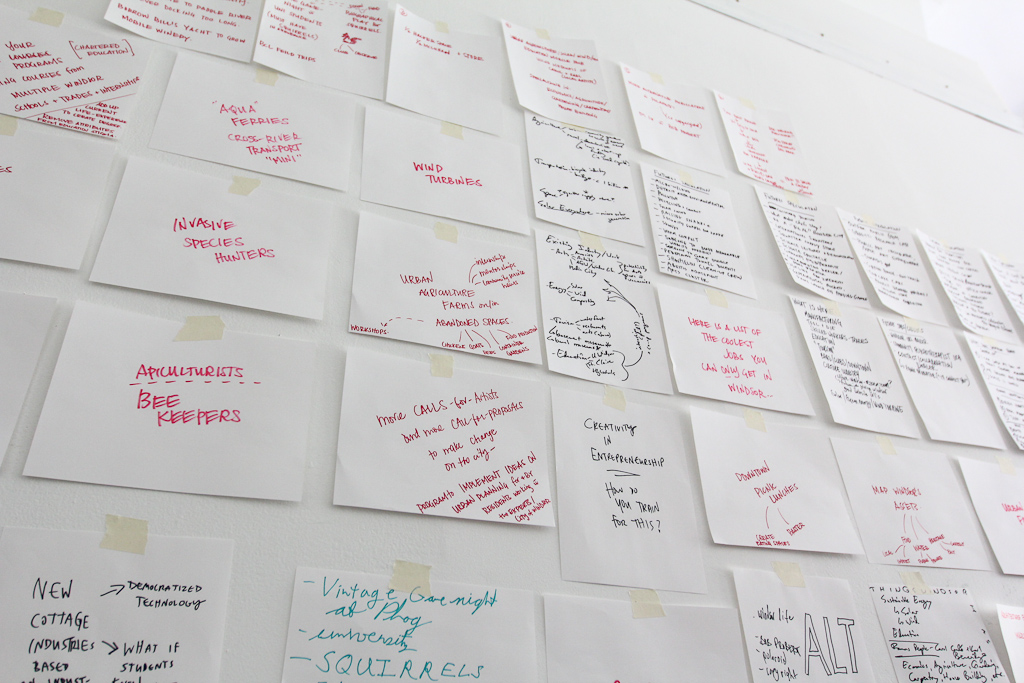
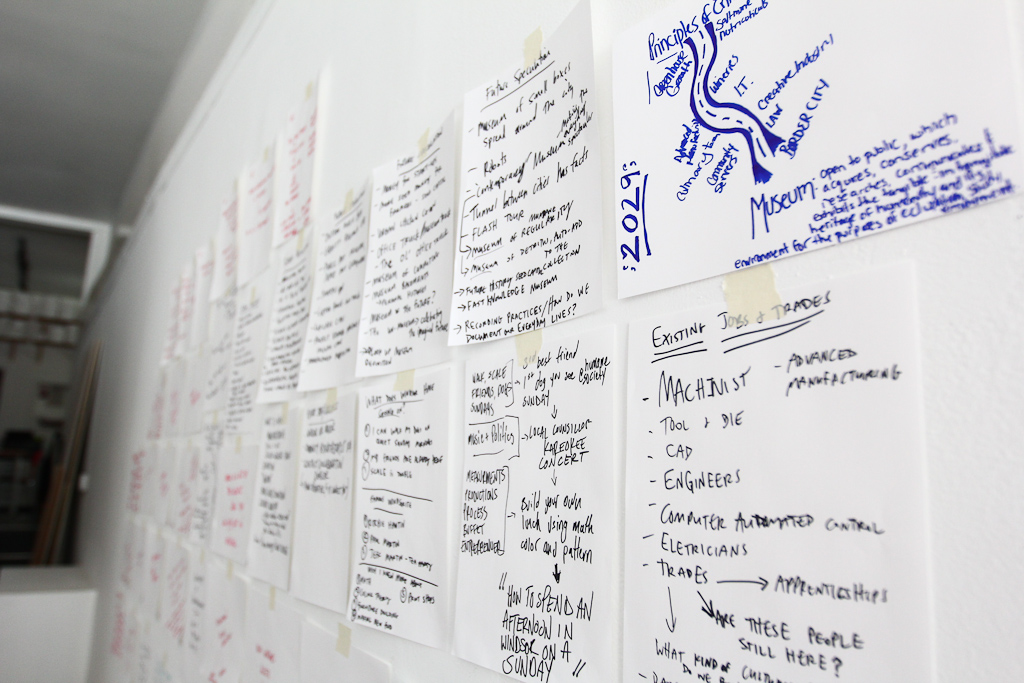
The last few days have been so busy here, at Eastern Edge. In anticipation of the 24 hour Art Marathon that is happening today, we have been keeping busy getting the Public Space Gallery installed and running. Here’s a recap.
")
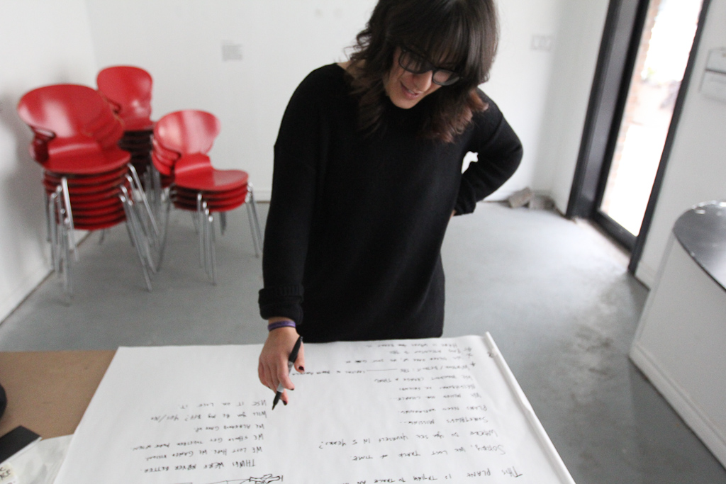
On Thursday, we held our “Assembling the Public Space Gallery Workshop”. Before the workshop, Josh and I had gone around and photographed all the spaces we wanted to include in the gallery tour. We projected them back at our space at Eastern Edge and discussed them with our workshop participants.
")
With a fake title card, we tried to imagine how they could fit on the space in order to properly frame each stop on the tour.
")
Around the table, Kumi and Emmanuelle reference a map to get a sense of the route the tour would take.
")
Then Josh tries to locate one of the spots. A notable characteristic of St.John’s is how the streets work in the city. Google maps has mad multiple errors in helping us find the places we were searching for. The streets curve and take sharp direction changes without any indication of street signs, making it a challenge and adventure for any newcomer of the city to find their destination.
")
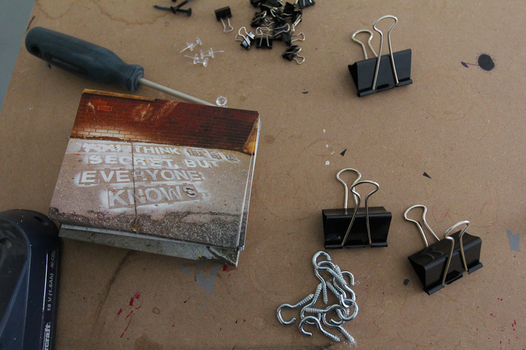
After the spots were finalized, we set out to buy all the appropriate materials for the task. Rick Page, who is our lovely house host, is also a carpenter and was really kind in finding us some scrap wood to turn into stakes.
")
Josh tests the stake in the ground.
")
And it stands!
")
Next, we got the title cards for the tour printed and began to mount them.
")
The method: glue all around and super glue for the edges.
")
A Josh touch.
")
We have 24 title cards in total, making this tour a 24 stop one.
")
As mentioned above, Google Maps had a tough time helping us find the places we were looking for and so, the map above is one we collaborated with Google on to find the exact coordinates of the places we wanted to caption in the city.
")
Before we headed out on our “Installation/Walking Tour Workshop” we tested out a scrap piece of foam board to see how it held up on the stake.
")
Friday was all about install. We decided it would be interested to take our last workshop to the streets and take the first “official” tour of the Public Space Gallery, but also give the workshop participants the chance to have an input on where the title cards would be installed. So we set off with Caley, an Eastern Edge volunteer, as well as the designated tool assistant on this workshop walk.
")
First stop on the tour is Eastern Edge. Discussion on where title card should be installed ensues.
")
First title card up.
")
Eastern Edge.
")
Some of the installation spots required a sign to be installed infront of it in order for it to be properly framed. Emmanuelle created a tape handle for easy transport.
")
Caley follows her lead and makes a handle for the axe.
")
Second stop on the tour is the view from the harbour of Signal Hill. This place came up in conversation so many times during the workshops and other discussions we’ve had during our stay in St.John’s. It seems to almost be like the beacon of the city.
")
The view’s not bad either.
")
Similarly to Signal Hill, the Habour acts as a distinct characteristic of the city, as well as a gateway, both literally and metaphorically in understanding this place a little better.
")
If you’re here, you’re somewhere.
")
47.565, -52.705 are the longitudinal and latitudinal coordinates of this exact spot. We decided to include them on the title card as a fun play on the normal gallery artwork measurements.
")
Stop 4 is a parking garage located on Harbour Drive. What stood out as worth noting of this place is that it was the spot people mentioned when asked where the best view to watch the sunrise/sunset was. Signal Hill was a definite contender but the parking garage made us curious about what spaces are meant to be used for versus what they can or maybe should be used for.
")
The group consulting.
")
Another great part of the “Installation Walking Tour” was being able to face the challenges of installing title cards in an urban space that isn’t exactly designed for this type of project. Emmanuelle is an artist from Quebec and is participating in the Art Marathon alongside us. She came on the tour and was really good at problem solving ways of installing the title cards in trickier spots.
")
Her idea was to make a looping mechanism with the tape so that it can be wrapped around the pole and stand more securely.
")
Google was having a tough time in St.John’s and thought that this tiny shoe boutique was Bay Roberts, which is actually a whole district of its own.
")
Erin’s Pub is a place of identity for a lot of people in St.John’s. While most visitors and tourists go to George Street for their pub experience, the residents of St.John’s find this pub to be a more accurate representation of their culture and heritage.
")
As we searched for a good spot to install, a gentleman that worked at the pub asked what we were doing. When we explained to him the project, he told us that we could put it wherever we wanted and that his boss will be happy to see it.
")
Discussing the spot.
")
Urchin Art Materials and Papery was another spot Google misread, but still worked for our Recently Changed Collection because this store just opened a month ago.
")
They gave us rubber suctions to hang our sign and also gave us some for the road. Thanks Urchin!
")
Susan Shiner was another participant that came with us on the walk but had to leave half way through. Before we parted ways, she pointed out to us that on her shopping bag, it said “changing perspectives”, which she said was what she felt she experienced on our walk. I was really glad to hear that because Susan has lived in St.John’s her whole life and have her say that our walk helped her point out things in the city she had never noticed before made all the work of this project worth it.
")
Next on our tour was the Rocket Bakery.
")
While this place may appear to be a normal bakery, we’ve experienced it as a real gathering spot in the city. Some people come here to eat a meal while others stop in on a grocery run. Josh and I had a few meals here and noticed the range of customers from men in business suits having meetings to grandparents taking their grandchildren out for a treat.
")
Rocket.
")
Josh marks off the places as we go.
")
As a part of the Fancy Artist Talks presentation on Wednesday night, a collective known as Noxious Sector discussed the project they were doing in St.John’s called The Haunting of George Street. The premise of the project is pretty playful and funny but stems from their genuine curiosity revolving around ghosts and whether or not you can actually haunt someone or something. While George Street is known as the partying district of St.John’s, it was more interesting to note something happening below the surface that the majority of people on this street didn’t know was happening.
")
This two block street has the most bar and pubs per square foot of any street in North America.
")
As we were installing the title card, the members of Noxious Sector showed up on site. Maybe they’re haunting us?
")
This spot was deemed as a place that is irreplaceable.
")
Holdsworth Court.
")
Reading funny posters.
")
Anna Templeton Centre is keeping the textiles alive.
")
This building used to be a bank before it was taking over by this centre.
")
Hiding in one of the alley pathways, The Ship Inn was talked about as the best music venue in town. People from St. John’s are always willing to talk about music, as its the biggest scene out here. The amount of music festivals and shows always going on is quite amazing.
")
This is a great spot to see where the city and nature meet. Sadly, the infrastructure being built is starting to block the view.
")
Down on Prescott and Water, the view is really cool.
")
An onlooker engages with the project.
")
St.John’s has Jelly Bean houses everywhere. It is definitely one of the first things you notice about the city.
")
The corner of Prescott and Gower is a great example of the brilliantly playful homes found throughout the city.
")
The mailboxes too.
")
The scary storm approaches.
")
Tucked away in a residential district, the Resource Centre for the Arts is where a lot of the local musicians, dancers, artists and actors spend their days.
")
Just below the LSPU hall is this staircase that leads to the next street block. These staircases are so common throughout the city because of how steep some of the streets are.
")
Similarly to most downtowns, parking in St. John’s is hard to come about. Older generations complain about this a lot because it has caused the downtown scenery to change a lot. This used to be a place only ever experienced on foot but has now become an urban center dominated by the automobile. However, one thing that is delightfully different from downtown St.John’s to other cities is how local businesses occupy 95% of the storefronts. All the big box stores are pushed to the outskirts of town, about a 25 minute drive away.
")
Huge church right in the downtown.
")
A part of the Where am I? Collection.
")
There’s a on going joke in St.John’s that because the Basilica and the Rooms are only a few blocks from one another, the Rooms was actually the box the Basilica was delivered in . The Rooms is a massive gallery and museum that over shadows any other architectural structure in the downtown.
")
After the install at The Rooms, a massive storm swept through and rained us out. While the title cards are fine, we weren’t able to finish our tour in its entirety. With four more spots to visit, we’re heading out this morning before the marathon begins.
More soon.
![[2014] Varying Proximities 1](http://www.brokencitylab.org/wp-content/uploads/2014/07/2014-Varying-Proximities-11.jpg)
![[2014] Varying Proximities 6](http://www.brokencitylab.org/wp-content/uploads/2014/07/2014-Varying-Proximities-6.jpg)
![[2014] Varying Proximities 5](http://www.brokencitylab.org/wp-content/uploads/2014/07/2014-Varying-Proximities-5.jpg)
![[2014] Varying Proximities 3](http://www.brokencitylab.org/wp-content/uploads/2014/07/2014-Varying-Proximities-3.jpg)
![[2014] Varying Proximities 4](http://www.brokencitylab.org/wp-content/uploads/2014/07/2014-Varying-Proximities-4.jpg)
![[2014] Varying Proximities 2](http://www.brokencitylab.org/wp-content/uploads/2014/07/2014-Varying-Proximities-2.jpg)
![[2014] Varying Proximities 8](http://www.brokencitylab.org/wp-content/uploads/2014/07/2014-Varying-Proximities-8.jpg)
![[2014] Varying Proximities 9](http://www.brokencitylab.org/wp-content/uploads/2014/07/2014-Varying-Proximities-9.jpg)
![[2014] Varying Proximities 7](http://www.brokencitylab.org/wp-content/uploads/2014/07/2014-Varying-Proximities-7.jpg)