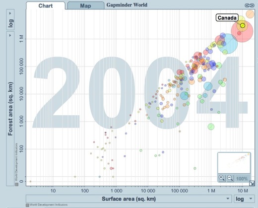
I watched a TED talk sometime over the summer by Hans Roslings, in which he talked about data visualization, specifically using Gapminder. The website, Gapminder World is powered by Trendalyzer, and “enables you to explore the changing world from your own computer.” Perhaps most interesting is that the software allows you to see changes over time, seeing the way things change and the ways in which those changes are interrelated. If you visit the site, make sure to press the play button below the graph before you do anything else—it really helps to understand the possibilities of the software.
I’m very interested in trying to imagine what it would do, in terms of change, if we did have a better understanding of the way in which we and our actions are interconnected to other people and situations across the world and 20 years from now. Are graphs with moving the circles the best way to do this? I’m not sure, but I think the idea behind the tool is incredibly important.
[via]