Heartbreaking by Lois Andison

'Heartbreaking' from olgakorpergallery.com

This one goes out to Josh.

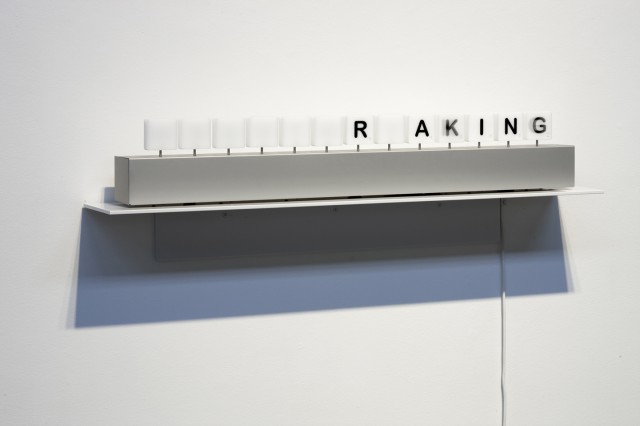
Heartbreaking, a kinetic sculpture by Lois Andison, is a device that gradually works its way through every possible word that can be spelled with the letters H,E,A,R,T,B,R,E,A,K,I,N,G (in that order). Terrence Dick over at Akimbo called it, “the closest thing I’ve seen that’s come to a perfect marriage of word and art.”

'Heartbreaking' from olgakorpergallery.com

Lois Andison was born in Smiths Falls, Ontario. She currently lives and works in Toronto, Ontario. Her kinetic sculptures/installations investigate the intersection of technology, nature and the body. Using movement to initiate an exchange with the viewer, Andison’s work poetically explores social and technological concerns through the construction of the hybrid art object.

'Heartbreaking' from olgakorpergallery.com

She has a number of other interesting data-driven types of works available to view on Olga Korper Gallery.

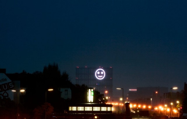
Smiley Face Visualizations from Mood Data of a City

Project Stimmungsgasometer, by Richard Wilhelmer, Julius von Bismarck and Benjamin Maus, is a giant smiley face that changes based on the mood of Berlin citizens. When they are collectively “happy” the light is a smile, and when they are not, it is a sad face. Input comes from facial recognition software (contributed by the Fraunhofer Institut) that takes in video from a strategically placed camera. The obtained mood data are then stored on a server and processed by the smiley on the screen to visualize the emotions in real-time.

Kind of hilarious, a bit weird, and somehow already feeling like its showing its age (though as I understand it, it was a temporary installation back in 2008). Data-driven artwork is already boring — that is, taking dataset x and applying it to artwork parameter y. Somehow I feel like Cory Arcangel had something to do with wrecking this for everyone, in the best way possible.

Thinking about ways to animate the intangibility of the city still seems like a good idea though.

via an email from Kim seen on Flowing Data & [Stimmungsgasometer via infosthetics]

XBees, Arduinos, Serial Data

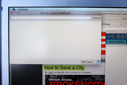
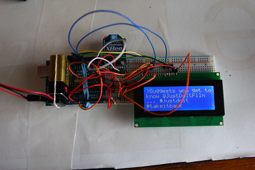
I made some huge progress over the last week or so on this ongoing Arduino / LCD project — it’s finally gone wireless!

With some more silly mistakes behind me, I’m finally getting a better handle on how to break down the problems I run into and solve them a lot faster. I remember back in February, it seemed as though it was going to be impossible to actually get this wireless part happening, so I’m super relieved to know it’s at least partly working.

Also, there have been people asking for the code used in this project (in terms of PHP and Arduino scripts), I will upload them! I just haven’t had the time to go through and appropriately clean them up and comment them, so I’m not sure how useful they would be at this point. I just wanted to note that I will indeed be doing that soon though!

Lots of photos of wireless glory ahead…

Continue reading “XBees, Arduinos, Serial Data”

The Watermarks Project

The Watermarks Project

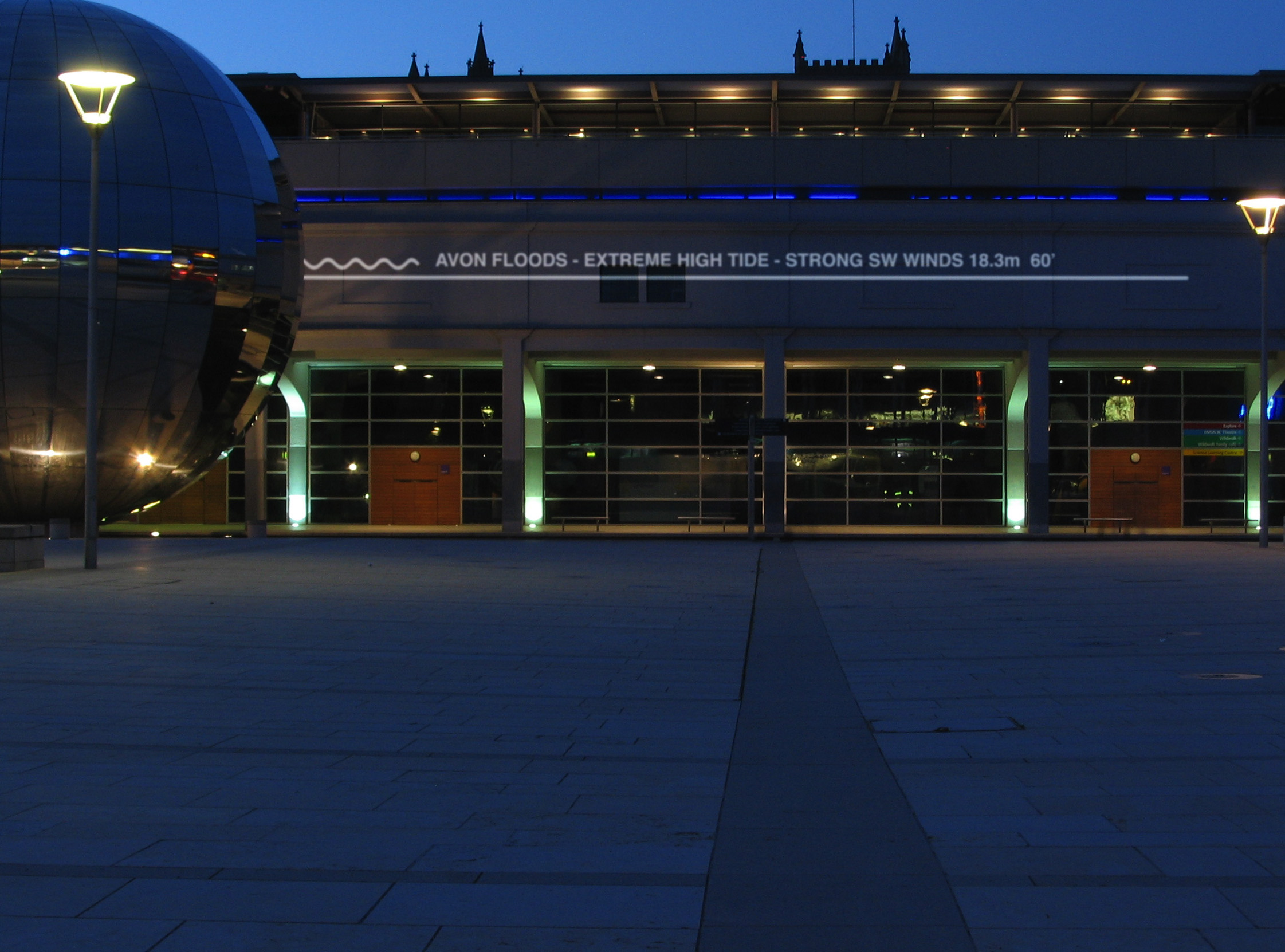
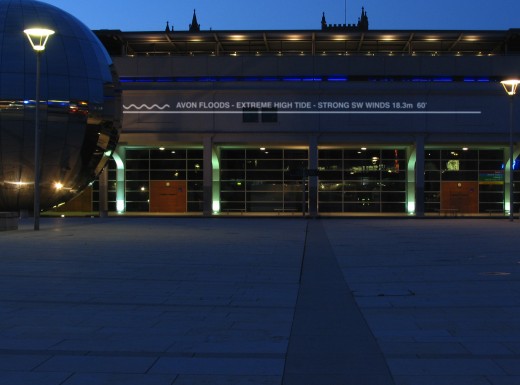
In order to highlight the possible future-effects of rising sea levels in Bristol, England, the Watermarks Project was initiated by Chris Bodle, a landscape architect. Notes and lines demarcating the rising water will be projected on buildings and infrastructure throughout the city.

This project is a great example of annotating the city, relaying information to the public that would be otherwise unknown or unrealized.

[via Rhizome]

In The Air

In the Air - a data visualization project initiated at MediaLab in Madrid

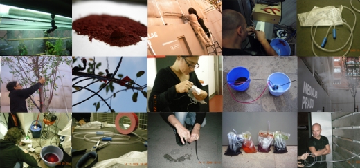
In The Air is a data visualization project initiated at MediaLab-Prado in Madrid. The project has taken a large dataset consisting of a year’s worth of air quality readings from Madrid and is beginning to realize a number of ways to make visible the invisible agents of the city’s air (gases, particles, pollen, etc). In The Air is using both web interfaces and physical prototypes for representing the data, and while the web component looks very slick, I’m considerably more interested in the physical parts.

I’m not sure how well the images read above, but those are some examples of their process as they work their way through Arduino-controlled contraptions that will spray out different colours of mist depending on the air quality data. There’s a video of one of their failed attempts on Serial Cosign, which is where I originally saw the project.

Seeing people do stuff is inspiring.

Gapminder: Free Data + Building Understanding

Gapminder - visualizing Canada's forested area vs surface area

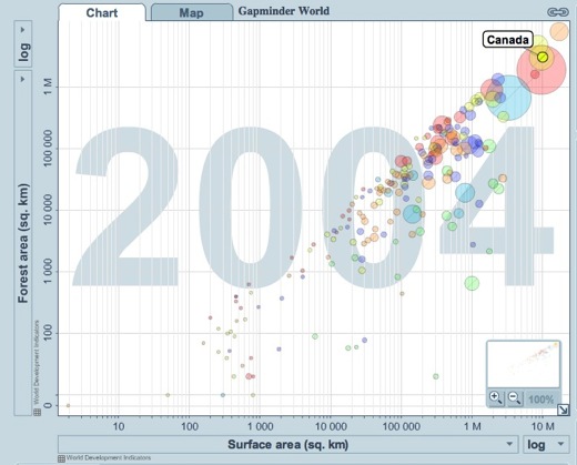
I watched a TED talk sometime over the summer by Hans Roslings, in which he talked about data visualization, specifically using Gapminder. The website, Gapminder World is powered by Trendalyzer, and “enables you to explore the changing world from your own computer.” Perhaps most interesting is that the software allows you to see changes over time, seeing the way things change and the ways in which those changes are interrelated. If you visit the site, make sure to press the play button below the graph before you do anything else—it really helps to understand the possibilities of the software.

I’m very interested in trying to imagine what it would do, in terms of change, if we did have a better understanding of the way in which we and our actions are interconnected to other people and situations across the world and 20 years from now. Are graphs with moving the circles the best way to do this? I’m not sure, but I think the idea behind the tool is incredibly important.

[via]