CAKFA.11: Reflect on Here

Reflect on Here, text installation at CAFKA by Broken City Lab

Reflect on Here, text installation at CAFKA by Broken City Lab

After months and months of work, we finally installed our project for CAFKA.11. Led by Josh, Hiba, Kevin, and myself, the project took an incredible amount of research and build time, but we were incredibly excited to see our efforts finally in place in front of Kitchener’s City Hall when we wrapped up the installation last night.

Reflect on Here calls on passersby to think on the infrastructure of the city, the attempt to create place with architecture, and the materiality of the text itself. This project was made possible with the generous support from the Ontario Arts Council‘s Exhibition Assistance Program and the incredible team at CAFKA.

Continue reading “CAKFA.11: Reflect on Here”

BCL Report: May 5, 2011 (Big Books & Small Letters)

We met twice on Thursday, and those meetings were after Michelle and I headed over to SB Contemporary Art to finally check out “On Your Mark” (a great exhibition featuring work by many of our friends) and talk about how we could partner in some way on Homework: Infrastructures & Collaboration in Social Practices.

Back at the Ecohouse to try to get the plan together to work on a video we’ve been tossing around for a while — final decisions have been elusive, so we put it on hold for now. Instead, we headed out to the front lawn and reminded ourselves of the what we can do with How to Forget the Border Completely.

Executing these projects is just a matter of carving out a day … we spend time planning, testing, experimenting, brainstorming because we know we’re more curious together and our collective curiosity is the driver for every one of these projects. It’s not about the solutions, it’s about the questions.

Continue reading “BCL Report: May 5, 2011 (Big Books & Small Letters)”

Retroreflective Materials Test

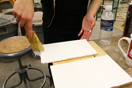
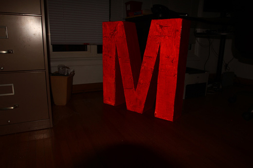
Earlier this week we received a couple of samples of various retroreflective materials for use on our letters for CAFKA.

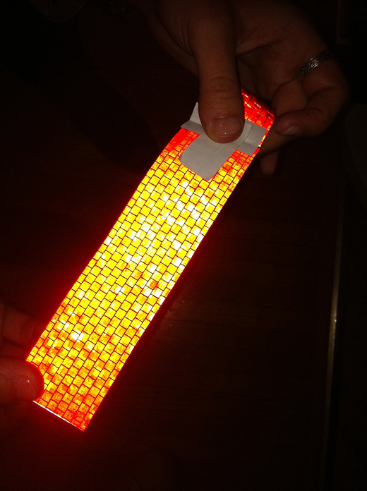
One material, the one on the roll, is a vinyl (3M Scotchlite Reflective White Vinyl), perhaps most famously used in the Bright Bike project, while the other is an industrial substrate (3M Engineer Grade White Prismatic Sheeting) used on municipal road safety signs.

I’ve been doing a variety of tests with a flash, the one above  where it appears that the Scotchlite vinyl is brighter was taken with my DSLR with the body flash, but the lens I have on there blocks the flash in the lower part of the frame. Tests with photos from my iPhone seem to favour the Prismatic Sheeting.

We’re still examining the costs of each and we still need to do some more rigourous tests, but it’s amazingly helpful to be able to see these side by side (thanks Sarah!) The vinyl has an estimated 7-year service life, the prismatic sheeting is about 10-years. Not sure on the cost difference yet.

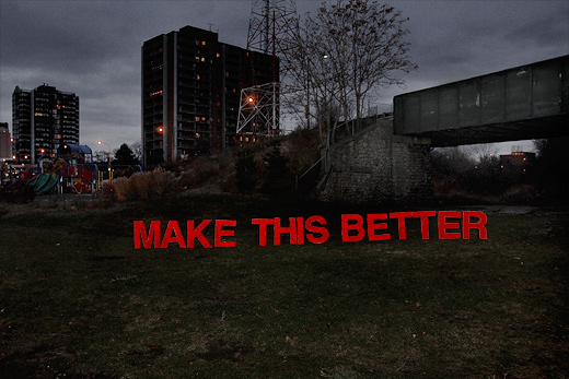
Thursday is catch-up night, so there should be lots to talk about. I know Hiba and Karlyn were working on a budget and I think a whole bunch of the crew met up on Monday to do some work. We’ll have to plan some really well-thought-out tests for these materials, in the outdoors, etc., to see how they fare in the weather. I put up a spec-sheet for both materials to our Dropbox. Anxious to figure out the best plan forward!

BCL Report: March 18, 2011 (the math)

We were a few people short of a full crew (Michelle was sick, Danielle was away, Rosina was on the line, and it was Cristina’s birthday), but Josh, Kevin, Hiba, Karlyn and I still made the most of our Friday night studio collaboration spectacular by putting some focus on our large-scale letters project for CAFKA.

With the semester wrapping up in just a few more weeks, we’re really looking forward to having a bit more time and brain space to work on all of these projects.

Continue reading “BCL Report: March 18, 2011 (the math)”

Make This Better: Ripper’s Valley

This is the first in what will be an ongoing series of posts as we temporarily install these letters across the city to generate some conversation and creative thinking around how we can indeed make this (place) better. You can check out the process of making these letters in this archive of posts.

Ripper’s Valley is visible from the Riverfront bike path, which happens to be how I first became interested in it. As an avid cyclist, I very frequently ride down this section of the Riverfront path and quite often see a bustling community of families, a diverse range of cultures, a balanced number of mothers and fathers, grandparents, babysitters and children using the play equipment and nearby benches during the day.

However, within feet of this area is a dead-zone. The entrance to the railway cut is dark, looming, and segregated from the Riverfront Park. In my experience, children venturing toward the entrance are most often called back by their parents and reprimanded to stay within the direct area of the play equipment.

Continue reading “Make This Better: Ripper’s Valley”

Red Paint & Testing Glass Beads

We made a lot of progress tonight, not only getting a considerable way through the first coat of red paint, but also testing a variety of techniques for applying the retroreflective glass beads!

We also got to spend some time talking through how we’ll be temporarily installing the letters in a variety of spaces. We figure that there’s still at least a few more weeks of preparation and tests, but we’re really getting excited to get these out into the world.

Continue reading “Red Paint & Testing Glass Beads”