Civic Space Studio Digest for December 13: on t-shirts and white walls

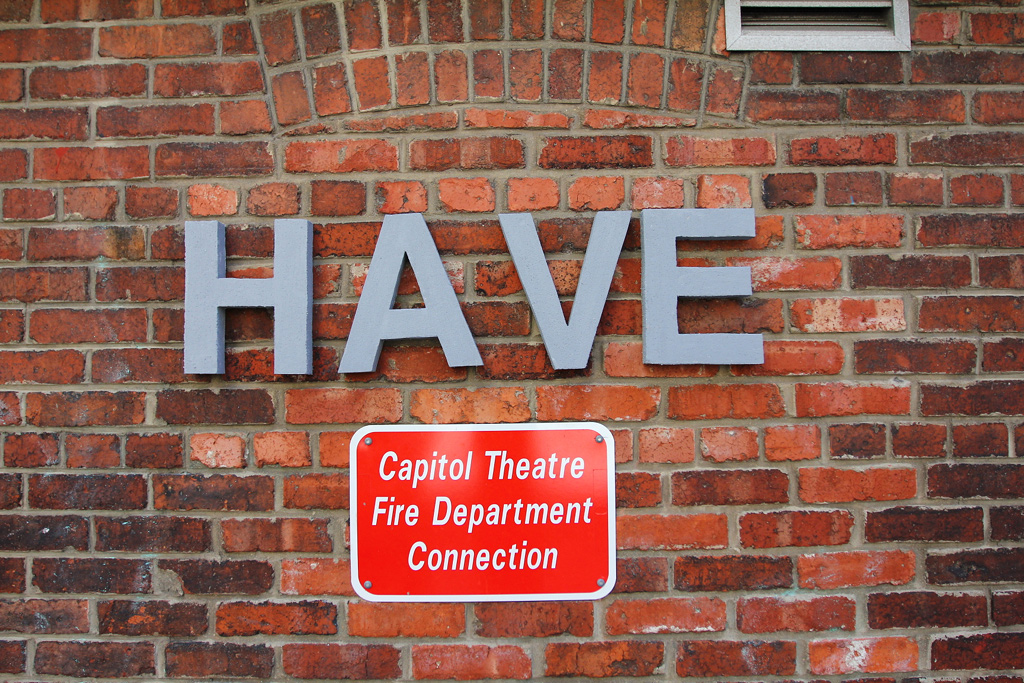
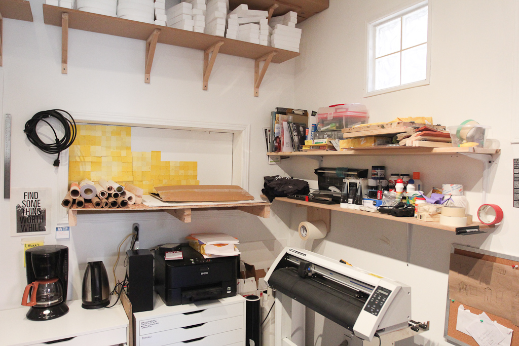
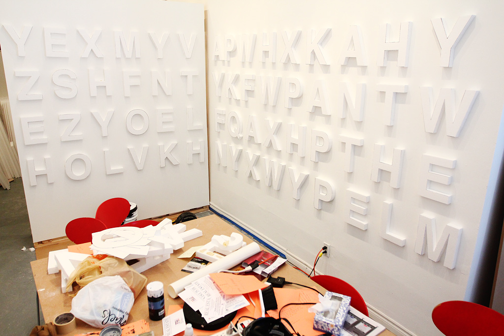
A look at our little corner of Civic Space. This is where we’ve been spending the majority of our time lately. For the record, the high shelves (those really nice ones with the Letter Library letters on them) were installed by Kiki. The lower shelves were hacked together by me. They’re very shoddy, but they hold many things.

As we’ve been hosting our 1W3KND Residencies, I love coming in on Monday and seeing the little re-arrangements made. Last weekend (I think) the coffee maker and tea kettle got a new home.

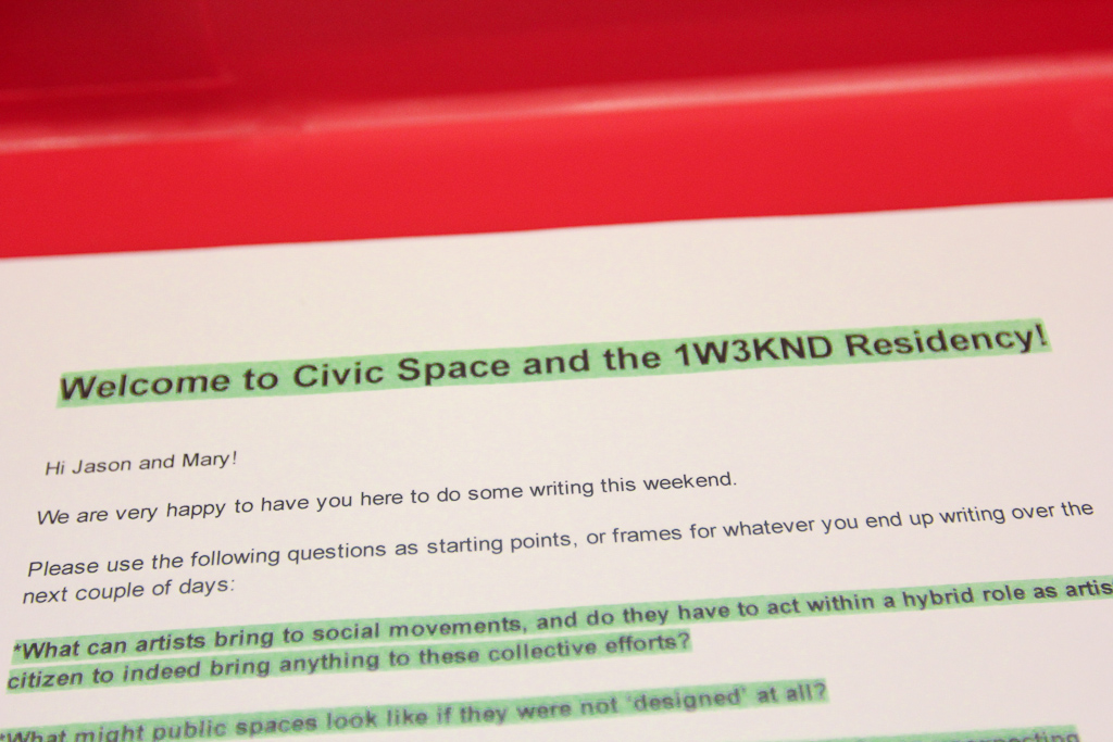
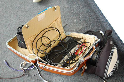
Hiba was away, so I got together the little instruction set for the writers in residence and put it back in the big red 1W3KND case.

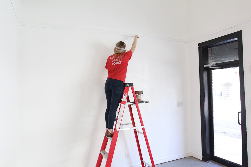
Meanwhile, Laura took on the task of repainting the walls. After two great exhibitions from Catie Newell’s class and the Green Corridor, the walls were in need of some repairs and touch ups.

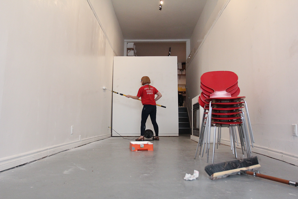
One can of paint got us about 80% through. One wall left, will have to pick this up on Monday.

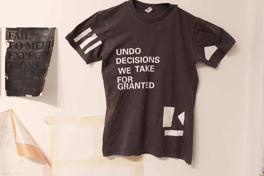
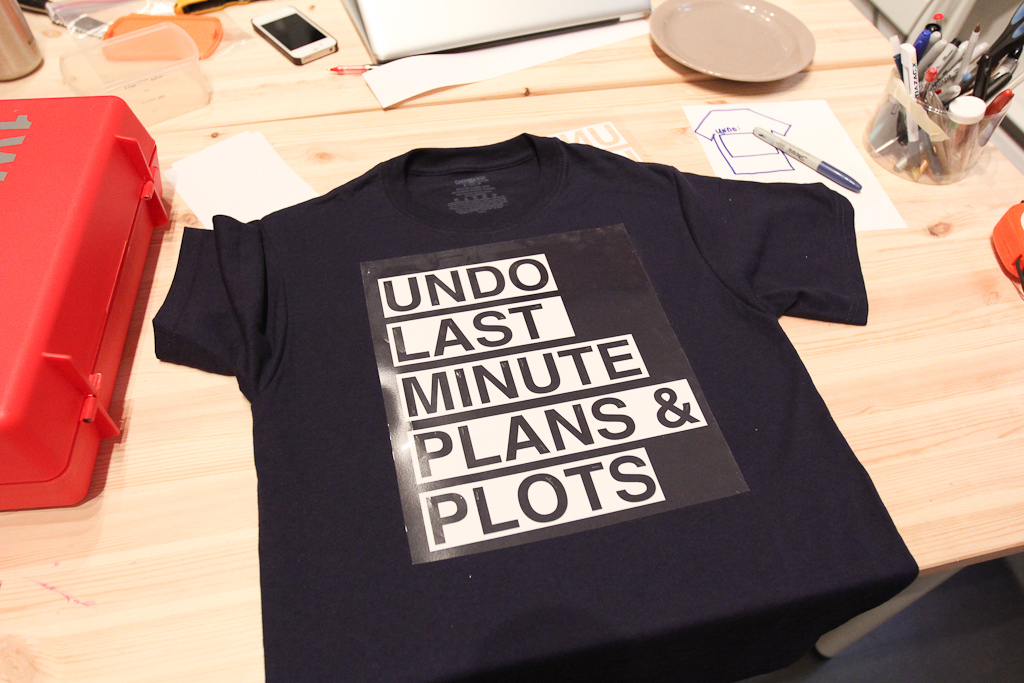
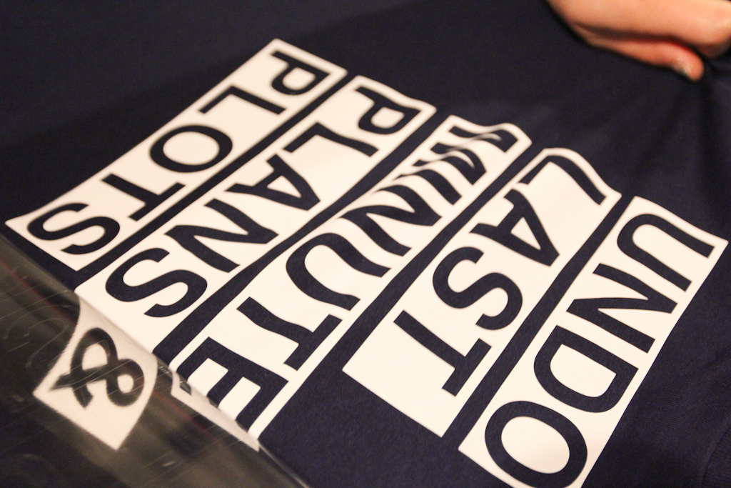
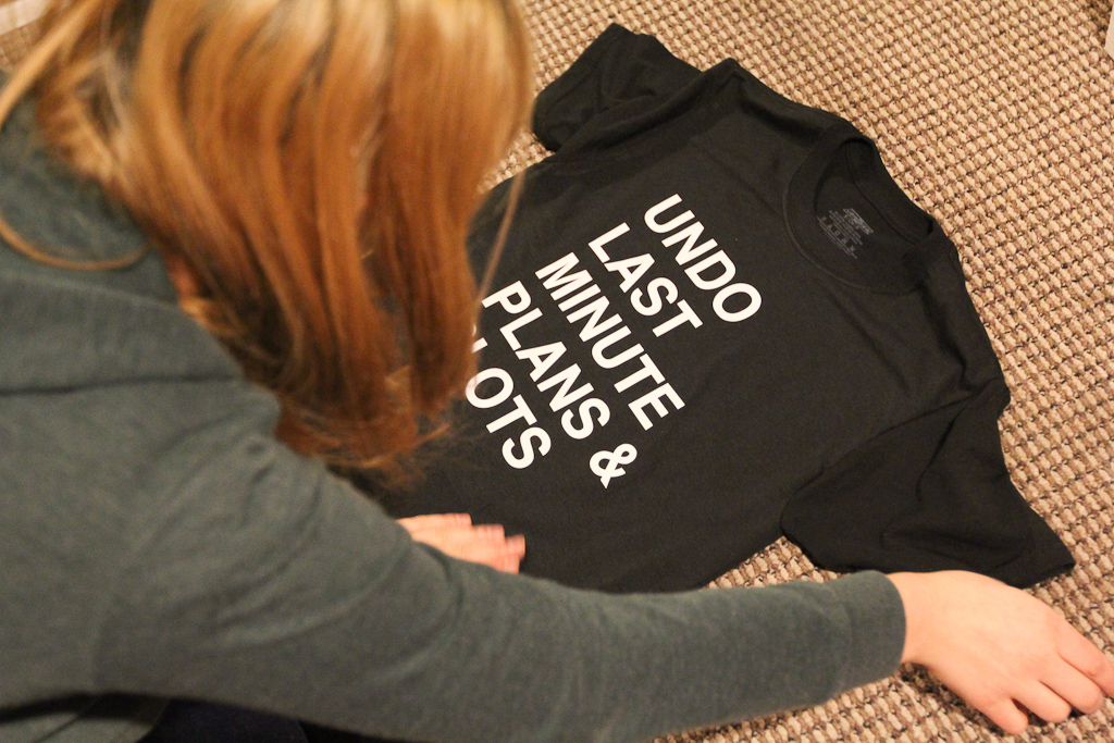
After painting, we spent the afternoon doing some more tests for this t-shirt project. The mangled shirt above features a number of test-sites of vinyl with various temperatures and times on the heat press.

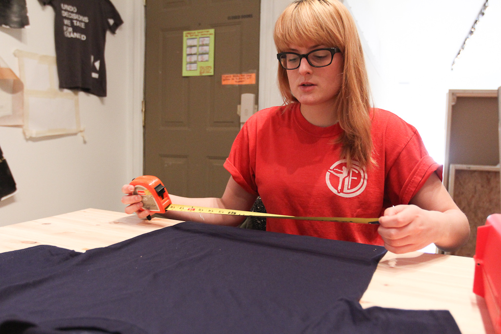
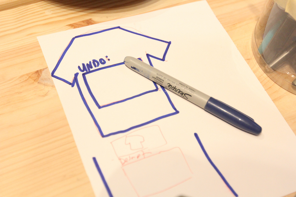
But, before we could do more tests, we had to go back to the drawing board and get a better sense of the size of the potential texts.

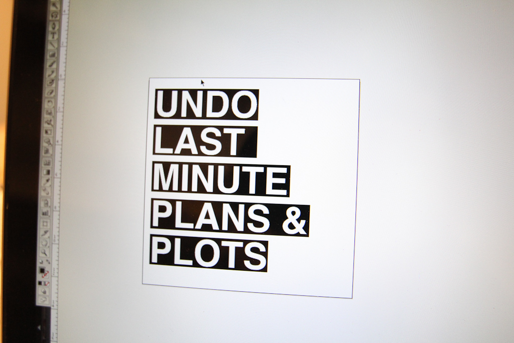
We also played with a highlighter look instead of just straight text.

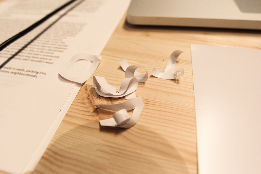
Our new weeding tools makes the vinyl cut process a lot faster.

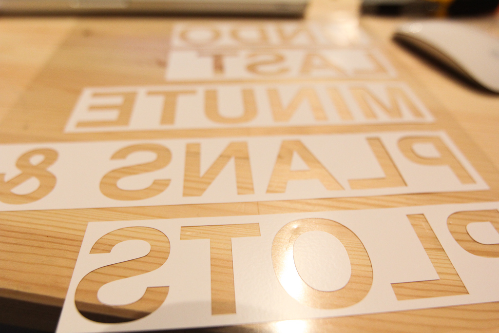
Remember, cut in reverse for t-shirt vinyl!
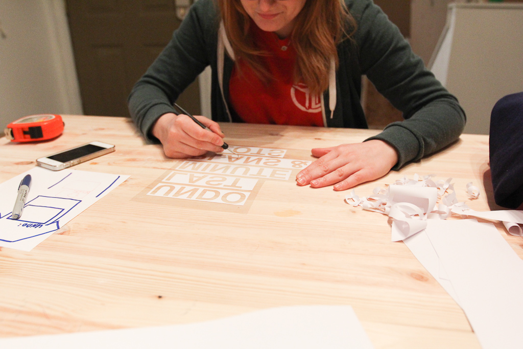
Laura weeds.

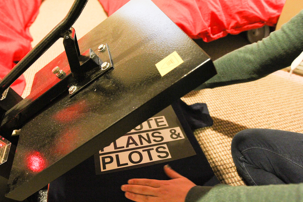
Then, we place the design…

… and head to the press.

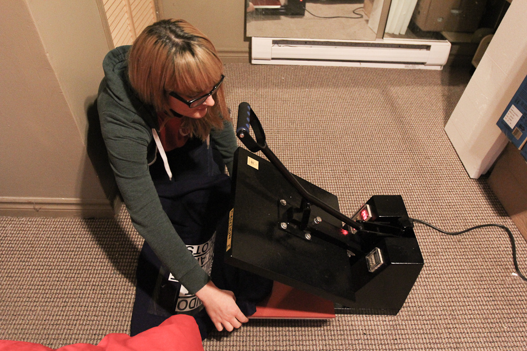
Laura is the master of this machine. I actually don’t even know how to make it do anything aside from plugging it in.

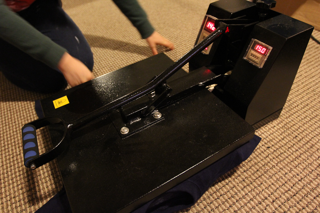
Laura picked up with the same time / temperature settings that we left off with before.

The vinyl seemed to go on no problem, but I think the temperature was still a bit hot, as it left a faint mark where the press hit the shirt.

We also played around with some ideas for the online forms that we’ll eventually make for this project.

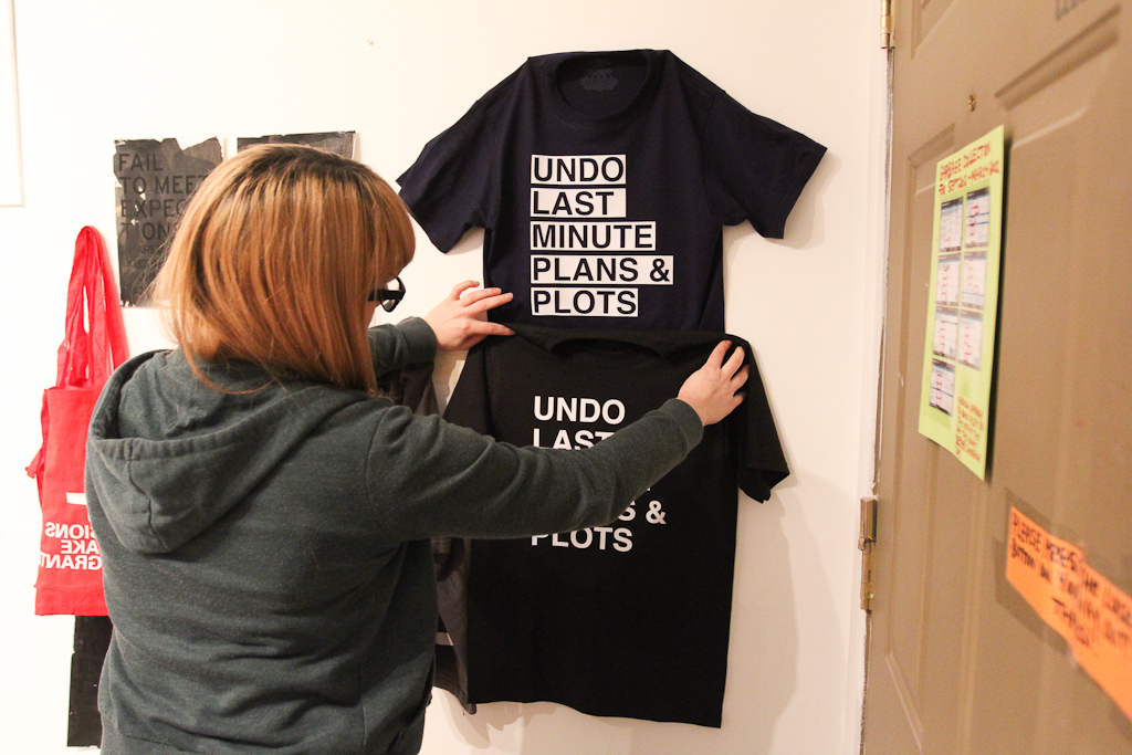
Above, the blue shirt on the wall.

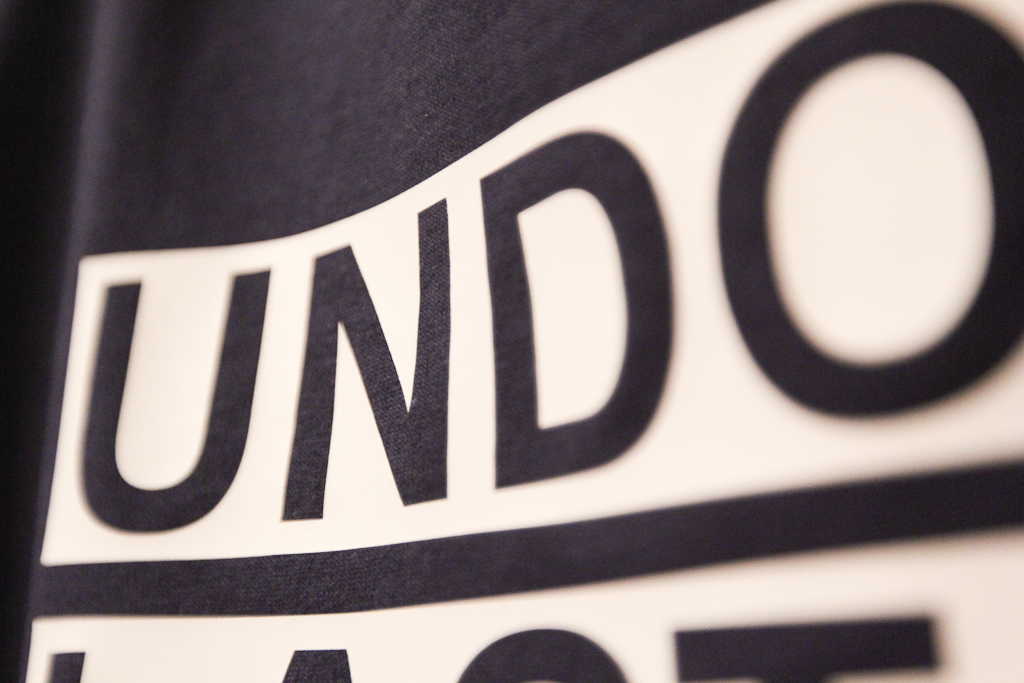
Detail of the vinyl.

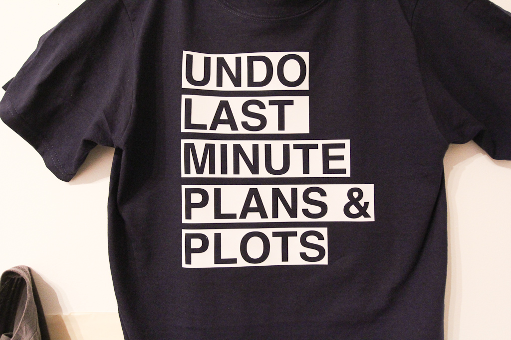
For the sake of true comparison, we also cut the same text in standard Helvetica bold. We also set the temperature a bit lower in hopes of avoiding the marks from the press.

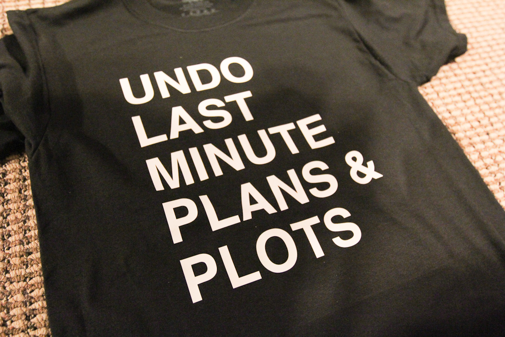
We’re pretty sure this looks better. I think we had discussed grey shirts before, we’ll see…

We ended the day doing some more comparisons. I’m going to wash the shirts and make sure that the temperature / time changes don’t effect the vinyl adhesion. More soon.

Nothing like being thorough: how we make decisions, slowly

Last night Hiba, Danielle and I met to do some more prep work on the letters for the Letter Library launch on June 21st. We painted another test letter E a different shade of grey and started to populate a wall with some more of the tests. It was excellent to see more than a few letters up at once to start to get a sense of the scale of the cluster.

Styrofoam letters, white walls, night time guerilla art (1)

Danielle tried her hand at cutting the letters for a little while, but we quickly shifted over to more tests, while also playing catch up and talking through some other projects we want to kick off later this summer.

Styrofoam letters, white walls, night time guerilla art (2)

We head out with a grey letter E and a two-tone S.

Styrofoam letters, white walls, night time guerilla art (3)

This was around 9pm or later … so we didn’t get a read of this shade of grey in the harsher sunlight. There’s something interesting about the grey — certainly it doesn’t pop like the white (or the black really for that matter), but it feels a bit more anchored.

Styrofoam letters, white walls, night time guerilla art (4)

We also put up a white letter Y. It’s no surprise it stands out the most, outside.

Styrofoam letters, white walls, night time guerilla art (5)

Danielle moves the letters around to other locations.

Styrofoam letters, white walls, night time guerilla art (7)

YES, more often.

Styrofoam letters, white walls, night time guerilla art (6)

Hiba, Lucy, and I returned earlier this morning. Hiba installed some rows of white letters to get a better sense of how they’ll look on the walls.

Styrofoam letters, white walls, night time guerilla art (8)

We also figured it might make them easier to paint and not take up every square inch of walking space while we continue to prep.

Styrofoam letters, white walls, night time guerilla art (9)

Taping the letters.

Styrofoam letters, white walls, night time guerilla art (10)

Meanwhile, Lucy takes on the jig saw.

Styrofoam letters, white walls, night time guerilla art (11)

We’re going to play a lot with the lighting.

Styrofoam letters, white walls, night time guerilla art (12)

Letters temporarily installed on a couple of the walls. We’ll end up putting them a lot closer together on the final install.

Styrofoam letters, white walls, night time guerilla art (14)

We’re still planning to paint the faces white to remove the black lines left over from tracing.

The effects are interesting — about what I expected where they feel more a part of the wall than objects to take out and distribute. Of course, getting closer to the letters easily reveals that they’re styrofoam, but we’ll have to work out a really straight-forward set of instructions to carry out the project.

The plan going forward — finish cutting the letters today and Monday, start (and hopefully finish) painting Monday, start clean-up and install Tuesday, and do all the other prep by Thursday morning, giving us the better part of the day for contingency.

Grey Paint Test, Tattoos, and Talk of Homework II

This afternoon at CIVIC SPACE started out with a video chat with Jason Sturgill from Portland about a really awesome project we’ll be collaborating with him on in the spring of next year.

There is also talk of Homework II happening this fall…stayed tuned for more info on this.

Also, our Akimbo ad was released today! Cool.

On the production side of things, we decided to do the final letter paint test for the Letter Library. While both white and black paint tests have had their pros and cons, we agreed on a final test of the colour grey to see if we can find a happy middle.

Word of the day today is: HAVE

Pre-paint.

Before coming to the space, Hiba went to Michaels to grab some grey paint. All the grey paint was sold out (weird), so we resorted to making our own by mixing our black and white paint remnants.

Painting…

Waiting…

After the letters dried, we hung them up in the space to see how they fit.

The grey definitely pops more than the white did in the space … and we do need to decide soon …

We took to the streets shortly after to take some install shots on different wall surfaces to compare with the white and black tests we did previously.

The grey has a nice pop, even on muted walls like this one.

While white had a really great pop on brick walls, the grey letters have a very interesting presence.

Almost looks like concrete on concrete!

The shadows cast on the grey letters give them more depth, while the black letters got lost in their own shadows.

The grey as the middle ground (in every sense) might win the day. It stands well on our white walls and looks interesting among the different textures of the buildings outside. Maybe we should sleep on it.

Remember, June 21st at 7pm, you’re invited to our Letter Library launch!

First Decisions of the Day … and notes from breakfast

Letter decisions - should we paint them black or white

First decisions of the day to be made — whether to commit or not to painting the letters black or white. Somehow this has been one of the longest ongoing discussions we’ve had for a while. The next step though is to paint and test in the wild.

Distance viewing of the styrofoam letters

The letters from the table view.

Notes from a meeting with Kika Thorne

Notes from a meeting with the wonderful Kika Thorne. She’s coming back to Windsor in September for a project with the AGW.

Our first piece of mail showed up today from Hamilton

Our first piece of mail showed up today from our friends at Hamilton Artist Inc.

Ms. vickie's breakfast of champions

Also, breakfast of champions with Kika — Ms. Vickie’s Sea Salt and Malt Vinegar with coffee from Milk.

And, in between, a meeting with the City of Windsor and the Arts Council Windsor & Region — good things ahead.

Red Paint & Testing Glass Beads

We made a lot of progress tonight, not only getting a considerable way through the first coat of red paint, but also testing a variety of techniques for applying the retroreflective glass beads!

We also got to spend some time talking through how we’ll be temporarily installing the letters in a variety of spaces. We figure that there’s still at least a few more weeks of preparation and tests, but we’re really getting excited to get these out into the world.

Continue reading “Red Paint & Testing Glass Beads”

Roadsworth: Painting the City

Life Support System by Roadsworth

Reading about a show up at Atelier Punkt, featuring work by Roadsworth, I was interested in the gestures that transform an infrastructure that doesn’t always get the attention it deserves.

Working with road paint, the street artist, Roadsworth, plays with the existing roadway communication to transform straight lines into heartbeats, street crossings into candles and fire crackers, and pedestrian crosswalks into gifts.

Continue reading “Roadsworth: Painting the City”

Let’s Colour Project

httpv://www.youtube.com/watch?v=uPpMWaSPt-s

It’s called the Let’s Colour Project.

Ok, it’s an advertisement for a paint company, and  it strikes me as being a pretty bad idea (in a long-term perspective, I kind of cringe when I see brick buildings painted here in Windsor). Inevitably, a bit history is being completely lost by painting over these walls.

However, the video is stunning and if for a moment we can forget the parts of it that make this a possibly poor long-term choice,  it does get my imagination going thinking about how we could repaint blocks of concrete in this city.

Danielle pointed this out to me.